Color management for video post production is a subject rarely covered by the popular mainstream blogs and is less understood by most than the LUT. You have to go dig around for the hidden blogs of specialist geeks and nerds usually confined to dingy dark rooms that speak in strange dialects of post workflowese.
Color management is simply not a very sexy topic and is inherently very technical and scientific. It can be a difficult concept to grasp let alone implement in your workflow. This article will give you a basic understanding about a topic that any filmmaker in the digital age should be aware of and will give you an advantage over your competitors.
Last week I wrote an article explaining the LUT, or ‘look up table’ and touched on color spaces. You can find it here: What Exactly Is A LUT
Now I’m going to look at the basic practices of practical professional color management when designing and setting up your post production workflows without getting into too much science. I’ve provided a link at the bottom of the article which is a must-read for anyone wanting to dive deep into color management.
This will all lead to an upcoming introduction to ACES, or Academy Color Encoding System developed by the Academy of Motion Picture Arts and Sciences (think Oscars). With the technical standards of color for digital cinema (DCI-P3) surpassing those of HD television (Rec709), and now the standards developed for UHD (Rec2020) surpassing those adopted for digital cinema, I believe in time ACES will become the unified standard for future professional color workflow.
In total, it’s a lot to understand in one go so I’ve had to split it up over a few articles.
Why do I need to know about color management?
So your Apple retina display looks fantastic and none of your clients are complaining. Why do you need to know all this?
The answer is simple: because it will improve the quality of your work and give you an advantage over your competitors who either don’t know any better, or don’t care.
Let’s be honest, it’s not as interesting as the latest cinema camera or color grading tools, however if you are making a living from small to medium scale production and post work then implementing professional color management can help set you and your work apart from the crowd and add important value to your service offering.
Color management is not reserved only for Hollywood’s biggest post houses. You can raise the bar for yourself and your customers just by understanding and taking some simple steps.
So what is color management?
First let’s look at the problems. You’ve got a whole bunch of different camera formats and codecs, at different color bit depths each with their own definitions, peculiarities and discrepancies when it comes to how color is recorded and represented. You’re ingesting, importing, and then processing all these different formats often mixed up in the same project. You are viewing it all on a display with its own color profile, and then rendering some kind of file in some format with yet another definition of color information.
At every step color information is decoded, interpreted, translated, encoded and displayed differently.
That file is then going to be played by some software whether it is for broadcast playout or cinema playout, or on someone’s mobile phone or computer and displayed on some other device all handling color differently.
You have no control over what happens with your file once you hand it over, and you have no control over how accurate your audience’s mobile device, display or television is, but you can control to the best of your ability what happens within your internal pipeline and post workflow, and that’s very important.
The purpose of color management is to make sure color is being represented correctly, and to minimize the variations as much as possible through the entire chain of hardware and software that makes up your post production workflow.
5 Things to Know
1. Make sure you set up your environment correctly
The first step to taking color management seriously is making sure you are working in an unbiased environment.
Strong colors in and around your working space such as bright décor or colored walls and non-neutral lighting will detract those same colors from your monitor.
For this reason, walls should be painted grey, close to a 18% “middle” grey is good and lighting should be dimmable and the same color temperature as your monitor backlight, that means CIE D65 (daylight 6500K). It’s advisable to have a soft “bias lighting” behind your monitor to reduce strain on your eyes from the bright monitor in the darkened environment.
2. Use a color critical reference monitor
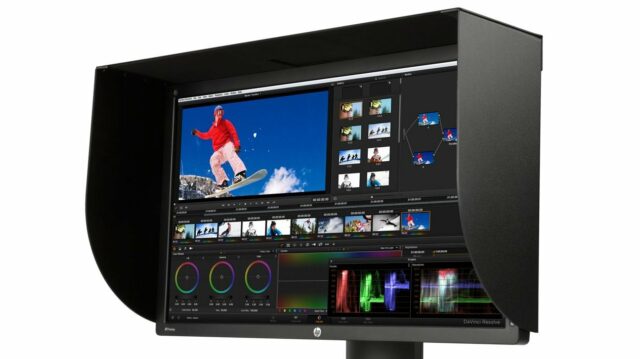
This one we have all at least heard before. Sure, a Flanders Scientific or Cinetal grading monitor is expensive, but there are more budget friendly options from Eizo and the Dreamcolor monitors from HP that support hardware calibration such as the HP Dreamcolor Z27x.
3. Calibrate your monitors correctly
The device used to calibrate a display is one of three types, a simple and cheap colorimeter, a spectrophotometer or at the highest end, a spectroradiometer. Some manufacturers include Klein Instruments, Photo Research, Konica Minolta, X-Rite and Datacolor among others. The exact calibration procedure and accuracy depends on the hardware and is beyond the scope of this article. Monitors should be re-calibrated every 600 hours to compensate for the effects of ageing on the backlight. A good budget colorimeter for hardware calibration is the X-Rite i1Display Pro.
4. Choose your working codecs and formats carefully
Some codecs are better than others when it comes to color accuracy and reproducibility across multiple software packages. Apple ProRes is more popular than ever in post but has been known to suffer color / gamma shifts in some cases. This has nothing to do with the actual codec however, which is very robust, it has more to do with its implementation in some software. The high bitrate Avid DNxHD and DNxHR codecs are very good, and of course uncompressed DPX and EXR frame sequences are technically ideal but often impractical. Cineform is another very good option to unify source media and ensure accuracy throughout post.
5. Work in the required destination color space
The color spaces you need to know and be aware of are below.
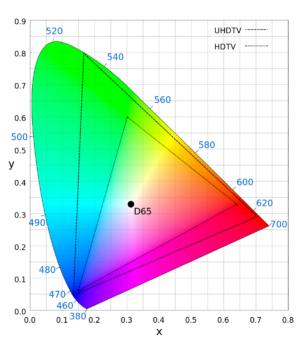
Rec709 – Almost identical to sRGB, this is the international standard for HD broadcast. It is the most likely choice to work in for non-cinema projects.
DCI-P3 – This is the required standard for digital cinema and most closely approximates the color response of film.
ITU.Rec2020 – The widest gamut color standard yet, which has been defined for UHD. It covers 75.8% of the CIE XYZ color space.
CIE XYZ – This is a device independent standard that includes the entire visible spectrum. This is not a working color space, but rather a space that encompasses all other color space standards. It is however a standard for encoding media destined for DCI compliant cinema projectors.
You are likely to be working in Rec709 most of the time, which thankfully is the narrowest color space standard and will certainly be covered by any professional reference monitor. Many monitors now will cover most of DCI-P3, or all of it with an in-monitor emulation mode.
Facility wide color management is a must for any large professional post house, but it’s also achievable for a smaller setup, even at home if you can dedicate a room and invest in one color critical reference monitor with hardware calibration.
So now you know the crucial steps to achieving professional color management for yourself, you can make sure the work you deliver meets the same standards as Hollywood’s biggest post houses. That’s something worth every penny you might spend on a color critical monitor and colorimeter.
For a far more technical and in depth look that is beyond the scope of this introductory article, download the pdf from www.cinematiccolor.com here: Cinematic Color, From Your Monitor to the Big Screen


