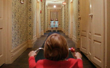
We all strive for balance – in our lives, in our experiences, in our frames. So, when someone taps into the opposite, it can create an instant emotional reaction. Used in shot composition, imbalance becomes a strong tool in filmmaking as well. Let’s narrow it down a bit and explore the impact of headroom in storytelling – a simple yet astonishingly powerful technique to give your creative pictures visual subtext and allow a greater impact on the audience.
Headroom (or head room) is the amount of space between the top of the frame and the subject’s head. Sometimes it is also called “negative space” or “matting”. There are several rules of composition, which guide you to construct your frame in the most eye-pleasing way, and we will talk about them later. Yet, once you know the rules, you can also break them. Try it, and your shot suddenly starts telling a completely different story without saying a word. You may call it “basics”. To me, though, this is exactly the moment when filmmaking magic enters the room.
Headroom in storytelling: understanding visual subtext
But before we dive into the power of unconventional headroom in storytelling, let’s go back to why such tools are important in the first place. In the MZed course on visual storytelling, seasoned cinematographer Alex Buono reminds us of the old saying, “A picture is worth a thousand words”, and then he refutes it straightaway.
Alex Buono's Visual Storytelling 2
We’re completely inundated with images in our lives – 24/7. You’re making images, you’re tweeting images, you’re instagramming images, you’re looking at other people’s images. We’re completely bombarded by images. There has been a virtual inflation of images, which is causing an absolute recession of meaning.
Alex Buono, a quote from the MZed course „Alex Buono’s Visual Storytelling 2“
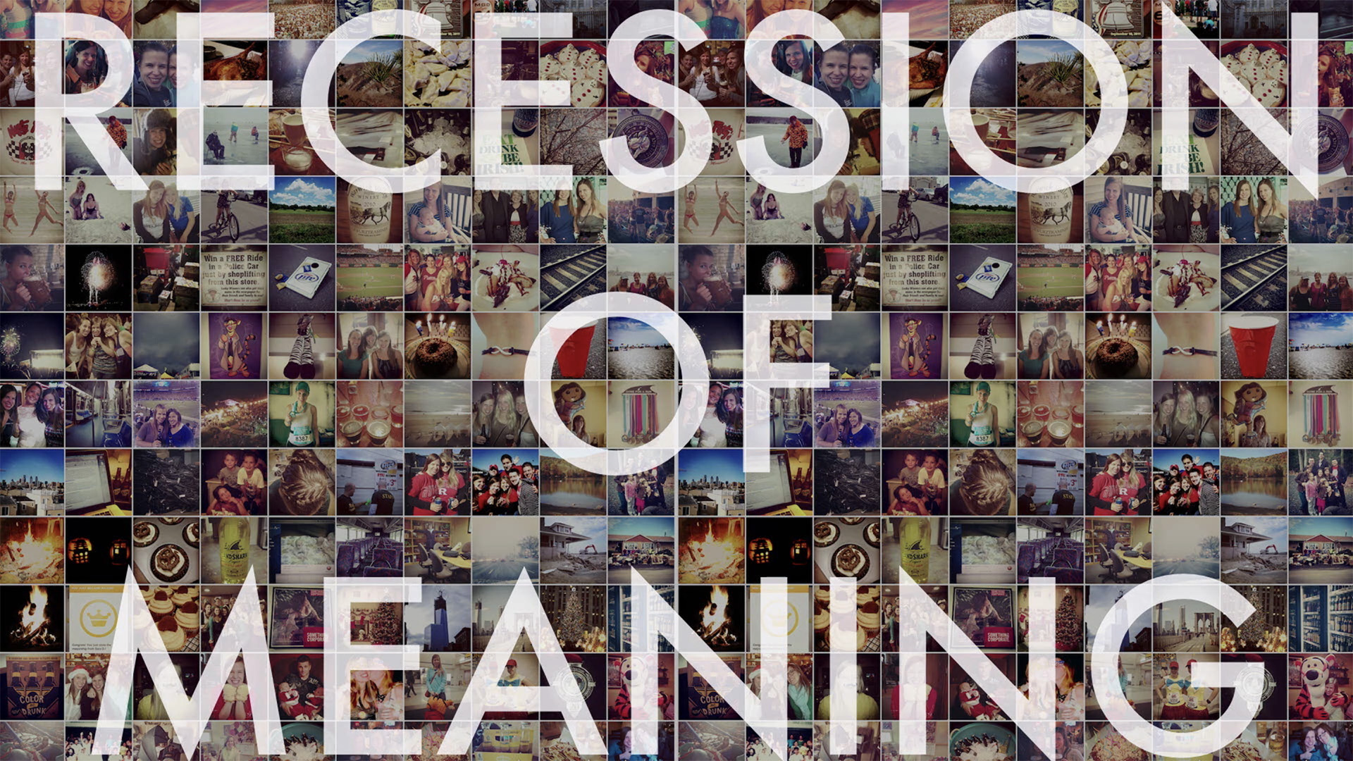
In Alex’s opinion, (which I personally agree with), nowadays it is hard to get our images to mean much of anything anymore. And that’s exactly why visual context is essential in films. We need each shot to start speaking again and to tell a story that supports the film narrative. You might achieve it by filling your visuals with consistent symbols, metaphors, and references. It also helps to learn basic camera language and its elements, like space, line, shape, color, movement, and so on.
Some rules of visual context
According to Alex Buono, the first and foremost rule of visual subtext is that it must be organic to the overall story. Obviously, it’s the whole point of the subtext in the first place. You cannot throw in random symbols hoping that this will engage your audience and prompt them to decipher your meaning. And even if they do, they will come out of this journey feeling overwhelmed and manipulated by the experience. (Please keep this rule in mind when we segue into different ways of applying headroom in composition).
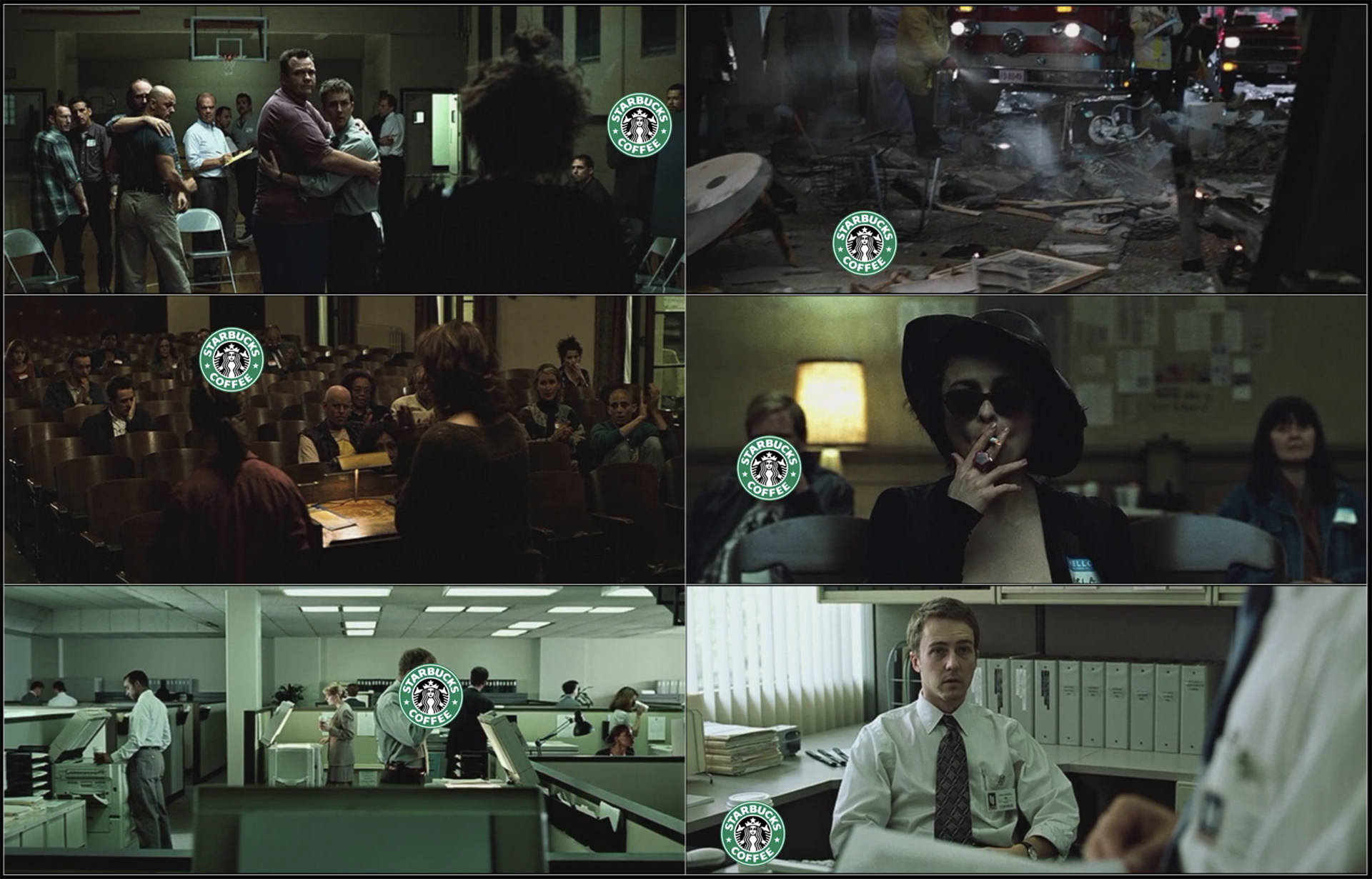
To give you an idea of how visual subtext works, think of David Fincher’s famous film “Fight Club”. You may have heard that the director put a Starbucks cup in every shot of this movie. It’s not always visible, as Fincher admits, but it’s there as a constant reminder of the extensive consumerism which has taken over our lives. Does it align with the underlying theme of “Fight Club”? Oh yes.
Another rule of subtext mentioned by Alex Buono in his course is that undefined is much more powerful than defined. This means creating a subconscious impact on your viewers through your visuals, which engages them into asking questions, feeling emotions, or reflecting on the topics you choose. And this is exactly where tools such as headroom come into play.
How to achieve perfect headroom in your framing?
As mentioned above, there are guidelines on how to construct a balanced image. In this regard, the optimum amount of headroom is usually connected to the rule of thirds, which we discussed in detail here. For example, world-renowned filmmaker Philip Bloom explains in another MZed course, “Cinematic Masterclass”, that if you place the character’s eyes in the top third of the frame, it will allow you to present a subject with a conventional headroom in the shot.
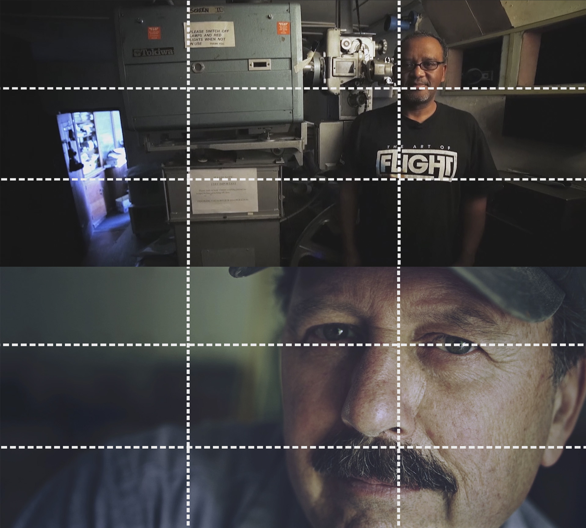
What’s interesting is that this rule works likewise in close-ups, yet with the completely opposite effect. In the example above, we can sacrifice the headroom altogether and even chop off the top of the subject’s head in the frame, as long as their eyes stay in focus on the upper line. Such an approach is also considered “appropriate” and eye-pleasing, but has a different impact on the story.
A simple rule, right? Let’s see how we can break it to convey various subconscious messages to the audience. A little disclaimer: there is no such thing as an invalid interpretation, so the following analysis of film examples may only be a product of my own perception. Feel free to share yours in the comment section below!
Unbalanced composition for using headroom in storytelling
A couple of weeks ago, I stumbled upon a short independent film, “Birdie”, produced by Searchlight Pictures. This 7-minute story has exactly one line of dialog towards the end and little to no action in the scenes, yet it’s incredibly intense and holds your attention from the very first moment.
When I rewatched it after some time, I suddenly noticed that all of the shots at the beginning of the film have way too much headroom. Although filmmakers tell this story in the nowadays rare 4:3 aspect ratio, which is always a good choice for focusing on portraits and creating a connection to your protagonist, here they don’t give the lead character enough screen place, crushing her to the lower part of the frame. But why?
Look at the opening scenes. It’s sunny midday (judging by the shadows) somewhere in a clean neighborhood of a rather large city. The birds are singing loudly, yet the picture still creates a feeling of unease, foreshadowing the events that will follow. In my opinion, the imbalance that the “wrong” headroom achieves here indicates to our brain that something is off, even if the overall image looks perfectly normal. It’s a clever psychological trick to create a state of anxiety in the viewers, which only intensifies as the story goes on. Can we call it visual subtext? I guess so.
Too much headroom hanging over the character
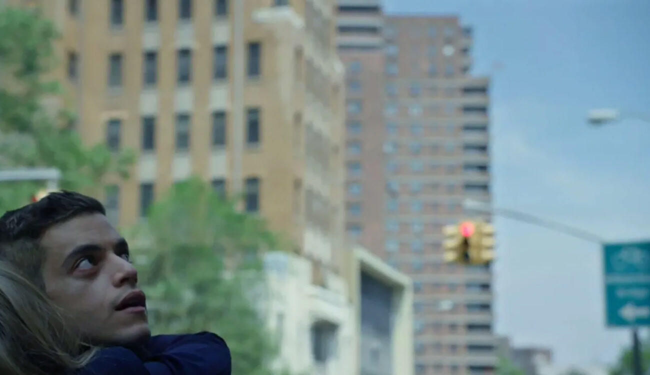
Another effect of leaving too much headroom in the shot is that it makes your character (or multiple characters) appear small and somehow lost in the frame as if something huge and powerful is looming over them. The best example of using this visual tool for a purpose like this is the American series “Mr. Robot”. The protagonist Elliot Alderson, performed by Rami Malek, not only struggles with several psychic disorders and clinical depression but also fights against the evil conglomerate E Corp. And visual tension, indeed, supports his story in every scene.
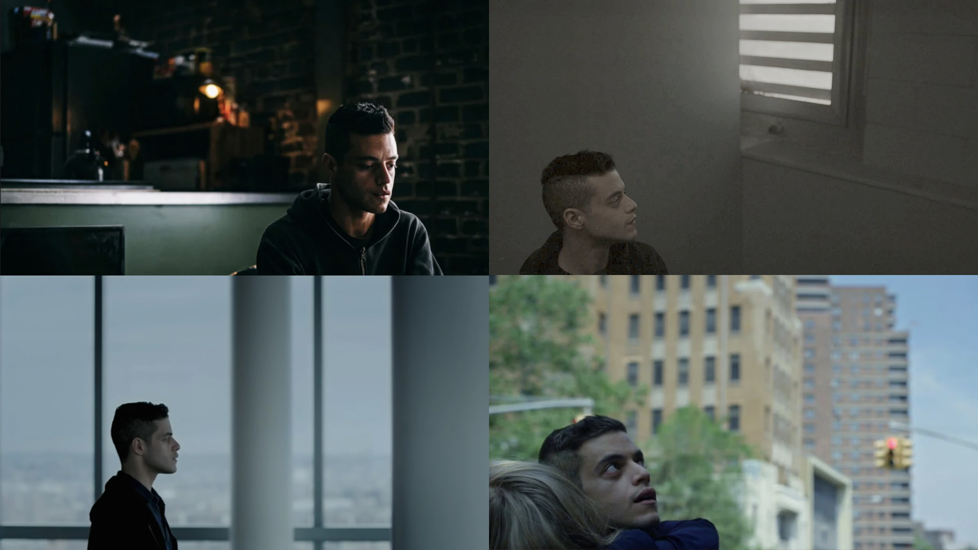
Here, the overwhelming headroom emphasizes the sense of isolation and loneliness the main character is feeling. It’s also a symbol of social oppression, which keeps him – and consequently us – on edge throughout the series. This feeling is also intensified by the elimination of the so-called looking room – a technique where you place your subject on the “wrong” side of the frame without any air for them to breathe. But that’s another story.
Using headroom as a symbolic matter
Wait, and what if extensive headroom could symbolize the endless sky, the power of destiny, or even God looking down on us? Well, why not? It’s another possibility to use and encode the lower quadrant framing of your protagonist. A good example here would be the Oscar-winning Polish indie feature “Ida”. The film follows the story of a young nun, so the generous headroom becomes a metaphor for her faith. Sometimes it’s her blessing, and sometimes a curse, removing her free will and allowing a larger force to make important decisions about her life.

Cutting off the headroom in storytelling
So, we talked about adding too much headroom to the composition. But what happens if, on the contrary, we remove it completely, like in a close-up shot? In this case, the face of the character is so close to the viewer that the moment is extremely intimate and sometimes even uncomfortable to the eye.

In the film still above, Joaquin Phoenix’s Joker from the somewhat controversial movie of the same name forces a smile in front of a mirror. He is a villain, but the filmmakers want us to understand and humanize him, at least to a certain degree. So, showing him that close might be disturbing to some, but others will feel a sudden wave of empathy towards him. Framing your character this way is a very strong visual tool, so be careful and intentional when using it.
Conclusion
Visual subtext is very important, and if you know how to create it, your stories will only get better. Imbalanced composition, and unconventional headroom in particular, may seem like a small and very specific tool in this regard, yet when used correctly, it has a huge impact on the audience.
Let’s turn the tables now! What other exciting film examples come to mind when you think of using headroom in storytelling? How did or would you imply this tool in your video projects to achieve a certain feeling? Tell us all about it in the comment section below.
Feature image: film stills from “Joker” (2019), “Mr. Robot” (2015-2019), and “Ida” (2013).
Full disclosure: MZed is owned by CineD


