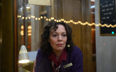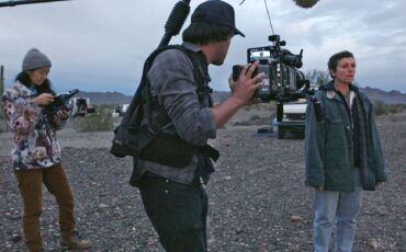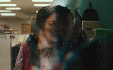
“What aspect ratio will fit here?” When you start a new film or video project, that question would (or should) be among the first you ask in preproduction. Of course, you can always stick with the go-to 16:9 format. However, why not explore alternative options that go beyond the norm? Aspect ratio isn’t just about framing your images and taking advantage of a specific screen size. Over time, filmmakers have started to use aspect ratio as a storytelling tool or to create a specific visual atmosphere. In this article, we’ll take a look at some strong examples of films that utilize these techniques, and talk about ways you can apply them in your own projects.
Let me emphasize that visual components within a frame, such as headroom, leading lines, and even the art of camera movement–do not occur merely by chance. It’s something that requires careful composition and planning to make it work and reveal true craft. The same applies to aspect ratio. You may argue that the video production industry doesn’t often leave us a choice with all the technical delivery requirements and additional snippets for Instagram reels. Well, even in that case, there are a couple of tricks that can be inspirational for your content.
The history of aspect ratio
The Art of Visual Storytelling
Let’s get back to basics. Needless to say, we haven’t always had a variety of aspect ratios to choose from. Do you know how the most common 16:9 (or 1.77, to be more formal) entered the game in the first place? Cinematographer Alex Buono explains the whole format evolution in his MZed-course “Art of Visual Storytelling” with a blend of clarity and an entertaining style.
History takes us all way back to 1892 when George Eastman gave Thomas Edison a roll of 35-millimeter wide film, leading to the creation of a frame that was four perforations tall. The interior image measured 18 by 25mm (equivalent to a 1.33 aspect ratio), and this remained the universal film standard for years. With the advent of sound in 1932, the frame suddenly had to accommodate an optical soundtrack as well, which reduced the inside picture size bringing the aspect ratio to 1.37 (commonly known as the “Academy Ratio”).
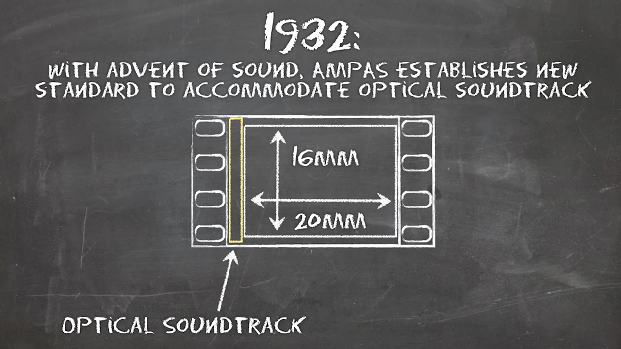
But the famous “box” (1.33, or as we often refer to it–4:3) didn’t die out. When television was invented, it adopted the beloved format and gave it new life. Now, filmmakers were concerned about how to bring people back to movie theatres. So, in 1953, Paramount created a 1.66 widescreen format, starting a new boom in development. The screen got wider and wider, reaching up to absolutely insane aspect ratios, like MGM65 2.76, in which the movie “Ben-Hur” was shot.
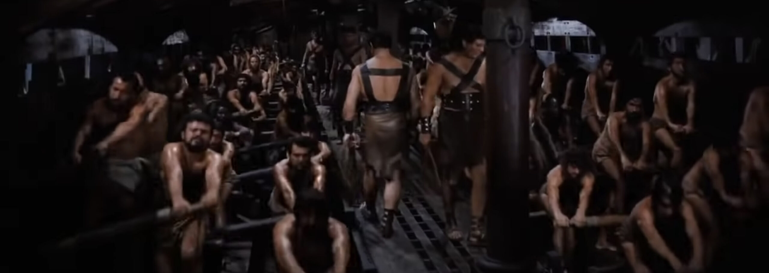
This unmanageable expansion of the screen stabilized with the increasing reliability of anamorphic lenses. Nowadays, we have two scope standards: an anamorphic with a 2.35 aspect ratio, and a “flat” 1.85 widescreen (used for filming with spherical lenses).
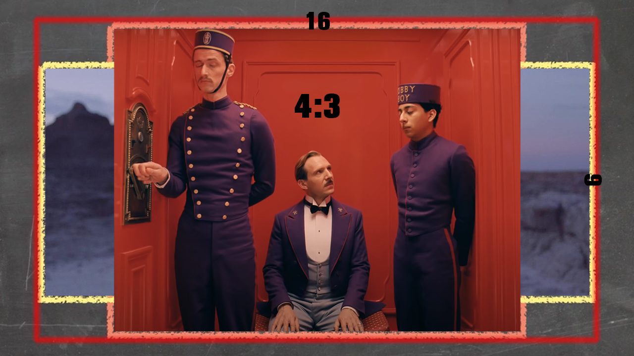
What about 16:9 then? Well, as technology advanced, some engineers opted to create a new format for television. In dealing with the fact that some filmmakers still liked the square frame and others utilized the whole anamorphic scope, the new aspect ratio needed to cater to both choices without distorting the image. So, as you see in the illustration below, they basically drew a frame around the whole thing and called it “high definition”.
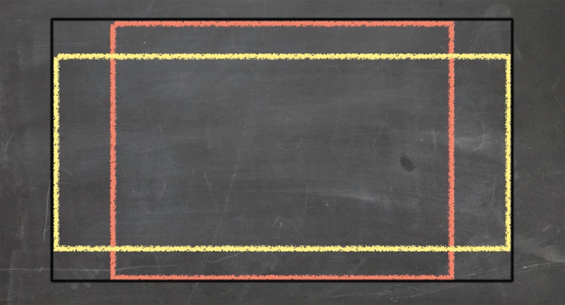
If you’re ever in doubt or want to choose an aspect ratio based on pure logistics, go for 16:9. It won’t let you down as it’s compatible with most standard HD televisions and monitors. However, if you’re up to trying something different, let’s look at several options.
4:3 aspect ratio as a storytelling tool
First, a specific aspect ratio can become a time machine in your film, paying tribute to a particular period or filmmaking phase. Let’s take 4:3. Historically, the box was associated with a television format. Also, some viewers might feel slightly nostalgic looking at this aspect ratio because the earliest movies used it as well. So, if you want to evoke this emotional response, consider 1.33 as your format. You can also play with history as Wes Anderson does in his “The Grand Budapest Hotel”. For example, take a look at the three film stills below. All of these scenes take place in different periods (1932, 1968, and the 1980s), so the director uses various aspect ratios, which were common at each specific time.
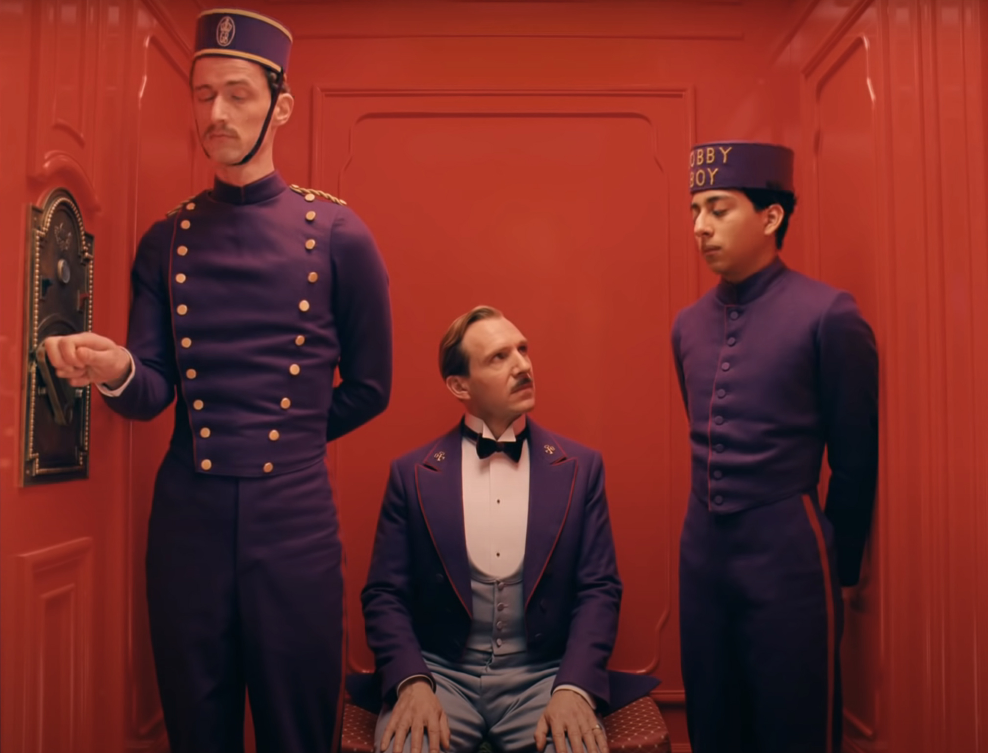
Film stills from “The Grand Budapest Hotel” by Wes Anderson (2014) 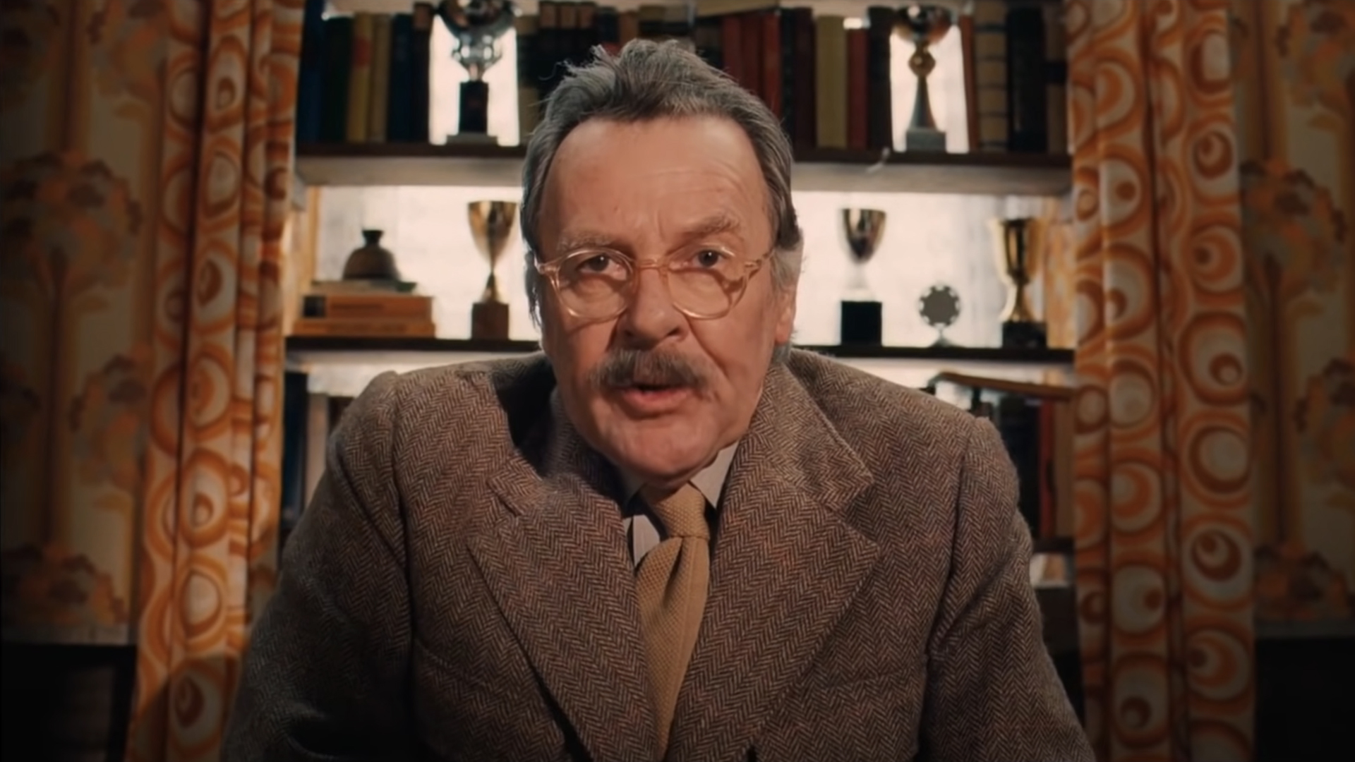
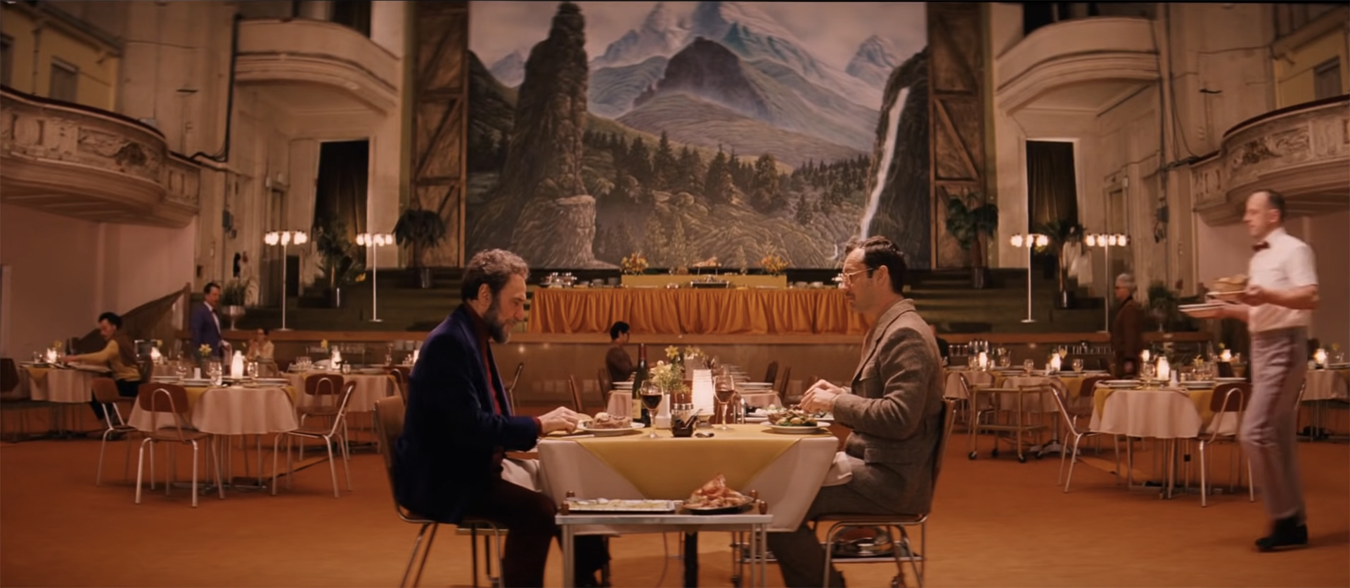
Another reason why a filmmaker might choose an almost square 1.33 aspect ratio lies in the story they want to tell. If your film follows a personal and deeply emotional story, 4:3 might be a wise choice. Why? Because it’s an absolutely gorgeous format to frame faces. When you opt for middle shots or close-ups, the head of your character will fill out a big part of the screen compared to, say, a classic cinemascope with a lot of empty space on the side. It’s only logical, right?
As we know from other film theory lessons, close-ups of faces are a great way to connect viewers to your character emotionally, without words. For example, here are some stills from “American Honey”, a road drama from 2016 shot in 4:3. This film tells the story of a young girl, Star, from a troubled family, who runs away with a traveling sales crew and goes through different challenges of youth and growing up.
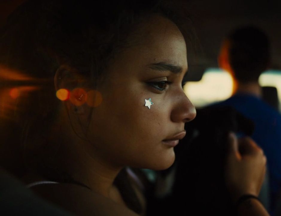
Film stills from “American Honey” by Andrea Arnold (2016) 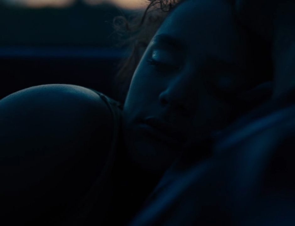
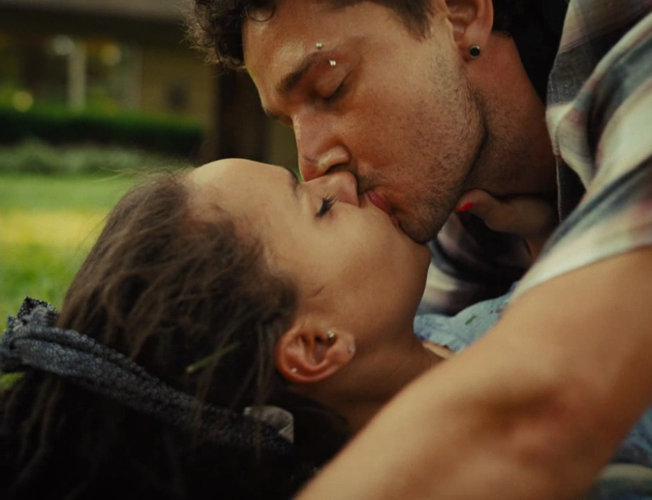
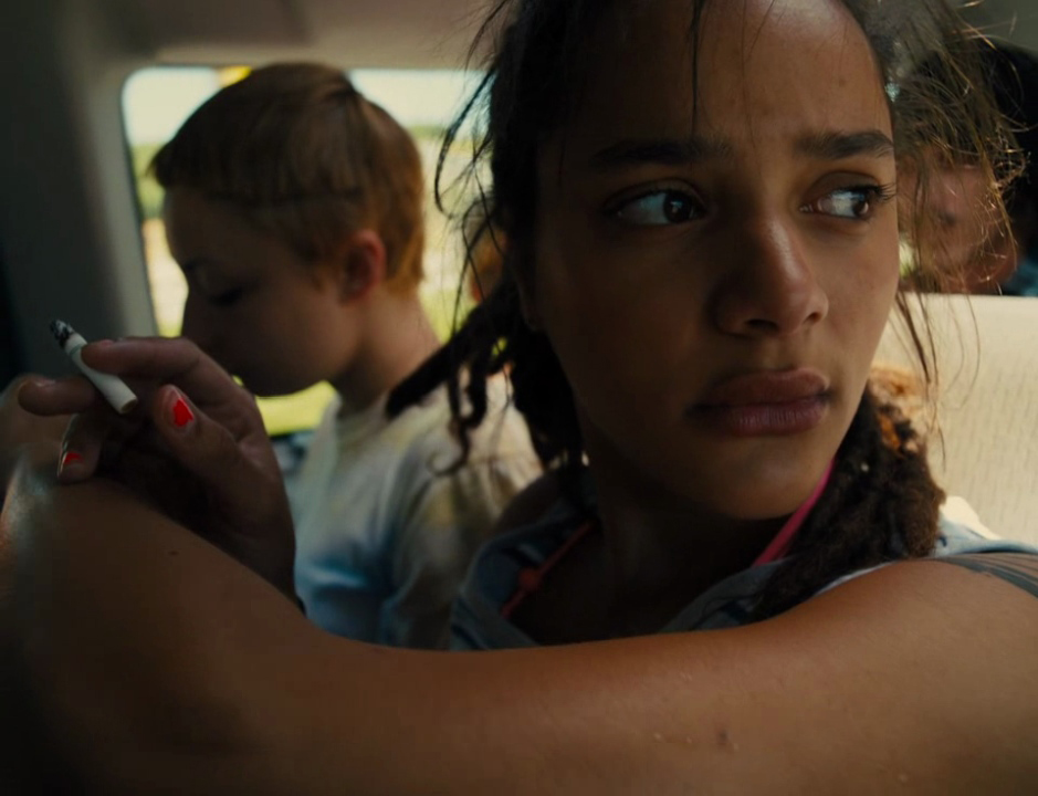
The chosen frame format focuses solely on her face, tapping into her inner world. Everything else here is blended out. We relate to her feelings and concerns. What’s interesting is that some people perceive such an aspect ratio as too tight, even claustrophobic, which is not a contradiction to her story at all.
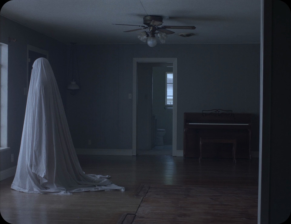
Quite the opposite: it’s another visual effect you may achieve when deciding on a 4:3 format. By boxing your characters in a tight frame, you provoke an uncomfortable feeling of distress. For me, the most powerful example of using this aspect ratio as a storytelling tool is “A Ghost Story”. This is also one of my favorite films, which brings me to tears and an existential crisis whenever I rewatch it.
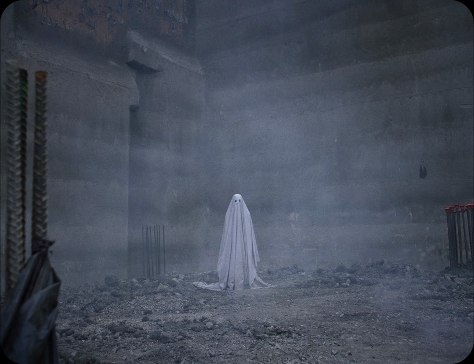
Film stills from “A Ghost Story” by David Lowery (2017) 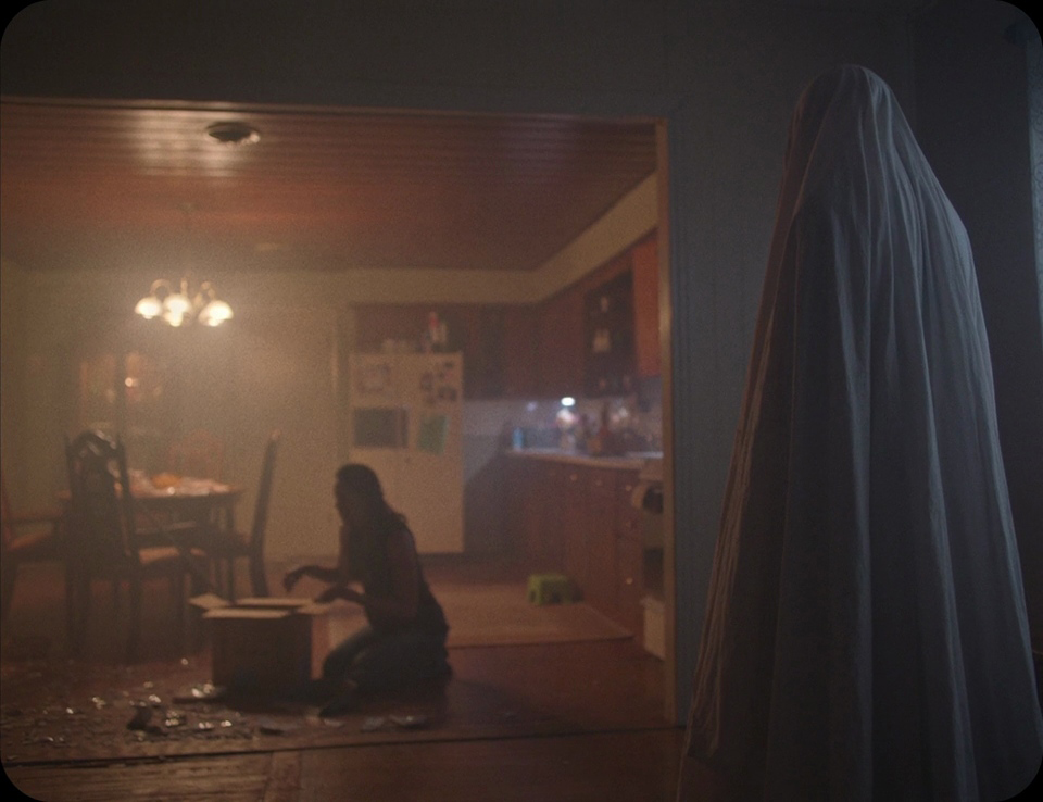
Widescreen for epic landscapes
However, certain stories call for a widescreen presentation, particularly those in which landscapes, nature, and various environments play a significant role in the storyline. They may represent essential symbols, or even be personified as characters within the film. Among such examples are “The Tree of Life”, “Nomadland”, and “Apocalypse Now”, to name a few. All of them were shot in some iteration of widescreen. Trust me, it’s not a coincidence.
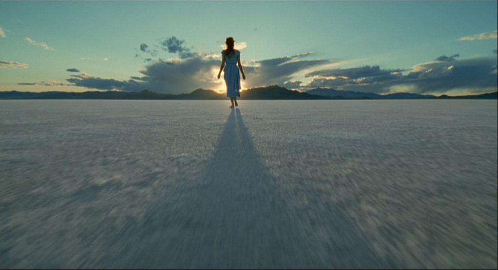
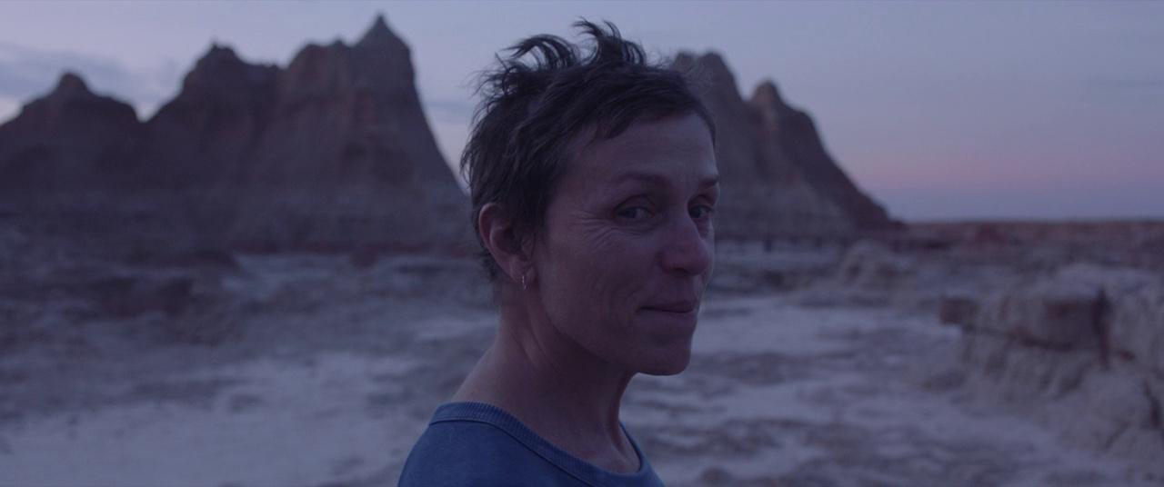
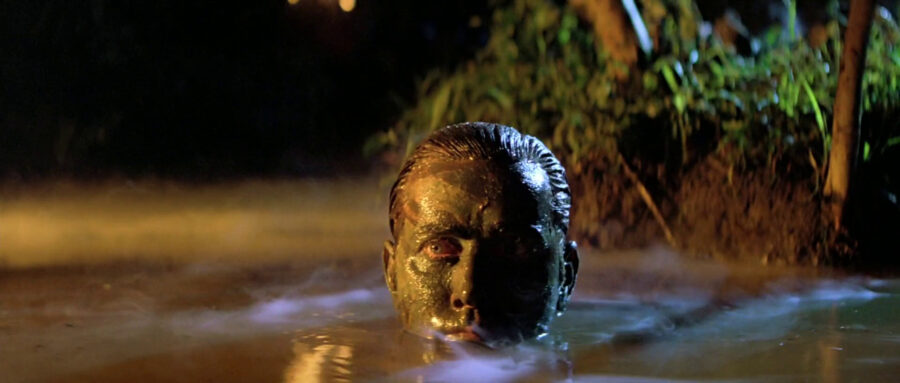
Because of the width of the frame size, these aspect ratios are a perfect choice for wide cinematic landscape shots. This is also the reason why Westerns adopted widescreen formats straightaway, capturing sprawling mountain vista panoramas, and desert landscapes in their full grandeur. “The Good, The Bad, and The Ugly” or “Once Upon a Time in The West” are classic examples of how filmmakers also used screen size for the sake of staging epic fights or chase scenes.
Shifting aspect ratios like Christopher Nolan
We already touched on mixed aspect ratio films in the example of “The Grand Hotel Budapest”, where various formats aided Wes Anderson in leading the audience through different time periods. Yet, you can also shift aspect ratios to create a visceral viewing experience or to clearly divide different narratives from each other. A renowned director, Christopher Nolan, does this in almost all his work.
To give you an idea, think of his most recent feature, “Oppenheimer”. While it was shot entirely on IMAX cameras (Nolan has already become an unofficial ambassador for this format), the biopic constantly jumps between two different aspect ratios: the tall IMAX-friendly 1:43:1, and the wider letterbox 2:20:1.
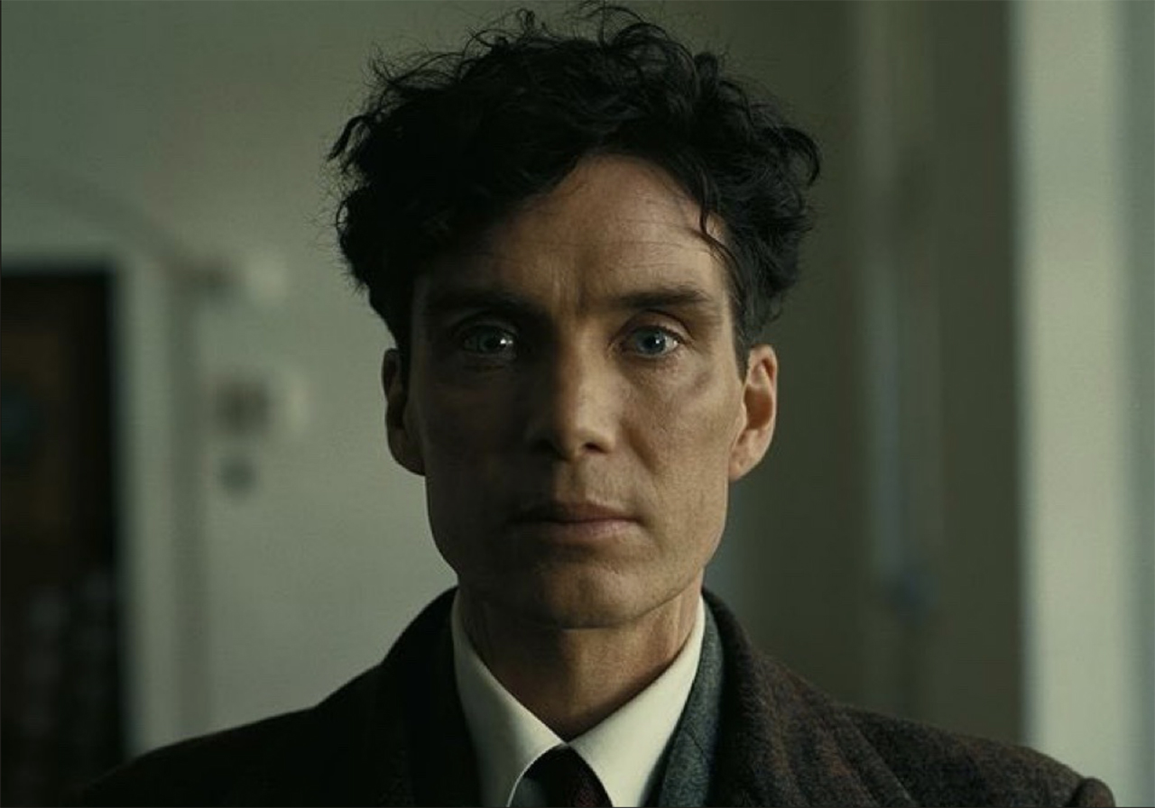
Film stills from “Oppenheimer” by Christopher Nolan (2023) 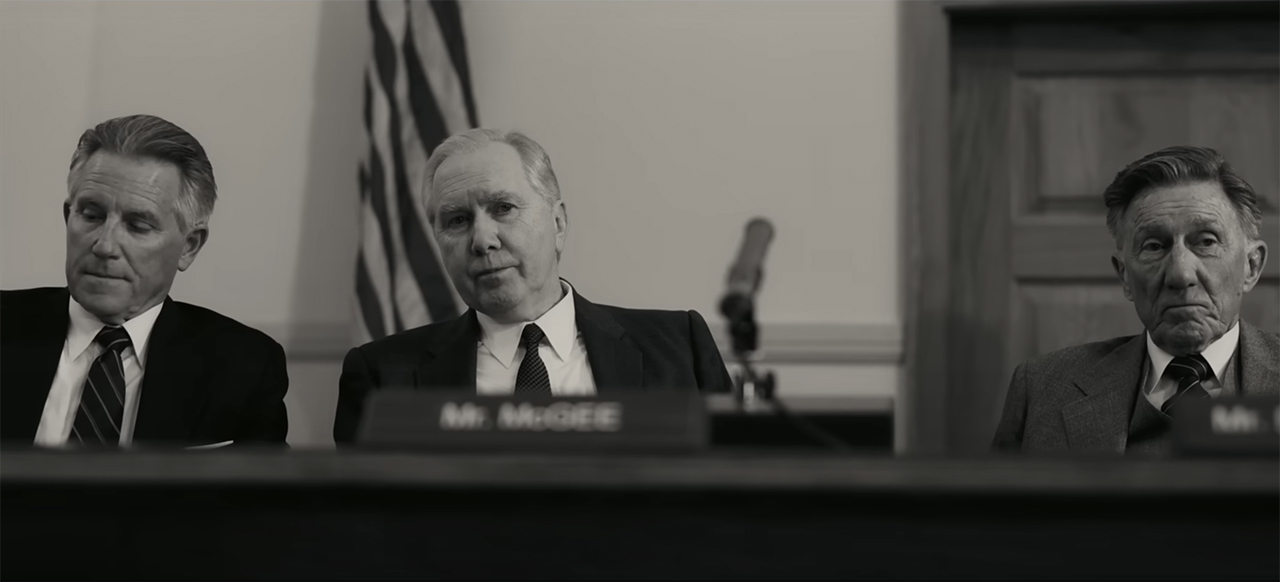
Setting the different color approaches aside, what effect do these two different stills have on you? To me, the IMAX format feels like it’s opening up the world of Oppenheimer and making him a bit more relatable and human. When the widescreen suddenly expands, it’s like peeking through the keyhole of his mindset, and we suddenly understand his inner motives, fears, and guilt for the nasty choices he makes. On the contrary, the 2.20:1 aspect ratio feels like a standard and even an objective point of view, as if the frames show glimpses of real history.
Choosing an unconventional aspect ratio as a storytelling tool
Nowadays, the three formats mentioned above (4:3, 16:9, and scope) are considered standard for film and video production. Yet, as we well know, rules are there to break them. So, if your story needs another, non-conventional aspect ratio, I encourage you to go for it.
My favorite example here is the film “Lighthouse”, a striking psychodrama by Robert Eggers about two lighthouse keepers slowly going mad in isolation. Eggers chose a very unusual aspect ratio for his work: an almost square 1.19:1. He did it not to be noticeable, but also to stay true to the historical era. The chosen frame format created this weird, boxed-in atmosphere, and supported an extreme sense of claustrophobia and isolation. That’s what the characters feel, and that’s what viewers also feel very strongly.
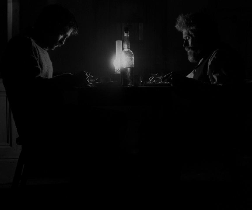
Film stills from “The Lighthouse” by Robert Eggers (2019) 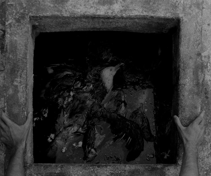
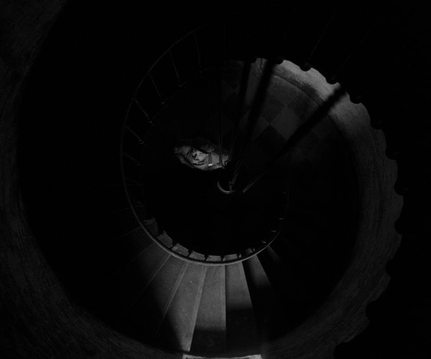
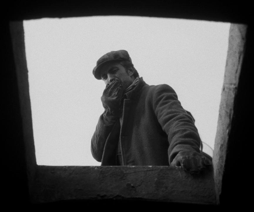
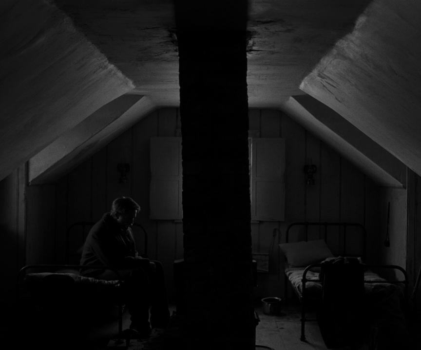
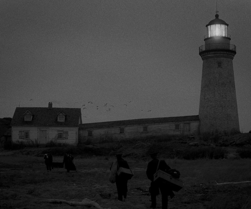
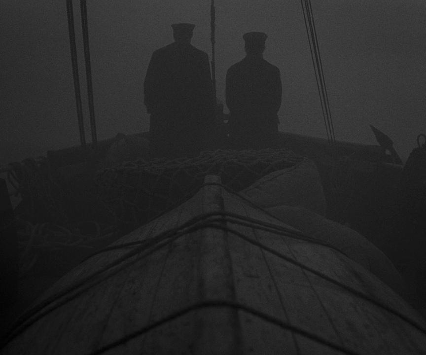
What adds to the intrigue is that this particular aspect ratio decision needed to be made during the very initial stages of conception. Filmmakers constructed each and every building (including the lighthouse, naturally), and piece of set design to perfectly fit into the square format. It was an immense amount of work, but in the end, the result was worth it. In the video below, the film creators explain some of the process behind the scenes:
Breaking the rules
Maybe you can come up with a completely different format, who knows? Alex Buono in his course, for example, asks why we never established 1.61 as a go-to aspect ratio. It is considered a golden ratio in art history, after all, and the most perfect dimension that mankind has come up with. I think it would be an amazing idea to explore if your story revolves around themes of perfection or art.
You can also break the aspect ratio stereotypes altogether and play with viewers’ expectations, as director Ang Lee once did in “Life of Pi”. Do you remember the flying fish crossing the black bars on the bottom of the screen? I do. Maybe it was exactly this creative choice that made it feel surprising and engaging.
A couple of words on 9:16
I want to wrap up with a few words on a vertical aspect ratio of 9:16. We use it very often in the modern world of video, as people watch a large amount of content on their phones without turning them horizontally (Instagram reels, TikTok, you name it).
But even in this case, knowing the aspect ratio from the beginning may bring great results to the table. How? Just watch the short film, “The Stunt Double”, created by the Oscar-winning director Damien Chazelle, an author of such iconic works as “Whiplash”, “La La Land”, and “Babylon”. This is an example of creative thinking, and adapting your story to the vertical screen, taking full advantage of it.
Conclusion
Cinemascope, 16:9, the box, or something completely different – your choice, as long as it supports your story or helps to create a specific atmosphere and impact. Of course, it’s not obligatory to change the aspect ratio every time you make a new movie. Yet, it’s indeed a great tool in your filmmaking kit to keep in mind.
What about you? What aspect ratio do you usually choose for your video projects? Have you already gone for some completely unexpected format? Or maybe used aspect ratio as a storytelling tool? How and why? Please share your thoughts and examples in the comments below.
Feature image source: film stills from “The Grand Budapest Hotel” and “Nomadland”, combined with aspect ratio frames from the MZed course by Alex Buono.
Full disclosure: MZed is owned by CineD


