Let’s not fiddle around: tell me, why do you make films? Of course, there is no general answer to this question. The most common, though, is probably – to tell exciting stories and to engage with your audience in some way. As a filmmaker, I have so many ideas in my head, that want to be heard. Does this relate to you? If so, there’s something that can help your stories become even richer and take their meaning to the next level: visual subtext. Seasoned cinematographer Alex Buono has an amazing lesson about it in his MZed course on visual storytelling. Below, I’d like to share some of his insights, showcases, and tips for practical use of the theory.
We already touched on visual subtext in one of our previous educational posts on the art of imbalance and the impact of headroom in storytelling. This time around, I want to dig a bit deeper and understand, how visual subtext works in films, and also show you some ways of implementing it into your own stories. Don’t worry, Alex Buono will guide us along the way.
We want to know, what a film means. We want our stories to mean something because we want our lives to mean something. We want to know, that we didn’t just waste our time on an hour of mindless television.
Alex Buono, a quote from his course on visual storytelling
Symbol and meaning are the essentials of visual subtext
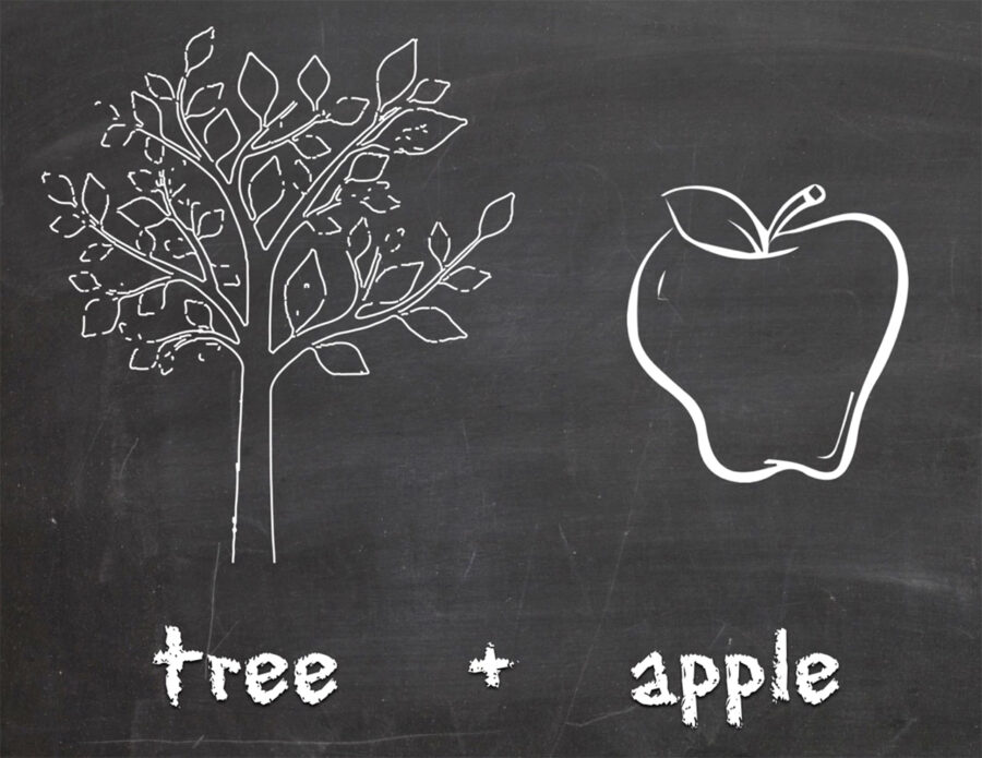
Simply put, the visual subtext consists of symbols, signs, and metaphors, you use to convey a message. Images work both consciously and subconsciously, and we always connect our own meaning to them. Alex Buono explains that phenomenon with a drawing of a tree. When you look at it, you see a simple tree, but your brain may think about other things, like nature, the environment, or even a family tree. Let’s add another picture:
Alex Buono's Visual Storytelling 2
What associations come to mind, when you see this image? Some probably think about Isaac Newton or science. Others may be picturing the story of Adam and Eva. Personally, I was reminded of the saying “The apple does not fall far from the tree“. So, the meaning has changed completely. If we were to add yet another image to this composition, we would observe this effect to its fullest.
Three rules of visual subtext
Have you ever watched a movie that frustrated you so much, that you loudly cried out: “What the hell does it mean?” Well, that’s not the idea of visual subtext. We don’t want to confuse the viewers or create a massive riddle no one can decipher. That’s why Alex Buono recommends following a couple of rules.
The first rule of the visual subtext: It must be organic to your story. Its whole purpose should be serving the script. You can’t just use random symbols and metaphors, because they won’t mean anything.
The second rule is: Undefined is much more powerful, than the defined. Think of Leonardo da Vinci’s “Mona Lisa”. People from all over the world rack their brains for centuries, trying to understand, why she is smiling. If the artist had written the explanation on the back side of his picture, it probably would have lost its appeal very quickly. It’s the mysticism of it, and not knowing the answer – that’s what invites your audience to engage in your film or artwork.
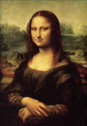
Finally, the third rule of visual subtext, according to Alex Buono, is to think laterally (as opposed to linear). In his lesson, the cinematographer quotes Francis Ford Coppola on that matter:
We’re going to count from 1 to 10, just not in that order.
The question of the artist’s intention
Combine “undefined” and “lateral” and get “universal”. The idea of adding visual subtext to your story is to open it up to more people, not less (as we already mentioned above). However, as you invite all kinds of viewers to connect to your film and seek meaning in it, you should know, that it no longer belongs to you.
Of course, you can leave behind hidden clues, as many creators do. The question of the artist’s intention is older than time. Alex Buono offers to come back to art history for a moment and think of Michelangelo’s most famous painting “The Creation of Adam”. As you may know, the artist was meticulously precise about anatomy. (He would dissect cadavers to understand how the human body is built, after all!) So, the clue that Michelangelo hid in his artwork is the following:
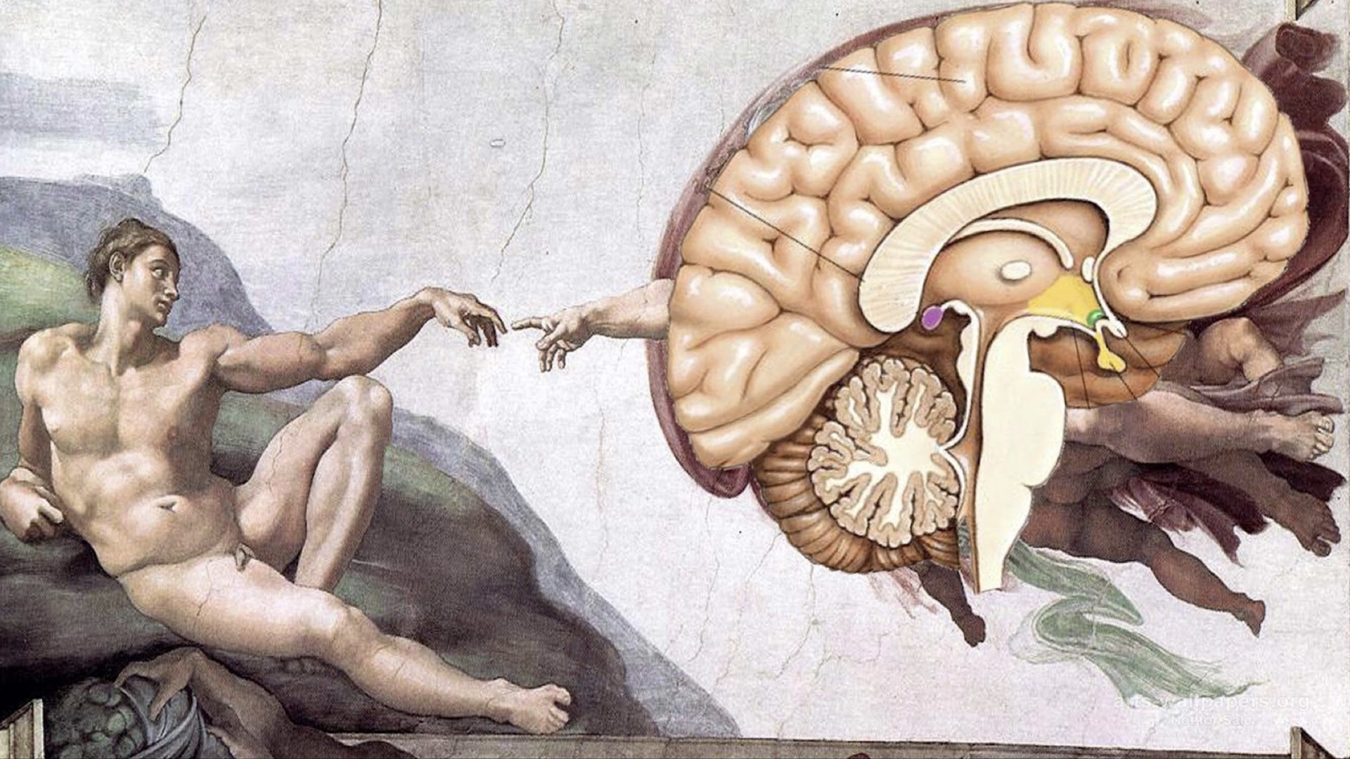
A clear and anatomically correct illustration of the human brain in the place of God. What was Michelangelo trying to say? That the God’s gift to us is intellect? Or maybe, that there is no God because we just made him up in our heads? (Not sure, if they let the painting hang in the Sistine Chapel in that case, though). Two drastically different interpretations, yet there is no right or wrong one.
The learning from this story is to understand that the artist’s intention is quite frankly, irrelevant. As a filmmaker, you also don’t have the chance to watch your film with your audience and whisper in their ear: “Let me explain what I meant here.” As soon as you release the film, it’s no longer for you to say, what it means. And that’s okay! The purpose of art is not to give a defined answer, but to ask questions and to engage.
How to add subtext to your film – learning from the best
It’s a linear progression: the more subtext you give to your audience, the more they engage in your story. So, how do you add it to your film? In his course, Alex Buono starts by showing an amazing example of “The Silence of the Lambs” – an absolute masterpiece in using visual subtext.
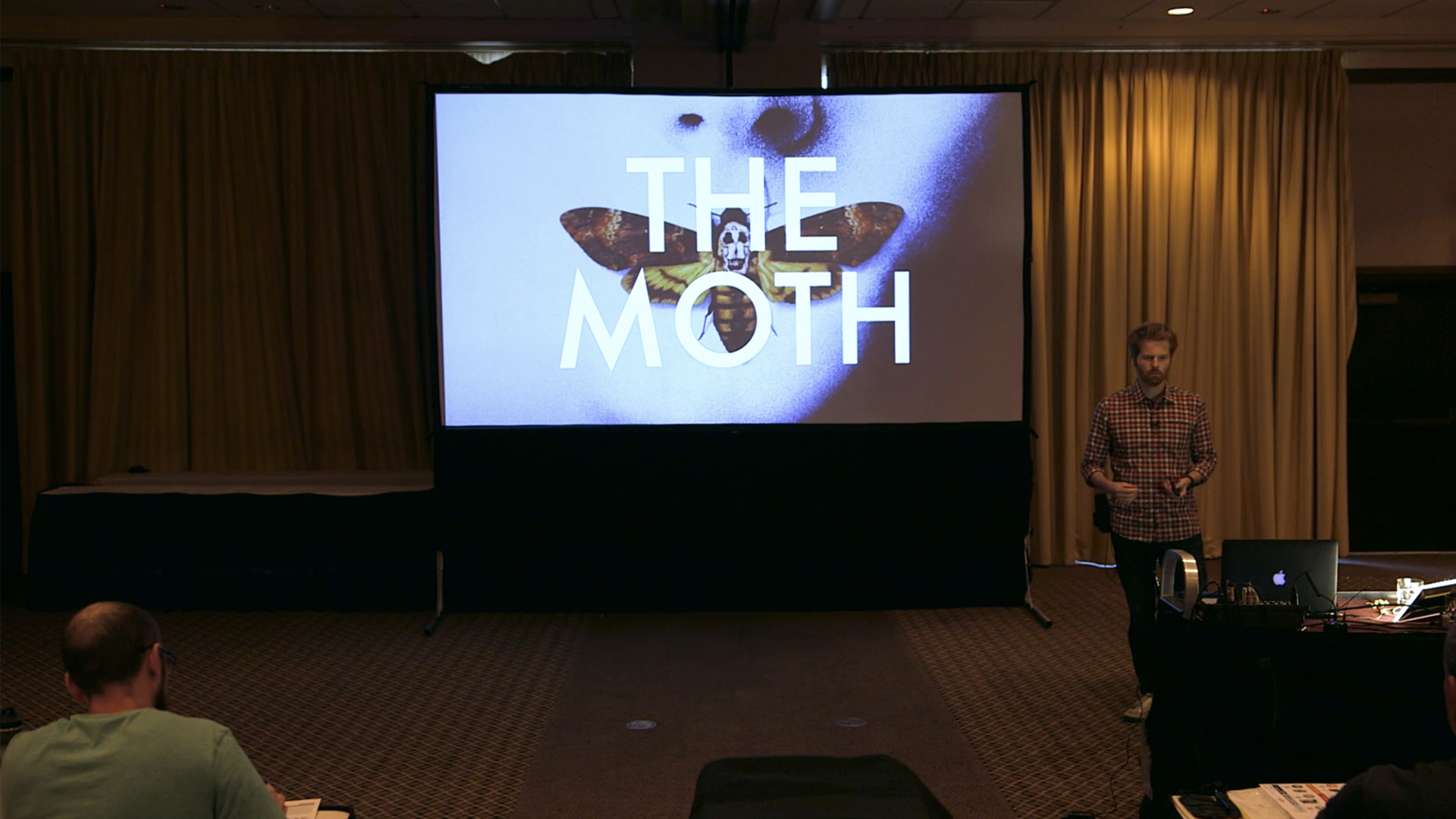
The moth from the film poster is the visual motif that occurs throughout the film. It is a symbol of transformation, that every character seeks. In this movie, Clarice wants to prove herself in a man’s world and become a real agent, Buffalo Bill’s desire is to literally transform into a woman, and Lecter strives to become a higher being, intellectually escaping from his prison.
At the same time, the moth is connected to flying, and you will find this concept in the names of characters (like Clarice Starling, named after a bird), in dialogs (“You fly back to school now little starling. Fly, fly, fly…”), and in visual compositions. Look at the following screenshots. Don’t they resemble the actual moth?
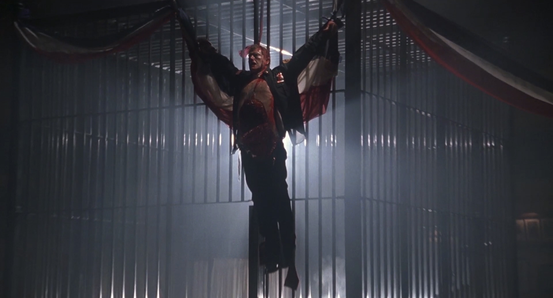
FIlm stills from “The Silence of the Lambs” by Jonathan Demme (1991) 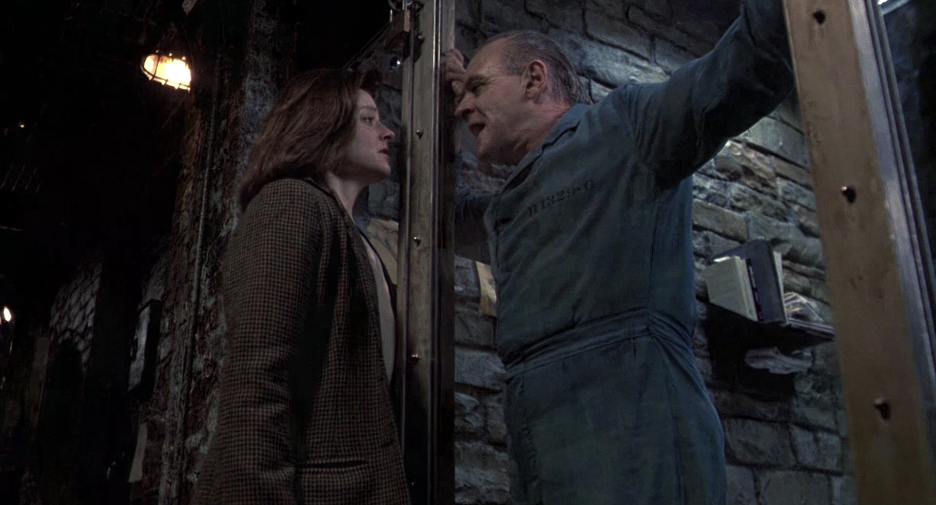
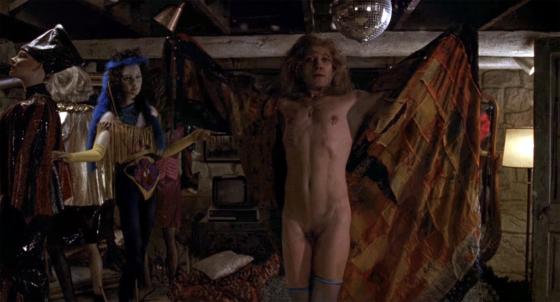
At the end of the film, Buffalo Bill even transforms into an interpretation of a moth – a creature that can see in the dark. However, this is only one of the many film’s themes. If we dig deeper, we can speak about the lamb (a childhood memory of Clarice, that Lecter invades), or the silencing, or even about Dali (zoom in at the poster above and look at what hides inside the moth). Levels and levels of visual subtext. Engaging? A thousand times “yes”.
Different ways to add visual subtext
If you are only at the starting line, it may be difficult to create such a consistent system of symbols in your film. There are several simpler ways to imply visual subtext. These are the areas Alex Buono recommends to begin with:
- Art direction
- Costume design
- Hair design
- Makeup design
- Sound design
- Lighting design
- Camera work
Let’s take makeup design as an example. Remember the Joker from Christopher Nolan’s “The Dark Knight”? This character has been impersonated hundreds of times before this film, yet the director wanted to do things differently. He gained inspiration from the art history:
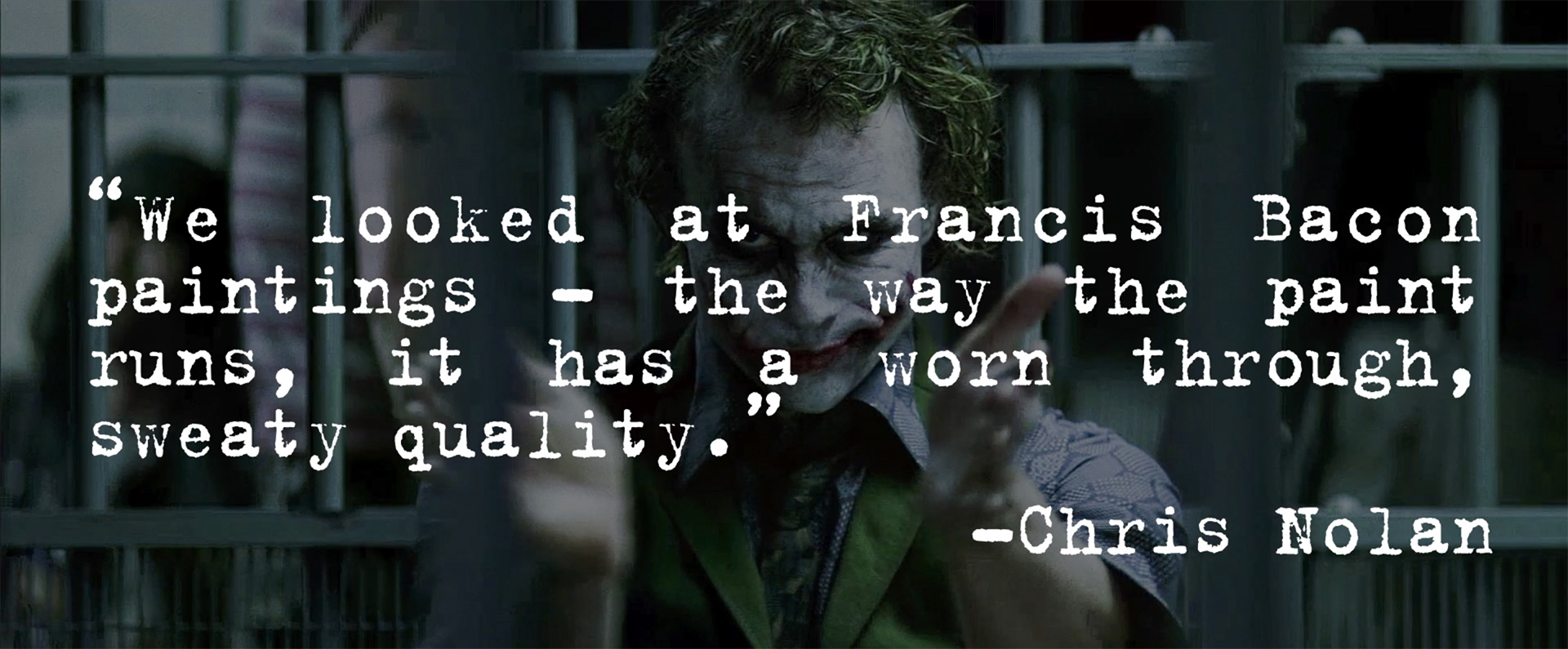
Images source: Alex Buono/MZed 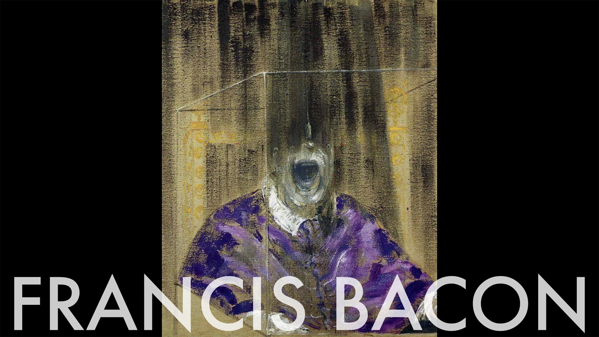
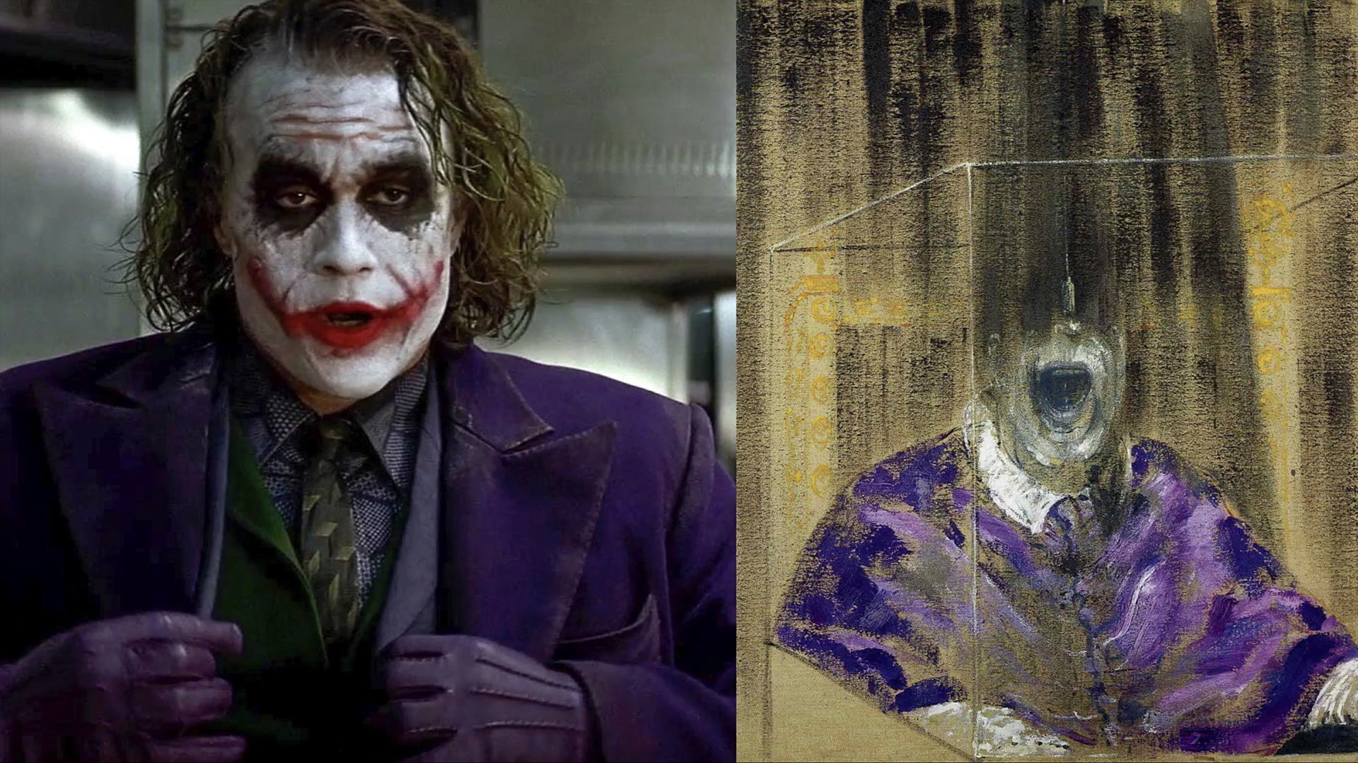
Francis Bacon is an artist famous for his raw, unsettling imagery. He made self-portraits of himself, that show decay in different ways. The makeup of Joker, inspired by this look, may seem a bit too much, too ridiculous, but it’s so organic to his story, that it works very well.
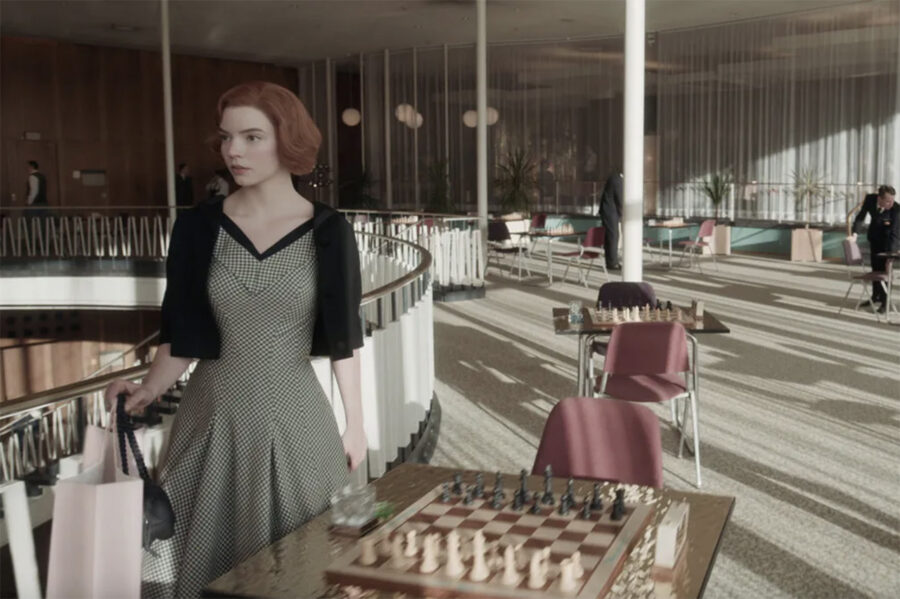
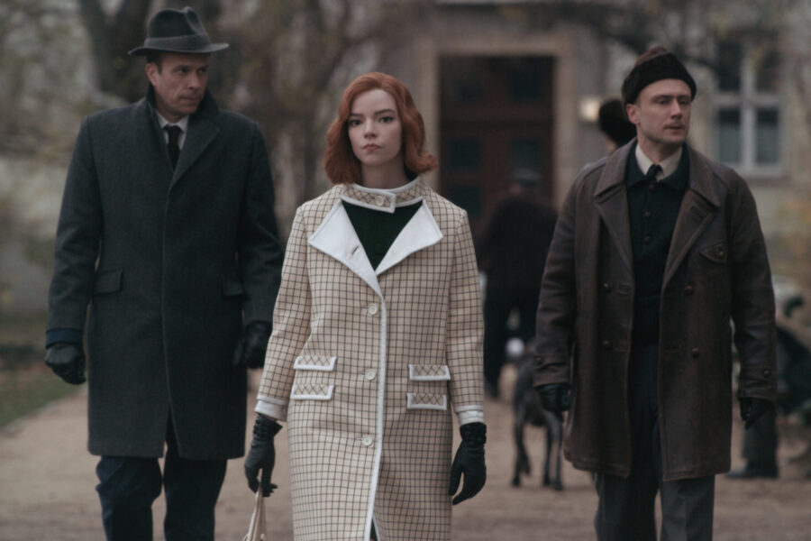
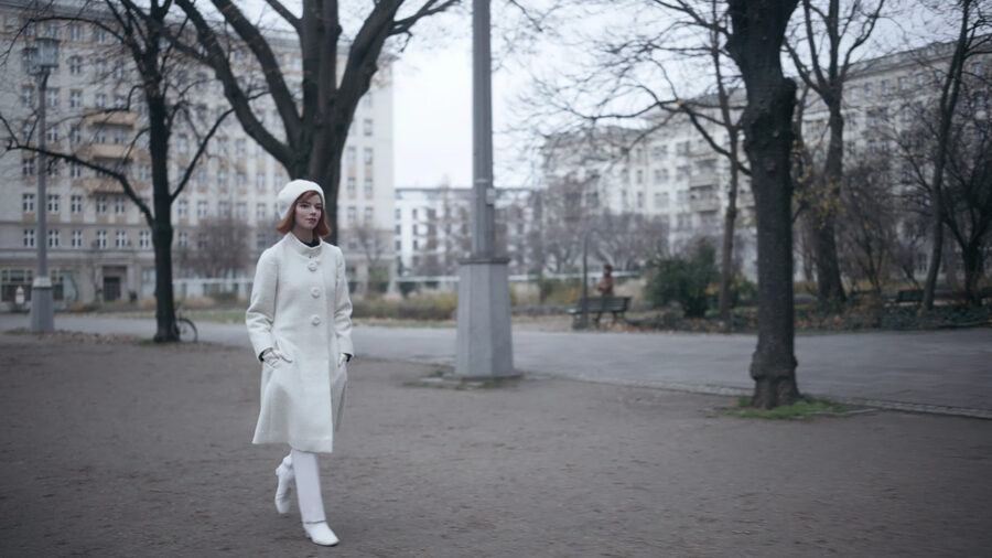
If you start searching for visual subtext in films and series, you will find it in different yet exciting places. Like colors and their meaning in “The Neon Demon” by Nicolas Winding Refn, or fantastic costume designs in Netflix’s show “The Queen’s Gambit”. While an orphan chess prodigy Beth grows up and gains success, her costumes evolve and become richer. At the same time, every one of her outfits echoes the game of chess (in plaid musters, black and white palette, or even resemblance of chess pieces). At the end of the story and on top of her success, she literally looks like a real-life white queen.
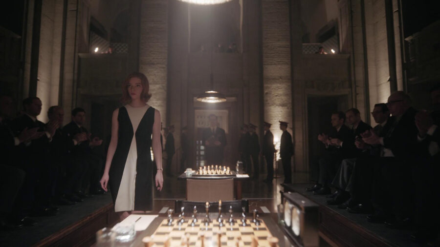
Film stills from the Netflix’s “The Queen’s Gambit” (2020) 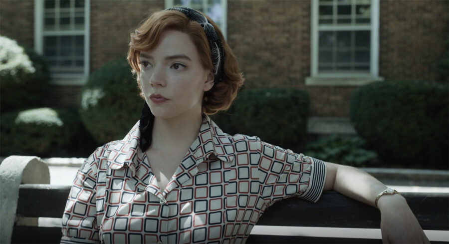
Conclusion
So yes, visual subtext does make your story richer, but only when implied correctly. Remember, where we started? The purpose is not to confuse the viewers, but to engage with them, to give them something to think about, and to connect.
If you want to see more amazing examples of visual subtext use from the film history, head over to “Alex Buono’s Visual Storytelling II” on MZed.com. In this course, you can also find tons of practical tips and tricks in lens selection, interview lighting, color correction, and much more.
What will you get with MZed Pro?
As an MZed Pro member, you also get access to nearly 300 hours of filmmaking education, plus we’re constantly adding more courses (several in production right now).
For just $30/month (billed annually at $349), here’s what you’ll get:
- 54+ courses, over 850+ high-quality lessons, spanning over 500 hours of learning.
- Highly produced courses from educators who have decades of experience and awards, including a Pulitzer Prize and an Academy Award.
- Unlimited access to stream all content during the 12 months.
- Offline download and viewing with the MZed iOS app.
- Discounts to ARRI Academy online courses, exclusively on MZed.
- Most of our courses provide an industry-recognized certificate upon completion.
- Purchasing the courses outright would cost over $9,000.
- Course topics include cinematography, directing, lighting, cameras and lenses, producing, indie filmmaking, writing, editing, color grading, audio, time-lapse, pitch decks, and more.
- 7-day money-back guarantee if you decide it’s not for you.
Join MZed Pro now and start watching today!
Full disclosure: MZed is owned by CineD
What about you? Do you use visual subtext in your works? Which film is your favorite example in this matter, that we should take a look at? Let us know in the comments below!
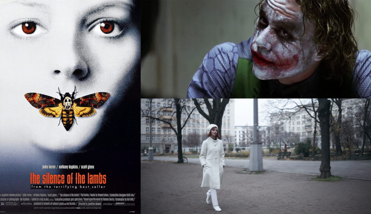
Feature image source: a film poster of “The Silence of the Lambs”, combined with film stills from “The Dark Knight” and “The Queen’s Gambit”.


