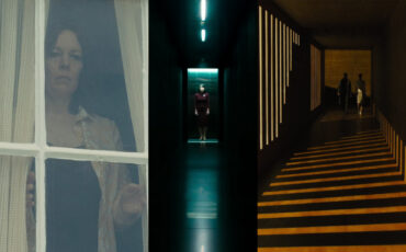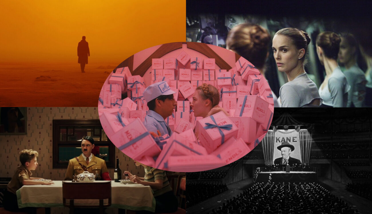
Are you familiar with the phrase, “We need to create more depth in this frame”? I hear it a lot from cinematographers I work with. Most of the time, the reason behind this is to create a visual shot composition that is more interesting. Indeed, conjuring the illusion of three-dimensional space on a flat screen surface is an important filmmaking tool. However, other types of space in film can suit your story even better, if used with intention. Let’s talk about flat, limited, and ambiguous space, and how and when to apply them! And I promise to go much further than only looking at amazing Wes Anderson’s approach.
Deep space versus flat space? We touched on this topic slightly when we discussed the power of focus in film. If you’re unfamiliar with terms like high or shallow depth-of-field, I suggest reading about them first, as we’ll be relying on these concepts in the subsequent exploration of theory. Ready? Then let’s dive deep!
Perspective as an important cue
When we go to the cinema, take our seats in the dark theatre, and let ourselves be sucked into the story, we usually want to experience something different. It’s like abandoning the realm of ordinary life for a couple of hours and immersing ourselves in an unknown world. What supports that impression is when this world feels three-dimensional and real.
If you know art history, you’re surely aware of how the perception of drawings changed with the introduction of perspective. What used to seem weird, suddenly appeared more realistic.
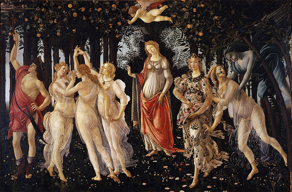
“Primavera“ by Sandro Botticelli, 1470-1480 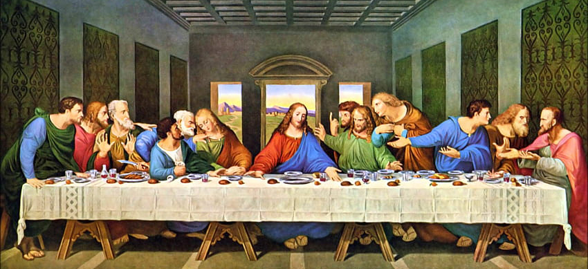
“The Last Supper” by Leonardo Da Vinci, 1495–1498
Film is another medium that mostly takes place on flat screens (not taking into account 3D glasses or virtual reality). Nevertheless, we can make cinematic pictures appear three-dimensional. That’s what deep space within the shot does.
Deep space is the illusion of a three-dimensional world on a two-dimensional screen surface. The audience believes they see depth on a two-dimensional screen because of depth cues.
A quote from the book “The Visual Story” by Bruce Block
That’s right – the so-called depth cues are different instruments that help to trick our brains. Perspective is the most important of them all. Imagine you’re standing in the middle of a railroad track (don’t try it out for safety reasons though). The rails will appear to meet at a vanishing point. In reality, they never do, of course, as they remain parallel, but our eyes perceive the world this way. By introducing perspective, vanishing points, and convergence in your shots, you will automatically add depth to them.
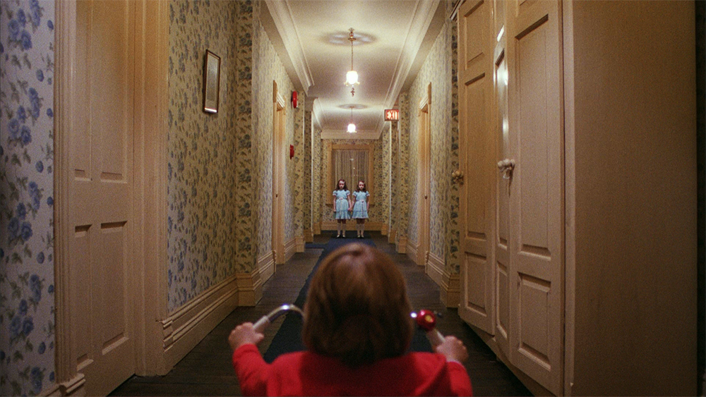
An interesting side-effect is that any vanishing point on the screen will automatically draw the viewer’s attention. In the example above of “The Shining”, it’s the mystical twins who suddenly appear in an endless hallway. Everything in this frame leads our eyes to them, making their presence significant. Should we always place our characters or important subjects on the vanishing points in frames? That depends. Sometimes we may want to play with the audience and hide clues from them instead. (See also “Using Lines in Shot Composition”).
Fundamentals of Directing
Other depth cues
Adding a feeling of perspective is important to create deep space within your frame, but that’s not the only tool. Here are several other depth cues to consider:
- Size difference. When some characters look smaller than others, it appears that they are standing farther away, and vice versa. This rule applies to all kinds of objects in the frame, but only if we know their sizes. Some people call this trick “staging in depth”.
By the way, we can reverse this effect by placing smaller objects closer to the camera and bigger ones further away. Then they will appear to be located on the same plain. You probably know that the makers of “The Lord of the Rings” used this perception phenomenon to film Gandalf and Frodo scenes with both actors on set. Such a beautifully executed practical effect called “forced perspective”! Isn’t it fascinating how our brains can imagine and believe in things?
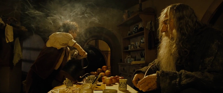
A film still from “The Lord of the Rings: The Fellowship of the Ring” by Peter Jackson, 2001 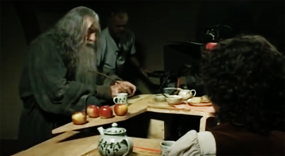
Making of the same scene. Image source: New Line Cinema
- Object movement. To create depth in the frame, let your characters move toward or away from the camera, but avoid any motion parallel to the lens plane.
- Camera movement. There are three camera moves that create an illusory depth. Some filmmakers even call them 3D movements. They include dolly in or out, tracking left or right, and booming up or down. We described all of the above in detail here.
- Tonal and color separation. Usually, the lighter objects appear closer, while the darker ones seem to be farther away. That also works for colors: our eye tends to interpret warm colors (such as red, orange, and yellow) as being closer to us than cool ones (green or blue). So, by placing different tones and colors accordingly, you can support the feeling of depth in the picture.
- Overlap. Naturally, when one object overlaps another, we think it must be closer to us, so the other one has to be in the distance.
- Focus. The perspective cue works only if we actually see what’s in the background. If it is completely blurred out, the shot loses its deep space characteristics and becomes flat – a type of space that we will discuss below.
Why do we use deep space in films more often than not?
The answer to this question is simple. We see the world in three dimensions, so that’s the most familiar way for us. It feels real, so it’s easier to immerse ourselves in this type of illusion.
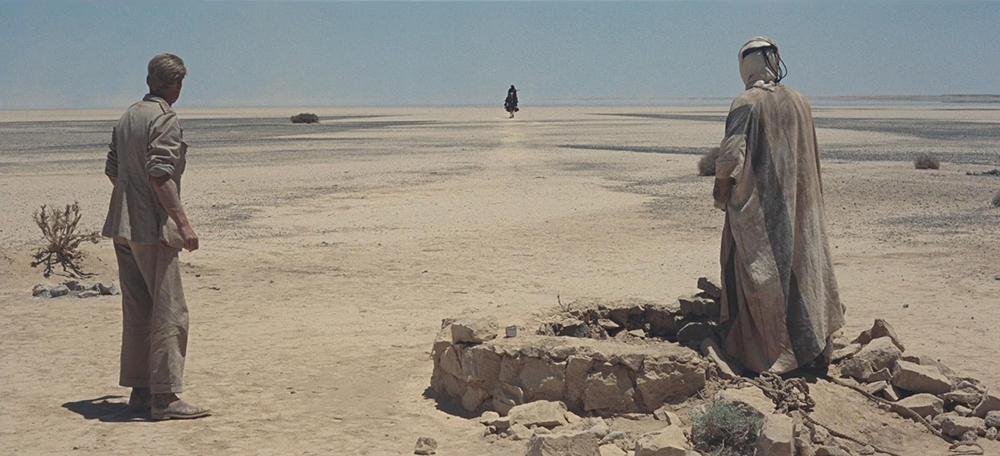
At the same time, deep space may also add to the storytelling. The following example from “Lawrence of Arabia” helps to emphasize the vast, endless landscape and the scale of the action.
Orson Welles also used deep space as one of his signature tools but for different purposes. In “Touch of Evil” – and especially in the opening sequence – it helps to achieve the sense of upcoming danger. And in his other classic feature, “Citizen Kane”, huge depth-of-field shots move us into the dark world of a millionaire protagonist.
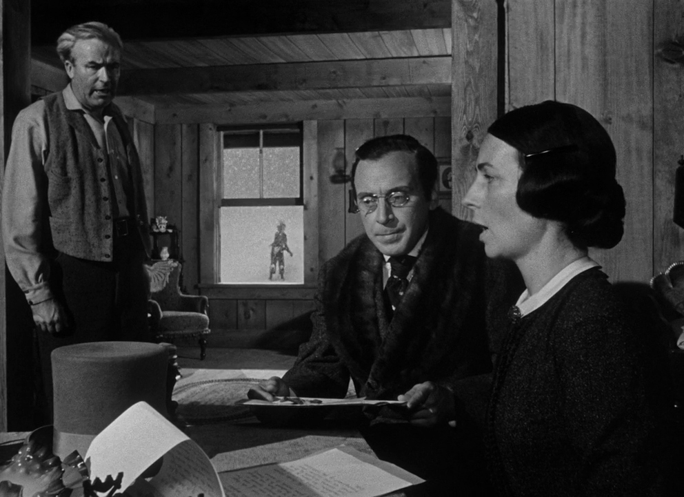
Film stills from “Citizen Kane” by Orson Welles, 1941 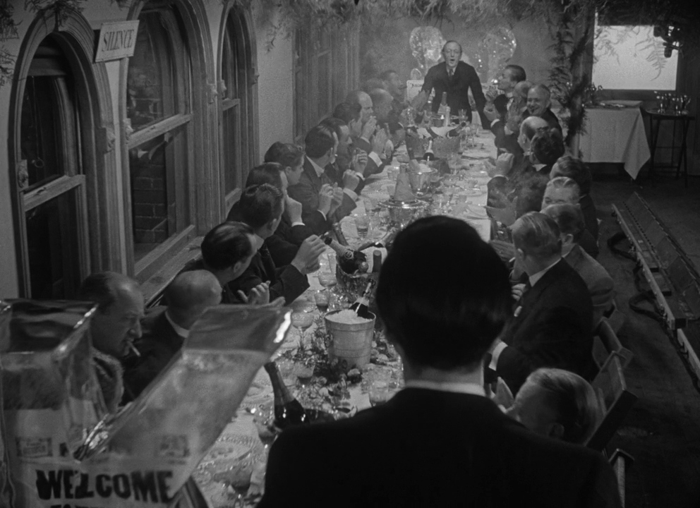
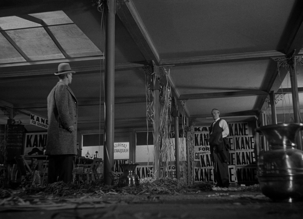
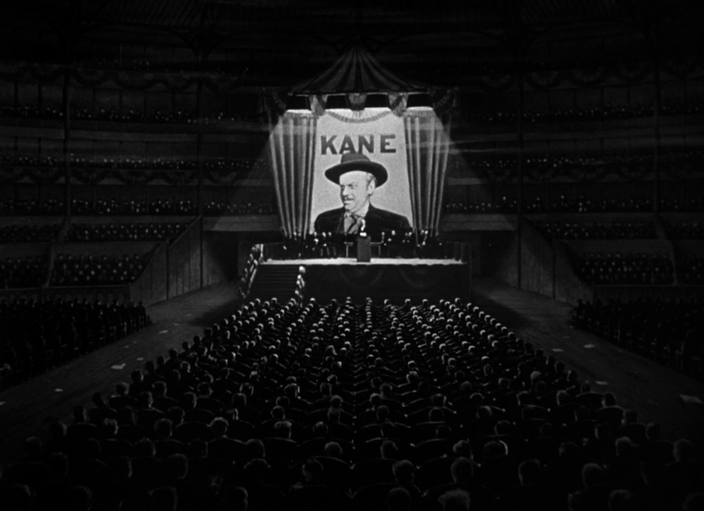
I often hear that deep space is for drama and flat space is for comedy. Well, let’s take a look at why, in my opinion, that’s not true.
Flat space and how to create it
As the name suggests, flat space is the opposite of deep space. Imagine putting your character in front of a brick wall and shooting directly against it. Voilà! Okay, this explanation might be too simplified, but all in all, to achieve flat space in the shot composition, you have to eliminate depth cues. How? For example, by removing the perspective and using frontal planes instead.
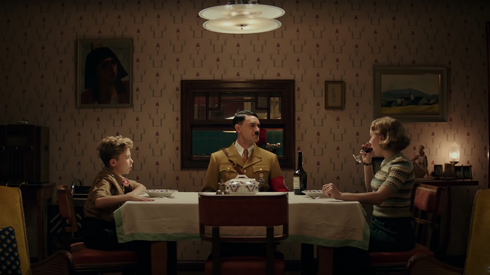
Another way to emphasize the flatness of the screen surface is by employing size constancy. Stage your characters parallel to the picture plane so they stay the same size, like in the “Jojo Rabbit“ still below.
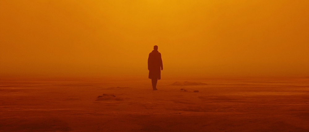
What else? Color separation suggests depth, so let’s try to reduce it to only using the warm or cold range. That’s what Roger Deakins did in some of the “Blade Runner 2049” shots. Compare it to the “Lawrence of Arabia” example above. Seems different, doesn’t it? As if the character of Ryan Gosling got lost somewhere in a 2D picture without a real way out.
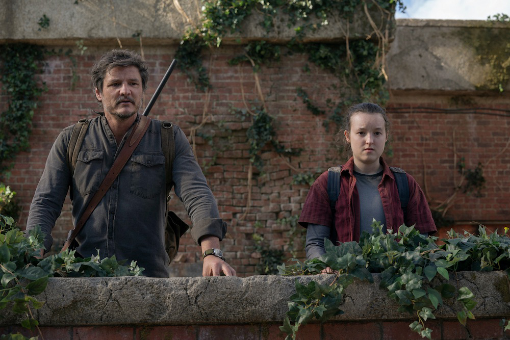
You can also restrict the camera movements to pan, tilt, and zoom; use mainly telephoto lenses; and put the focus on one specific plane to create flat space. Why would you do it? Certainly not only to achieve a comedic effect (and the stills from “Blade Runner” and “The Last of Us” support my opinion).
Dramatic value of flat space in film examples
Before we discuss how flat space may enhance your story, let’s talk about the effect it creates on the viewers in general. Unlike deep space, it feels more unnatural because we seldom encounter it in real life. Additionally, some older generations grew up on 2D cartoons and animations that used flat space, like “The Simpsons”. (Maybe that’s also a reason why the flattened image has a comedy touch to it).
Wes Anderson is tremendously famous for using flat space in his movies, as well as symmetry in shot composition, pans, snap-zooms, and other cues that remind viewers that they are watching an imaginary story unfold before their eyes. Over time, his fantastic, stylized, almost cartoon-like worlds have become his signature. Yet who would argue that within these artificial realms lie deep and touching stories?
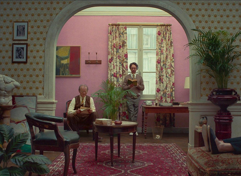
A film still from “The French Dispatch” by Wes Anderson, 2021 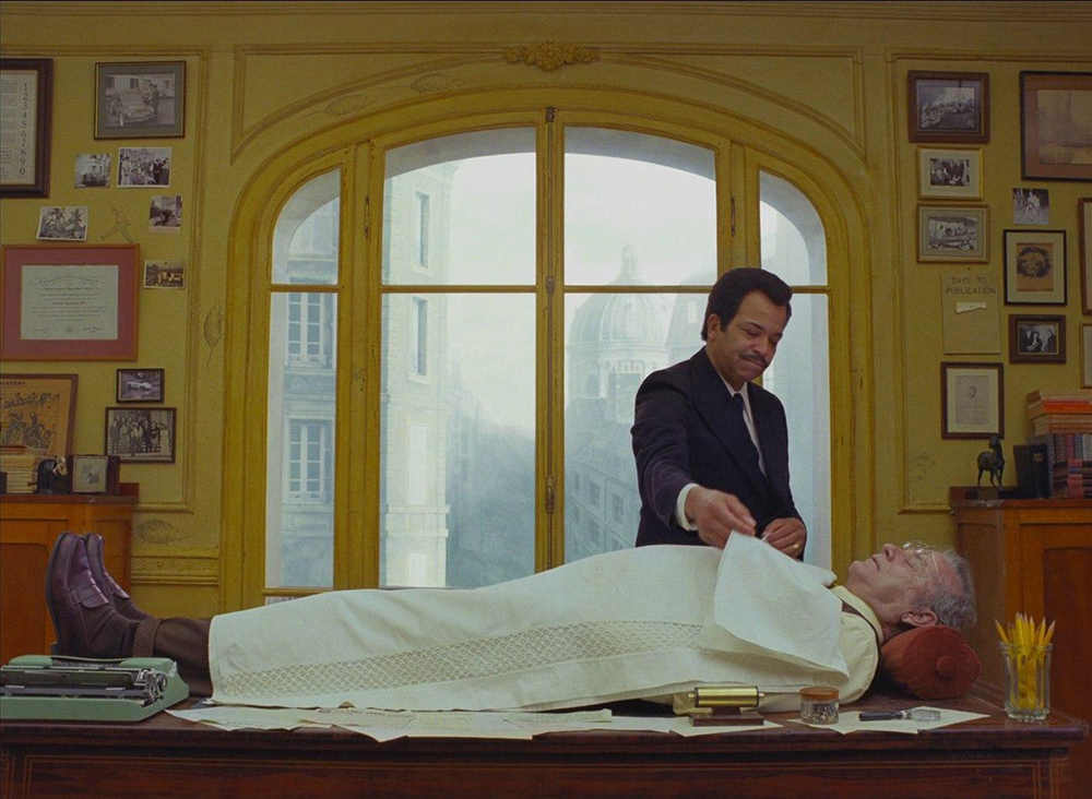
Also a shot from “The French Dispatch” 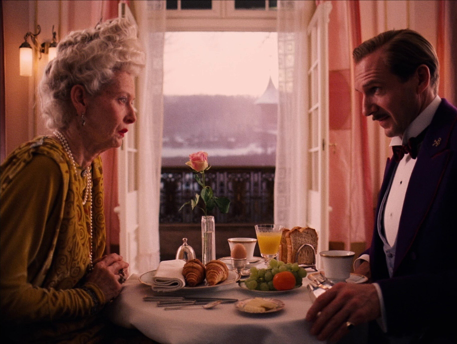
Film stills from “The Grand Budapest Hotel” by Wes Anderson, 2014 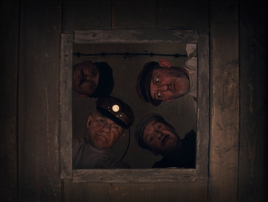
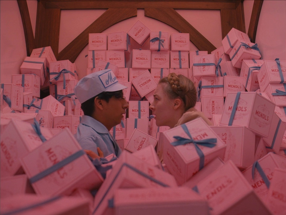
Anderson’s approach touches on formalism, which is a style of filmmaking that reflects the director’s subjective perspective of the world. Conversely, director and producer Alan J. Pakula used consistent flat space in “Klute” for a completely different reason. In a story where nearly everyone is ensnared by a single detective case, this tool amplifies the feelings of claustrophobia and paranoia.
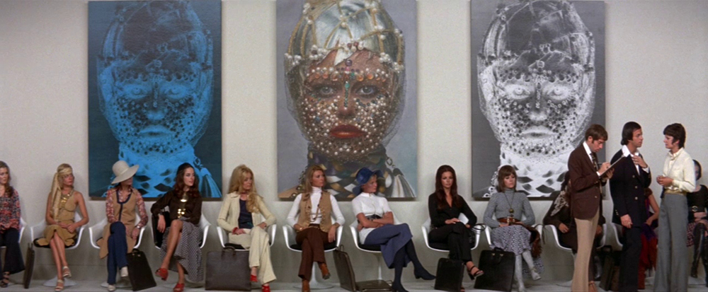
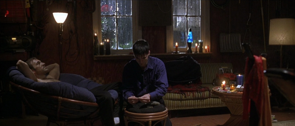
Another case for flat space might be to create a sense of detachment from the characters and their actions. We can witness it in “American Beauty” by Sam Mendes. This film transmits the feeling of unease from the very beginning and tells a story of a self-destructive family through consistently flattened images.
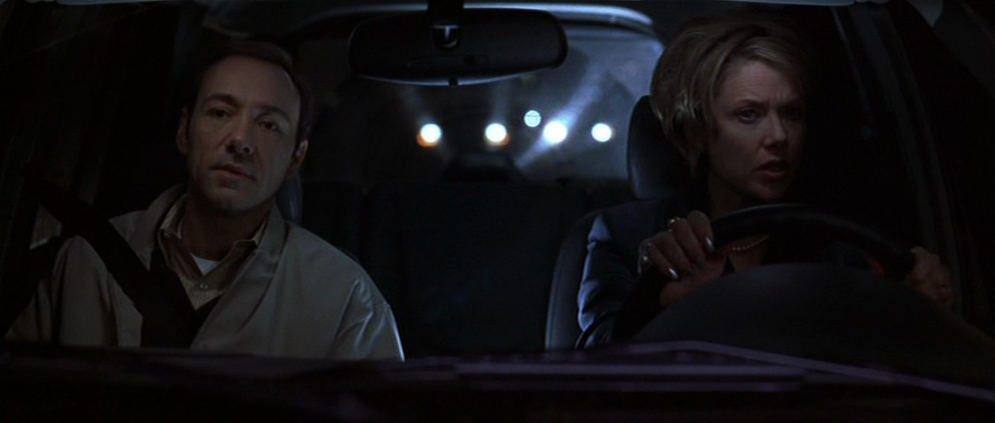
Film stills from “American Beauty” by Sam Mendes, 1999 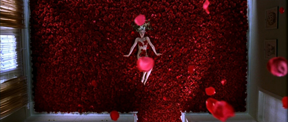
Other types of space in film – limited and ambiguous space
There are two more types of space. Limited space is a combination of deep and flat space cues. You can imagine it as filming several frontal planes that have a physical and visual separation between them. Two characters may be extremely far apart physically, but in a shot, they appear very close to each other. Here are some examples:
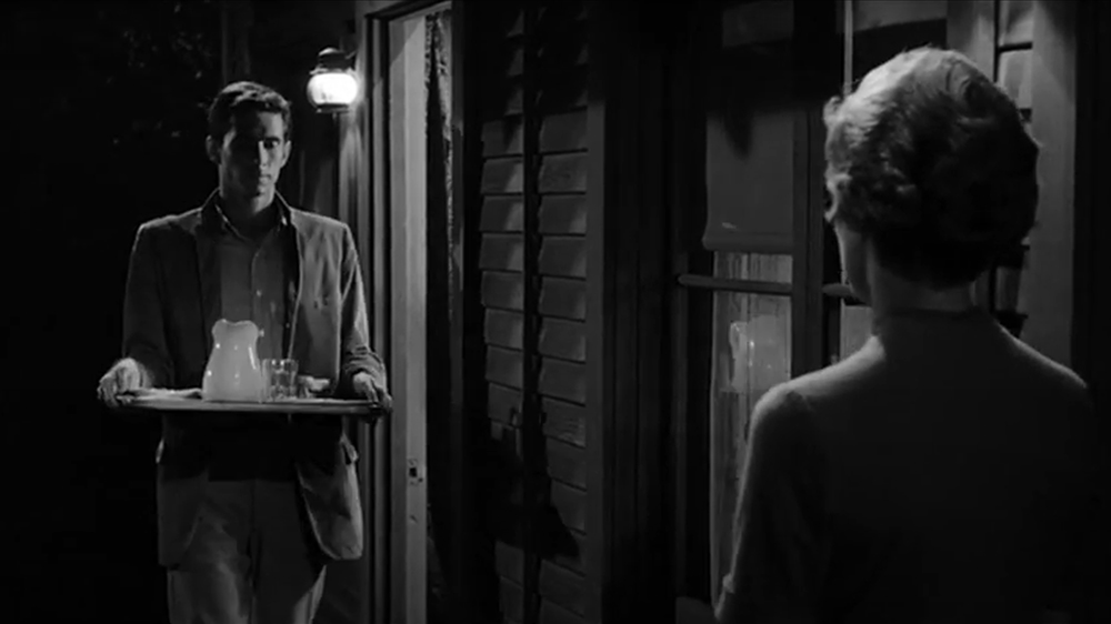
A film still from “Psycho” by Alfred Hitchcock, 1960 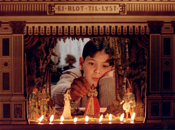
“Fanny and Alexander” by Ingmar Bergman, 1982 
“Drive” by Nicolas Winding Refn, 2011 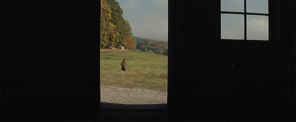
“Inglourious Basterds” by Quentin Tarantino, 2009
Limited space is unusual and quite challenging to achieve. As you see in the examples above, it creates a small enclosed area, which is often connected to the notion of intimacy, isolation, or even danger. Characters feel they are trapped, like the Jews in the opening scene of “Inglorious Basterds”, hiding from the Nazi patrol.
Last but not least, there is ambiguous space. It occurs when the viewer has no chance to understand the actual sizes and special relationships of objects in the frame. We try to find something to hold onto, but we can’t, as we’re completely disorientated. Here are some of the examples of that effect:
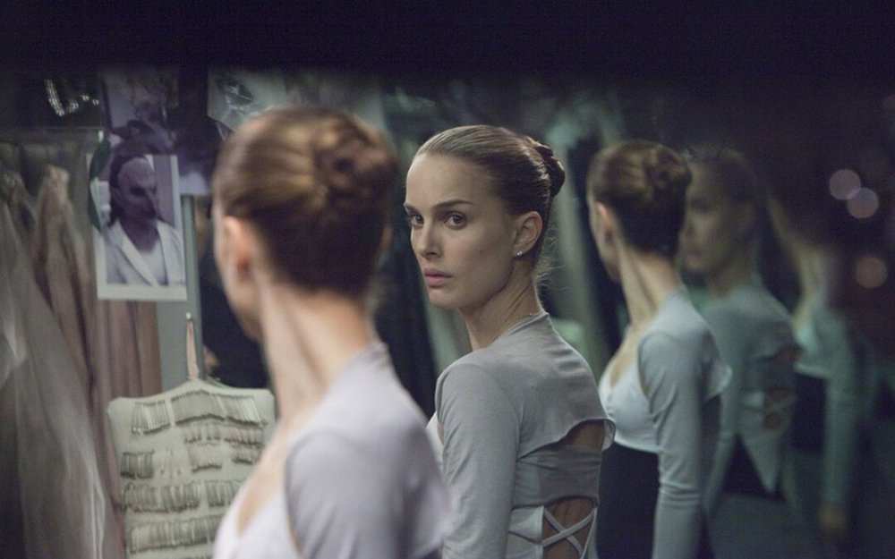
A film still from “Black Swan” by Darren Aronofsky, 2010 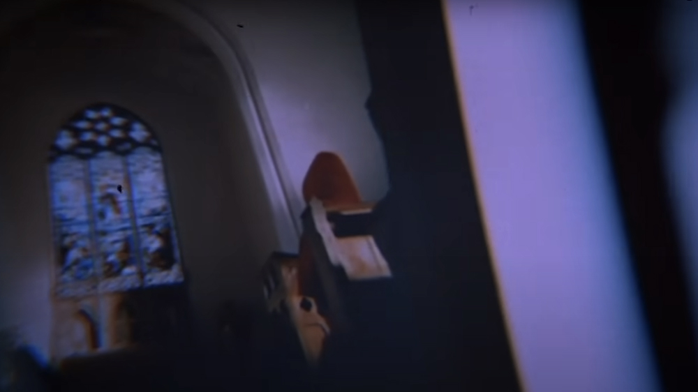
“Don’t Look Now” by Nicolas Roeg, 1973 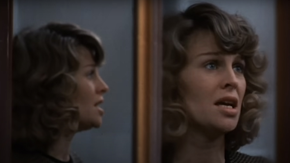
Also a still from “Don’t Look Now” 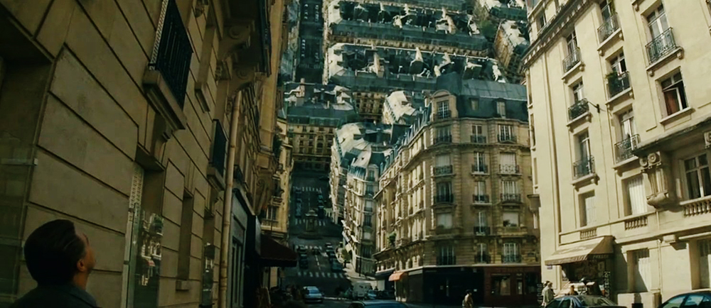
“Inception” by Christopher Nolan, 2010
These shots – and ambiguous space in general – create confusion, tension, and even anxiety. That’s why a lot of horror films use this technique to drive us crazy. At the same time, the application of ambiguous space might hook our interest, especially if something or someone enters the picture, and we suddenly recognize the spatial relationships. It works like a magic trick: I thought I knew what I was seeing, but, wait a minute!
Using space in film as a visual storytelling tool
Knowing how space works differently in film and what effect it has on the audience is a powerful tool for your visual kit. It’s not always about “creating depth” to make a picture “more interesting”. Sometimes, a flat image will be better for your story. The biggest magic, though, lies in understanding how to combine different types of space. Do you know what “shot progression” means? Director Kyle Wilamowski puts together the following definition in his MZed course “Fundamentals of Directing”:
Shot progression is how shot selection thematically progresses over the course of a scene to visually emphasize what’s taking place.
Kyle Wilamowski
We use it to emphasize the story and its development. For instance, we start a scene with a wide shot and get closer and closer to the character during their very personal monologue. Or a camera is locked down on a tripod in the beginning, but gradually it starts to move and is handheld when the situation grows too tense.
The same idea can be applied to the use of space throughout a film. Let’s say you tell a story of someone who seems dull and shallow in the beginning, but as we get to know them, we recognize their inner beauty. How about we start with shots using flat space, and slowly introduce depth cues one after the other? I reckon such a visual journey will create an enormous impact.
What do you think? Have you ever paid attention to which space you use in your cinematic stories? In what other cases would you decide on an ambiguous space, for example? Let’s talk a bit more about it in the comments below!
Full disclosure: MZed is owned by CineD
Additional source: “The Visual Story” by Bruce Block, second edition, 2008.
Feature image: a collage, made out of film stills from “Blade Runner 2049”, “Black Swan”, “Jojo Rabbit”, “Citizen Kane”, and “The Grand Budapest Hotel”.


