Want some tips on how to make your interview lighting look better? Here are some rules on lighting and exposure that will help you out, as well as translate into many other aspects of filmmaking.
There is more than one way to skin a cat, but there are a few rules you should know so you don’t fail and make a complete mess. The same can be said with filmmaking. When it comes to interview lighting, setting up can be fairly easy – anyone and everyone does it nowadays, right? Making them look nice can be easy also; it just takes knowledge and practice.
Here are a few rules that will help you through that practice.
Work From The Broad Side
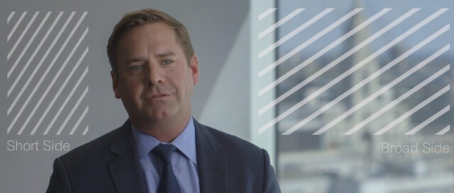
When considering framing for an interview, your image can be broken into two areas – the broad side and the short side. The broad side is where the negative space is. The short side is… the other, shorter side.
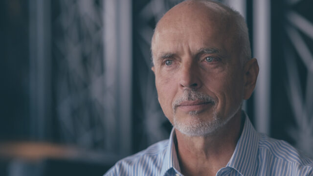
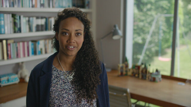
The rule of thumb is you should have your talent looking into the space across the broad side, with your key light also coming from this side. In a two-way conversation interview, placing the broad side for each subject on the opposite side from the other and looking into the space makes for a more natural flow of a scene, as it’s the most natural way in which a normal conversation would play out.
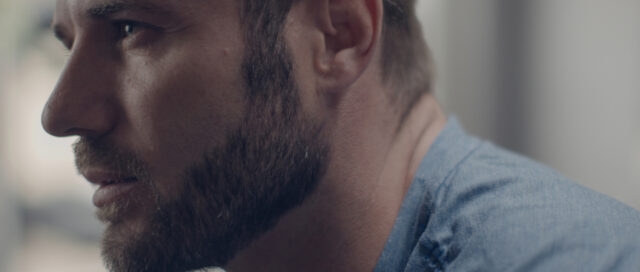
Lighting from the short side can lead to awkward and distracting nose shadows, and coming from the same angle as the camera can often look flat. Conversely, interview lighting from the broad side means you are primarily viewing the fill side of the subjects face – more interesting (more on that later) and more flattering .
Light From Up Stage
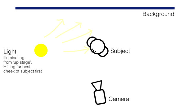
This is almost a continuation of lighting from the broad side, but stands itself as a rule as your framing starts to shift; a rule that is also translated in nearly every other shooting scenario. What is it? Let’s look at the interview lighting diagram below:
Working in a triangle like this means that, just like with rule number one, you’re shooting into the fill side of a subject’s face. This will not only add depth to your subject, but the whole scene. You are creating layers with your lighting, adding interest.
If you were to light the above person downstage, or from the other cheek, you would lose shape and the shot would appear flatter as the light is coming from a similar direction to where the camera is pointing.
Backlight The Sun
The sun is the most powerful light we harness on our tiny world – fact. Trying to compete with it can be challenging.
When considering an interview that involves the sun – usually, but not limited to, exterior setups – using the sun as a backlight by orientating the camera and your talent can help in a few ways.
It’s More Flattering. Ever been outside and looked in the direction of the sun? You’re a human, so I’d hope so. As you know, it’s uncomfortable and you squint. Placing your talent so that the sun backlights them helps prevents this.
It Looks More Interesting. Placing the sun anywhere across the backline of your shooting scene will create interesting shapes to your scene/background. Trees will have shape to them, a light and a dark side.
Backlighting in combination with late or early shooting can give you interesting elongated shadows.
Shoot Into the Shadows
Rule 3 could have had a section on Having More Control, but a separate rule on shooting into the shadows covers that point, as well as other non sun-related scenarios.
Shooting into the shadows as a rule gives you control over your image, which is often most important when you have less budget, and therefore less control over your environment due to the amount of lighting you carry. However, this is a huge time saver that’s relevant for productions of all sizes.
How does it give you control? If your background is one of the darkest areas of your surroundings, it means you have more exposure to play with in terms of lighting more important aspects of your image, like your subject.
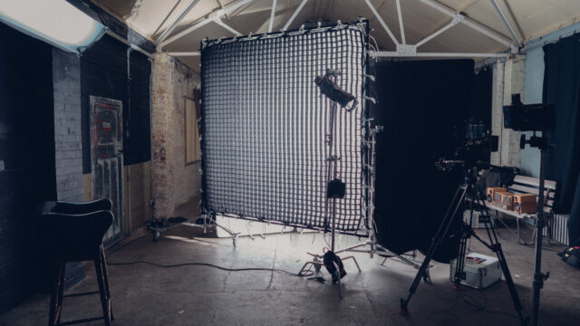
Example: you want to light an interview using natural light coming in through a window, you diffuse it with some grid cloth so the source is softer and more flattering to the subject.
By diffusing the window light you are also decreasing its level, meaning if there was an area in the background getting hit by direct window light, it will be overexposed in comparison to your subject.
Shooting into the shadows in this scenario means picking a darker area of your background, one that is maybe not being hit directly by the window. You can therefore modify the natural key light without worrying about it being less bright than the background.
The same can be said about shooting into the shadows with artificial light – you don’t need it to work as hard in order to get to your desired exposure, so you can therefore use a less powerful source or add diffusion to increase the size of your source without worrying about level loss.
The Bigger The Key, The Better
There are many caveats to this rule, but speaking in terms of how flattering light can be on a subject, the bigger the light in relation to the subject, the better.
A bigger light wraps around your subject, it softens shadows and therefore has a more flattering aesthetic.
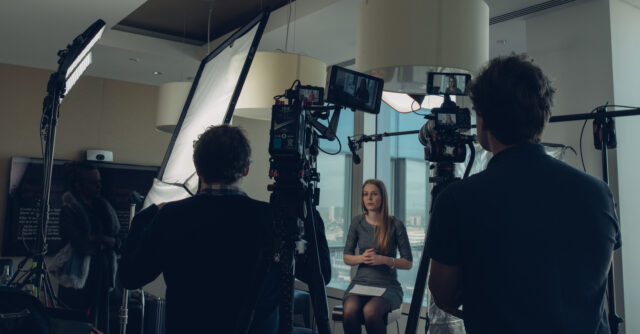
It will flatten the overall contrast, so there is a threshold before things look too flat, but generally a big, well-placed source will look lovely on skin. In practice, this can mean bouncing your small, high-powered LED light off some bounce rather than pointing it straight at your subject, or diffusing through a frame larger than your light fixture.
Knowing how much your grades/techniques of diffusion will reduce you fixture is key here, as every modification will reduce light level.
Expose From The One Aspect You Can’t Control
If you can’t control the light levels of a certain area of your image, this is where you should start with your exposure.
In a perfect world you would have control over all aspects of your image, but in cases where you can’t then you should expose to what you can’t control, and then light your other areas to match.
This could be a large window you can’t cut, or the general ambience levels because you can’t turn on or flag lights. Set your exposure levels so this area looks correct, and then bring in your lights to match this exposure level.
In smaller setups, using knowledge from other rules can help and save time here, for example by shooting into the shadows. If there’s a problematic window in the background that offers nothing to the story, frame it out!
Isolate Areas With Independent Control
Wherever possible, isolate your key, fill and background lights with independent sources. It’s often the case that you’ll be all setup and ready to go, when something changes last minute. The sun may come out from behind the clouds, or the client could suddenly want the the image to be less moody. If you have control of your key, fill and background independently, it means you can change things at the flick of a switch.
Having control is useful beyond being reactive to certain situations. It is also essential in work like greenscreen/colorama – you should completely isolate your subject and background to get optimum keying level, whilst lighting your subject appropriately, as well as flagging off the key light from the background so it doesn’t add level or cast shadows on the background.
Keep Light Levels In the Bank
Having isolated control doesn’t just mean having a dimmable light per aspect of your image. Sometimes your background level is lit with natural ambience, so how could you possibly have isolated control of this? Control is often found in the level of your exposure.
Using flexible fixtures for areas where you can control is the answer here (i.e a perfectly controllable key and fill light). You can then increase or decrease the key and fill, and match camera exposure to get the desired background level.
A tip here is to always expose with a stop more ND (Neutral Density) than you need. Then, if you need more level from the ambience of your background, just remove the ND and reduce your key and fill light by a stop, thus increasing the level of your background by one stop.
Lighting on the edge of all your fixtures and/or camera is problematic. If you have your key and fill lights on 100% and your camera exposed to it’s maximum (within your desired requirements), then you have nowhere to go if you need more level from your ambient background.
Learn Every Rule, Then Break Them
It’s a cliché in filmmaking, but there’s really no better medium where this theory applies best – the rules are there to be broken.
If you want to go for a silhouette scene, shooting into shadows may not apply.
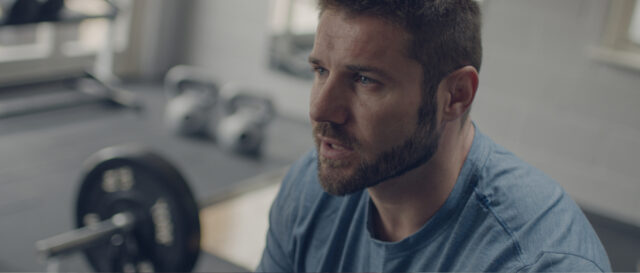
I regularly frame interviews where the subject is looking short side (although I rarely see a short side-lit interview work; that dancing nose shadow is always distracting).
Sometimes you are forced to break the rules. Shooting multi-person interviews such as round-table discussions can be a nightmare for lighting up stage.
For every rule, you can find a hundred examples of where it wasn’t adhered to and things worked out successfully. The key to success is therefore to understand how and why a rule is there, and when it can be broken.
These are just a few interview lighting tips that have directly and indirectly helped me along the way. If you want to chime in and round this number up, please feel free to make your own suggestions for rules and tips in the comments below.
