In this guest post, Canadian cinematographer Matt Bendo shares his experience using mason jars as light modifiers to enhance storytelling in his commercial work.
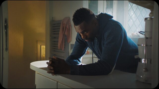
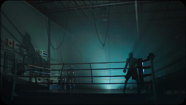
I recently had the pleasure of creating a piece of branded content entitled Legacy for a boxing academy called Kombat Arts (check out the cinema5D Talent Feature describing this experience HERE). My goal was to create a character and story that encompassed all of the philosophies and work ethics that Kombat Arts tries to instil in their students, and where each room represented a visual embodiment of the emotions the character was feeling. After the release of the film, I received a lot of emails and messages asking how I achieved the lighting effects, which prompted me to want to share this with the filmmaking community.
Creating the visual world in which Legacy takes place was an exciting experience. Luckily, I was given a large amount of creative control in this particular production, which allowed me to take risks and streamline the decision-making process to facilitate my vision. So, I decided to experiment.
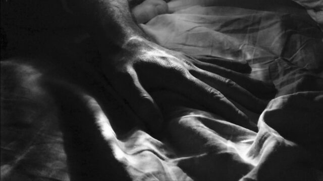
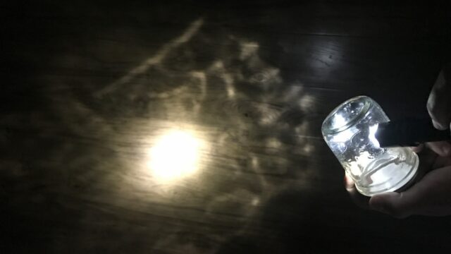
I have always been fascinated with the different ways to manipulate light in order to help tell stories and convey emotions to an audience. I am especially fond of hard lighting, and at first I thought of ways to create textured light patterns using cookies. Then, using my iPhone, I began experimenting by taking photos of my hand while backlighting it with a flashlight shooting through a small mason jar.
Mason Jars as Lighting Modifiers
The peaks and valleys in the design of the mason jar caused the light to scatter in many different directions, focusing in some areas and dispersing in others. I found that this resulted in a pretty interesting texture of light.
As I rotated the jar, the two different layers – corresponding to the closest and furthest sides of the glass to the light – would move at different speeds while weaving in and out of each other. This happened because, as the jar rotated, the closest side would move faster across the light source, whereas the furthest side of the jar would move slower across the beam of light in the opposite direction. In other words, this created a parallax with the shadows and highlights.
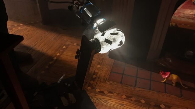
I contacted my gaffer, Samuel Pollock, and we began to chat about mason jars and other things we could potentially use to achieve interesting light textures. We experimented over FaceTime with other glass objects we had around our homes to see what texture of light they would create. We decided to build a small rig that would allow the operator to easily rotate the mason jar while maintaining the capability of finessing its movement.
We did tests beforehand to see which jars worked best with various lights, and found that the closer the jar was to the light, the wider the beam angle was. We also discovered that the technique works well with directional lights like fresnels or pars. For smaller sources, we used smaller jars, but for larger sources, we used larger jars. Also, flagging the light modifier with small pieces of black gaff tape caused a more dramatic occurrence of shadows as the jar rotated. This is by no means a polished product, but it allowed us to easily implement the technique on set.
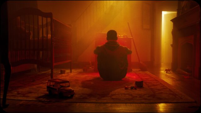
The use of haze added an extra element to the way the jars shaped the light: we now had volumetric rays that had three-dimensional shadows as the jar rotated. Most of the scenes were lit with multiple small sources which without the haze would have seemed too separated. The haze allowed the sources to blend smoothly into the atmosphere and become a cohesive element alongside each other throughout the scene. It also allowed for the light to not only be visible on the subject it was illuminating, but also in the spaces that the light was travelling through as it reached its subject.
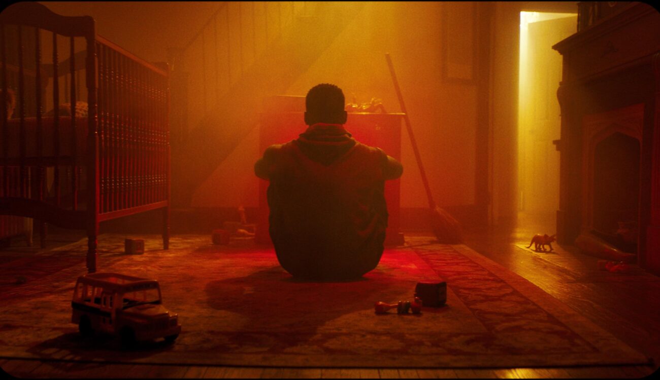
I find that this technique gives the light an organic quality as it pulses and breathes, not only creating interesting technical aspects, but also adding energy of the film. For example, the room in the opening shot of the commercial is a visual embodiment of the passion and determination the boxer possesses, with the pulsating and animating light helping to achieve the fiery and surreal aesthetic – something that I found was very appropriate for the scene. I felt I was able to convey an extra level of visual emotion when I was creating these lighting effects on the background or the character’s face.
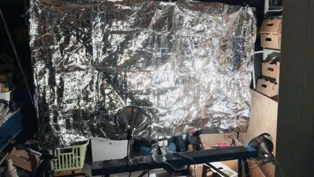
I ended up using this technique throughout the project in almost every scene. Sometimes the rotating mason jar was coupled with other light modifiers. In the opening scene, there was a flicker controller for a LiteMat in front of the TV. Inside of the shed for the chin-up scene, we used spinning mason jars in front of the sources and had them reflect off of a Space Blanket that someone was gently agitating.
In cinematography, there tends to be a great deal of importance regarding the motivation of light sources. I don’t think that this should stop you from creating a light source that has no motivation within the set, as it could allow you to impart a certain emotion or feeling onto the audience.
As a young cinematographer, I am still trying to discover myself as a visual storyteller. I believe it is very important to take risks with your work, as putting yourself in a position where you’re uncomfortable will certainly encourage growth.
Have you found any DIY tips and tricks with lighting of your own to help enhance your storytelling? Share your ideas in the comments section below!
