We talk a lot about visual storytelling and narrative tools in fictional films. Leading lines, creating depth, playing with aspect ratio, specific types of editing… Some of them apply to documentaries as well. Yet, of course, when we capture the events unfolding before our eyes, it’s not always possible to think about framing, let alone stylistic choices. Still, there are plenty of creative techniques that can help to enhance your documentary and add something special to the story you want to tell. Let’s take a look at several examples below!
Over the last decades, documentaries have become much more than plain reportages that document reality with interviews and B-roll footage on top. This one word includes so many parts of the motion picture: educational, observational, portraits and personal stories, wildlife cinema, historical documents – the list can go on and on.
There are no strict conventions on how to make a documentary, except for being truthful to your vision of the world. So, filmmakers choose their own form and style, adding creative elements that help to underline the story or visualize the message. As with every art form, you will find endless possibilities on how to make a documentary narrative stylized. We won’t be able to cover all the creative techniques in one article, but I want to show you some recent examples that I found inspiring. Maybe they will inspire you as well. And if you have other tools to share, please do so in the comments below!
Unusual approach to interviews to enhance your documentary
We all know that conventional documentaries include interviews – be it with experts, with portrayed protagonists, or with people involved in depicted events. However, an interview itself doesn’t have to be filmed conventionally. On the contrary, this is a part of your film that is typically pre-planned, providing you with ample opportunities for stylization. Let’s take as an example the Austrian film “Feminism WTF”, which premiered last year. Here are some of the interview setups from it:
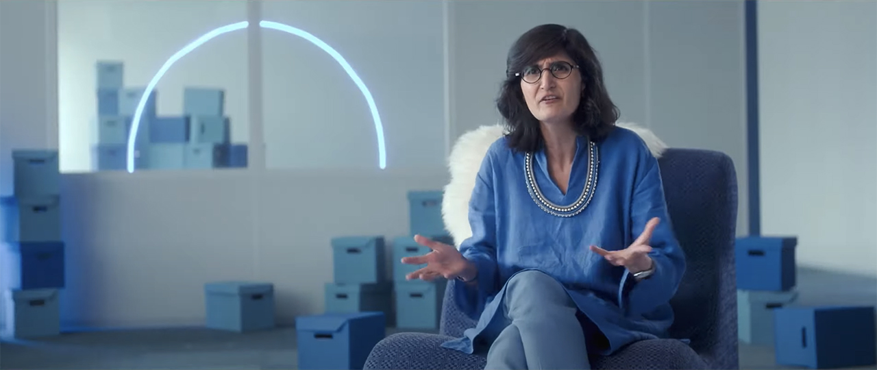
Film stills from “Feminism WTF” by Katharina Mückstein, 2023 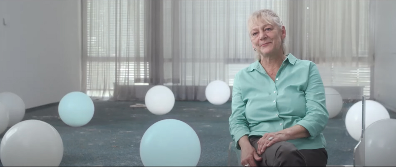
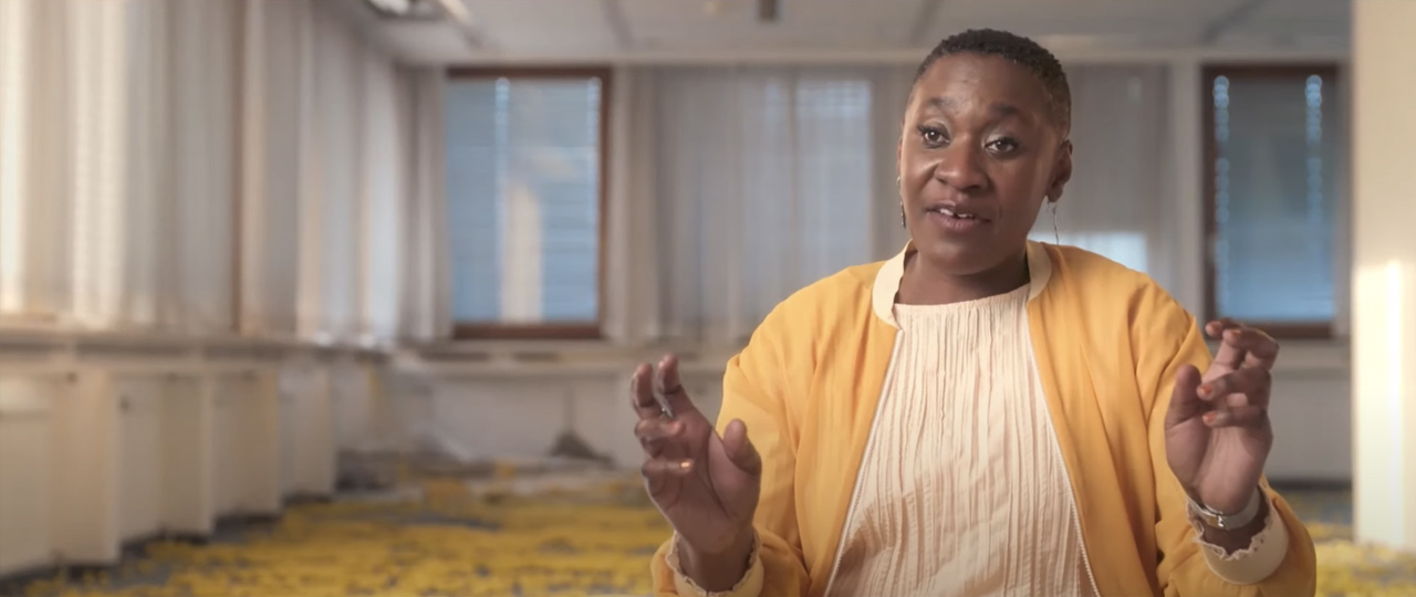
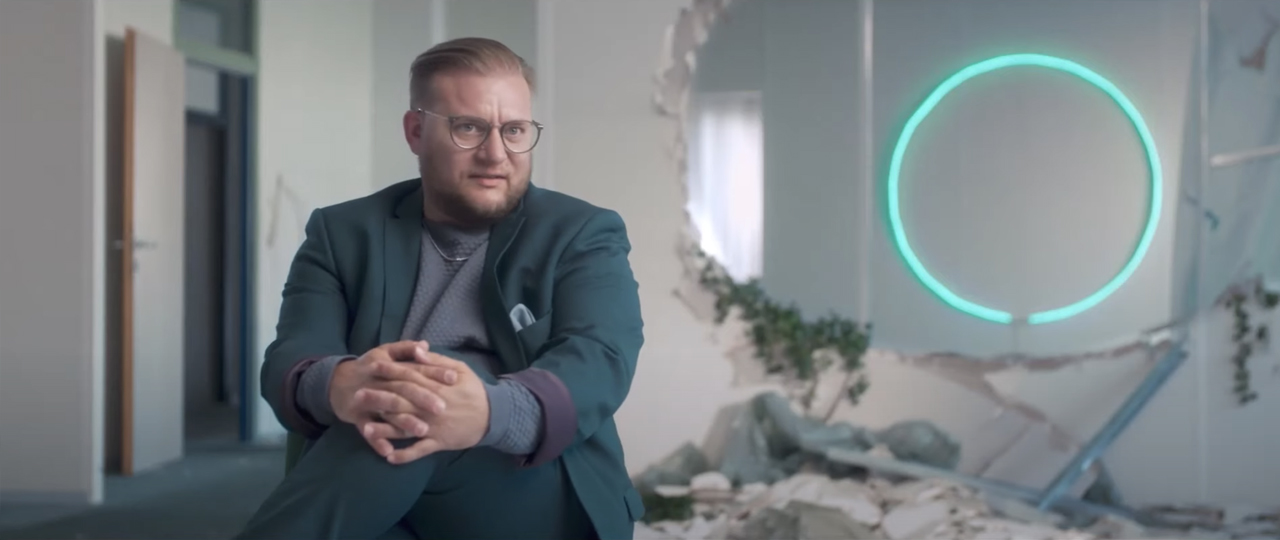
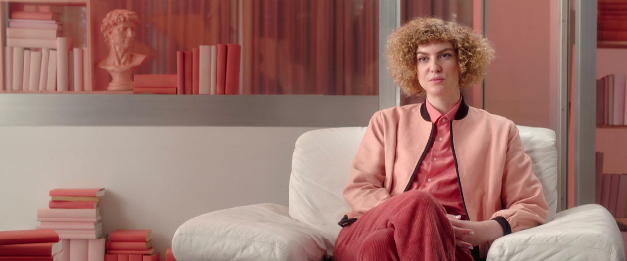
Looks impressive, right? Filmmakers chose an abandoned building for their interviews and dressed each room for each interviewee, using specific colors and objects. Yet, this meticulous set design is not only about flashy style. The documentary researches the topics of feminism in the 2020s, social stereotypes, modern challenges, gender equality, and different attitudes toward it. Choosing vivid and unusual setups for interviews provides viewers with some context on an unconscious level, and reflects the messages from testimonies. Isn’t this what thinking outside the box means?
What about framing?
Another idea to stylize a documentary interview could be by playing with frame composition. Here you can use all the possible visual storytelling tools we talked about. Remember though, that when you pick a specific shot size or decide on a particular depth of field, it affects the viewer’s perception in some way. For instance, in the Oscar-winning documentary “Navalny”, cinematographer Niki Waltl, AAC went for four different angles in the interview with the protagonist. Each of them created a different feeling.
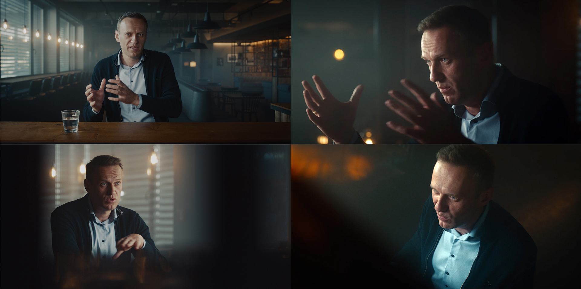
The main camera depicted Navalny talking directly into the lens. Breaking the fourth wall is not the most obvious choice for documentaries, but here it puts the viewer in the position of a listening bartender, which feels more intimate. One of the other angles is shot through a mirror – rather contradictory, isn’t it? At the same time, we also get a “regular” close-up, and a curious perspective from slightly above the interviewee, as if someone is always observing him. All these choices are not random, of course, as you can read in our interview with Niki Waltl here.
Recreating events for better visualization
You might have watched the Netflix comedy series “How to Sell Drugs Online (Fast)“. This story is inspired by true events that took place in Leipzig in 2015. A 19-year-old Maximilian Schmidt, under the pseudonym Shiny Flakes, managed to sell hundreds of kilograms of drugs, worth millions of euros, directly from his bedroom before he was caught. The German documentary “Shiny Flakes: The Teenage Drug Lord“, which also appeared on Netflix, follows his story.
What I found particularly interesting in the stylistic choices of this film is how they decided to recreate the events. Filmmakers shot the documentary partly when the protagonist was in jail serving his seven-year sentence. There was neither archive material, nor a possibility to locate him at the location where it all began. Still, they wanted to go beyond just listening to his story. That’s why they built his room at a 1:1 scale in an empty hall at the jail, recreating each and every detail.
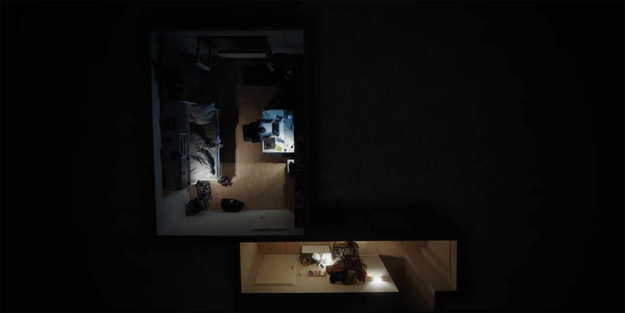
Film stills from “Shiny Flakes: The Teenage Drug Lord” by Eva Müller, 2021 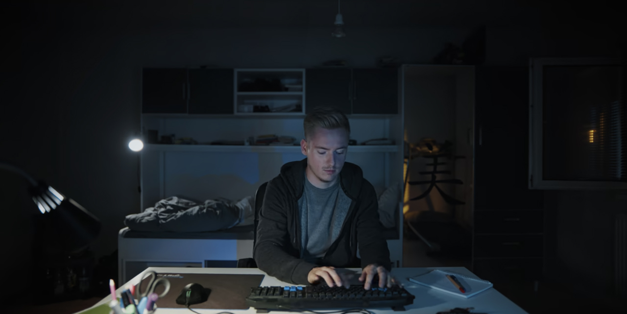
This way, filmmakers were able to take Maximilian Schmidt directly to the crime scene and re-enact his story, giving viewers a strong visualization of the events. This technique not only adds to the overall immersion but also helps the audience to get a better grip on the reality of the protagonist’s deeds and life.
Enhancing documentary with fictional parts, or docudrama
At times, documentary filmmakers go a step further by incorporating sequences filmed in a fictional style, complete with actors and staged scenes. This genre is called docudrama and normally it includes both documentary shots and dramatized re-enactments of actual events. Or you can film scenes that were written in addition to those shots as they do in “The Social Dilemma”, an American movie from 2020. In this docudrama about the negative effects of social media, director Jeff Orlowski used the cast to portray the issues covered in the film. Such sequences, like the one below, follow the story of a fictional family that suffers under the influence of social media in their daily life.
By watching Ben, a teenager who falls deeper into social media addiction, or Isla – the youngest daughter in the family – who becomes depressed because of the unrealistic ideals she follows on Instagram, viewers can more easily connect to the topic and understand it. Of course, relating to these fictional figures is not pleasant. However, that’s exactly what the director strives for. His message is quite clear: he wants us to wake up and see all the drawbacks of social media.
Capturing emotional response enhances your documentary
Naturally, we don’t always have huge budgets to dress elaborate sets or re-enact events with actors for a documentary. Nor should we. In creative approaches, it’s also the details that matter. For example, have you watched the recent but already celebrated docuseries “Beckham”? Even if you haven’t had football fever for the last thirty years, you definitely should. This portrait documentary about one of the most famous talents in sports will take you on a very emotional, nostalgic trip.
There is one small but powerful technique that I want to talk about. When the director speaks to Beckham (his family or teammates) about some remarkable game, they show it to the interviewee and capture their reaction, but not in an ordinary way. Filmmakers placed a replay screen just beside the camera and filmed the emotional response with a very tight lens. That results in shots like these:
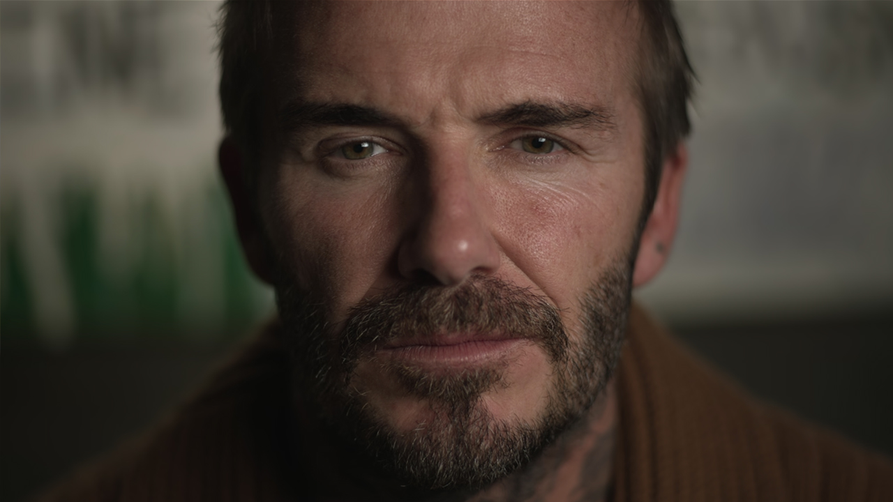
Film stills from “Beckham” by Fisher Stevens, 2023 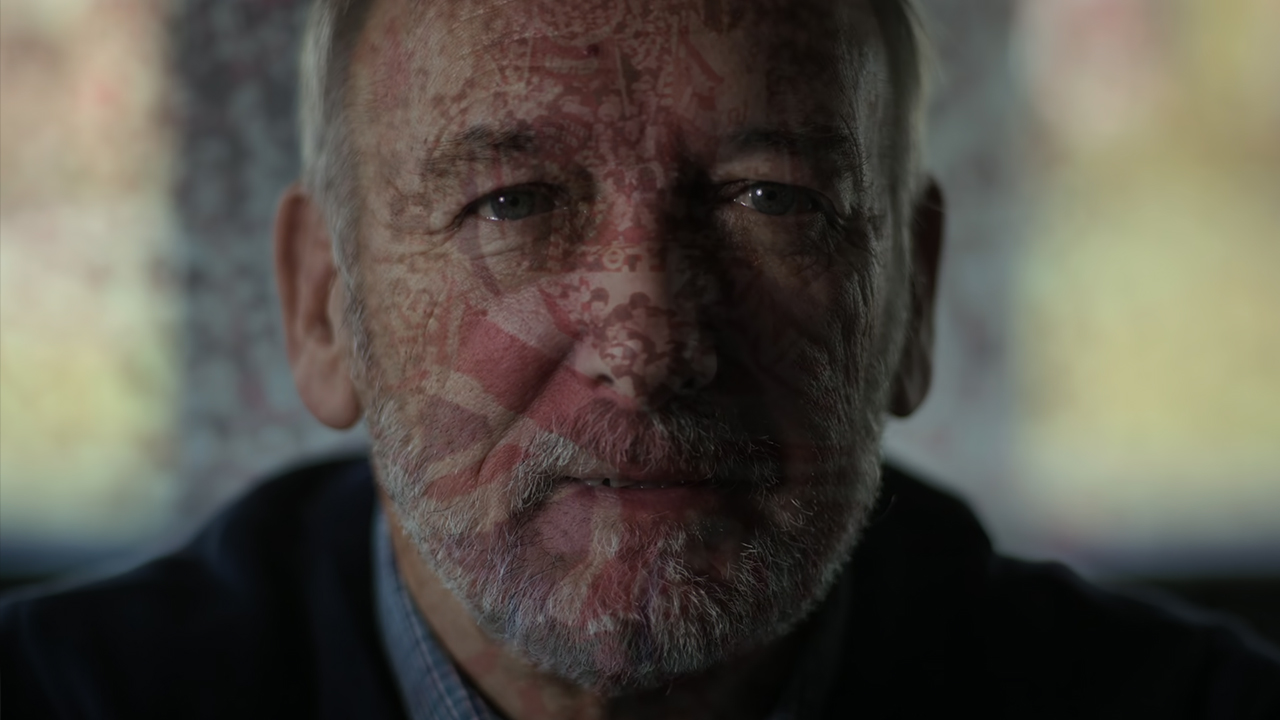
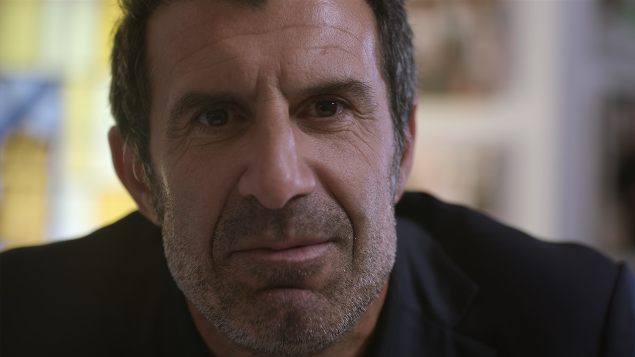
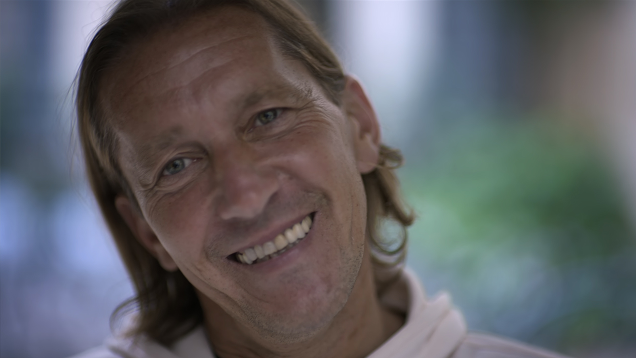
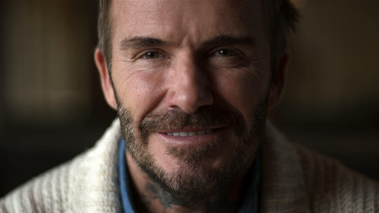
This approach creates a strong intimate feeling, as if these famous players hold eye contact with us while we watch and relive these historic games together. I’ve never seen this technique used before, and it indeed had an emotional impact on me.
Every picture tells a story
The thing about techniques and stylized elements in any movie is that they have to serve the story and/or the message. This also holds true in nature documentaries. In our free and exclusive MZed course on wildlife cinematography, held by the ASC cinematographers Paul Atkins and Stephen Lighthill, storytelling becomes an important topic.
As they explain to the participants of the workshop, whenever you find yourself with ample time before hitting the record button, remember to think about your image composition. Even a slight change in the angle can make a big difference. For instance, take a look at a macro shot of water bugs below.
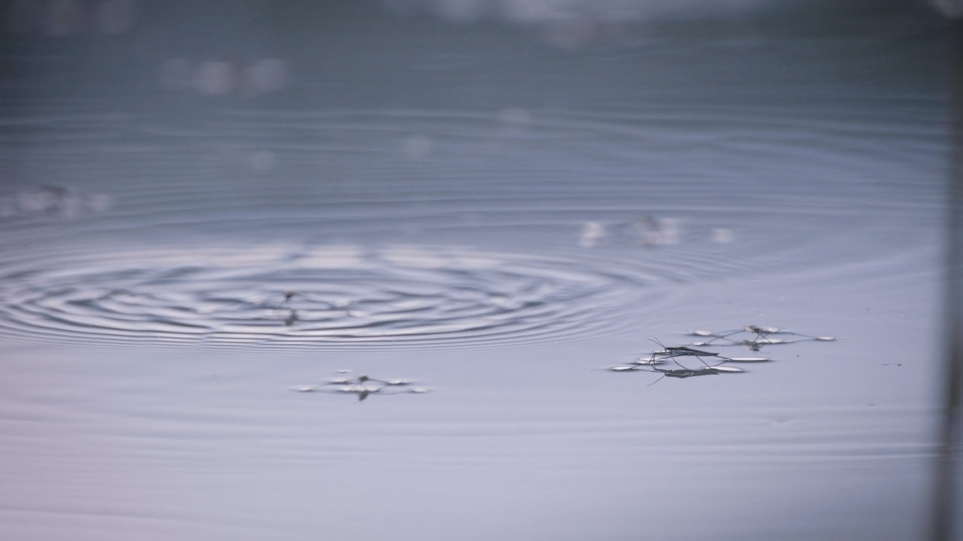
At the moment, it’s just a close-up of insects, used as an insert shot. However, if filmmakers chose another angle and pulled the focus from the mosquitoes to dry ground near the half-drained lake, it could have conveyed a poignant message: there used to be water, but not anymore. So, always keeping your story in mind is important in any situation, even if you’re “just” filming a B-roll shot of the surrounding nature.
If you’re generally interested in wildlife cinematography, head over here and attend our “The ASC Wildlife Filmmaking Course” on MZed.com for free.
Conclusion
These were just a couple of instances demonstrating how to enrich your documentary by incorporating stylized elements or introducing original approaches to conventional segments. We hope you can use it as a spark of inspiration for your own work. All in all, every creative technique that comes to mind is relevant here, as long as it supports the narrative.
Do you have other recent showcases from the documentary world that caught your attention? Or any stylization tools that you’ve never seen in this art of motion picture before? Let’s gather some ideas in the comment section below!
Full disclosure: MZed is owned by CineD
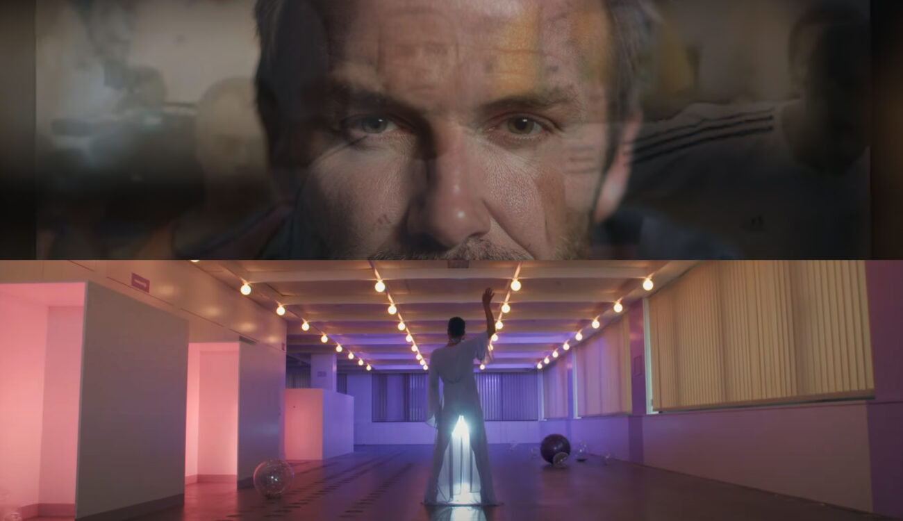
Feature image source: combined film stills from “Beckham” by Fisher Stevens (2023) and from “Feminism WTF” by Katharina Mückstein (2023)
