If you’re an editor, a video producer, or a filmmaker all-rounder, you know how frustrating it can get when you work with data sets that need visualization. All those charts, progress bars, graphs, and maps… Yet, sometimes there is no way around infographics, and you have to come up with ideas for integrating them. Digital Anarchy’s Data Storyteller is a newly launched tool that could potentially spare you both stress and time when approaching this task. The company guarantees that their new collection of plugins significantly simplifies the creation of animated charts and map visualizations for video production. How does it work? Let’s take a look!
Digital Anarchy is an American company that develops tools to enhance video production. For example, they were among the first to introduce a text-based editing plugin powered by AI – a feature that both DaVinci Resolve and Adobe Premiere Pro included only recently.
Advanced Editing with Davinci Resolve
Data Storyteller was announced at NAB 2023. Since then, it has undergone a couple of iterations and has now been brought to the market, available for immediate use.
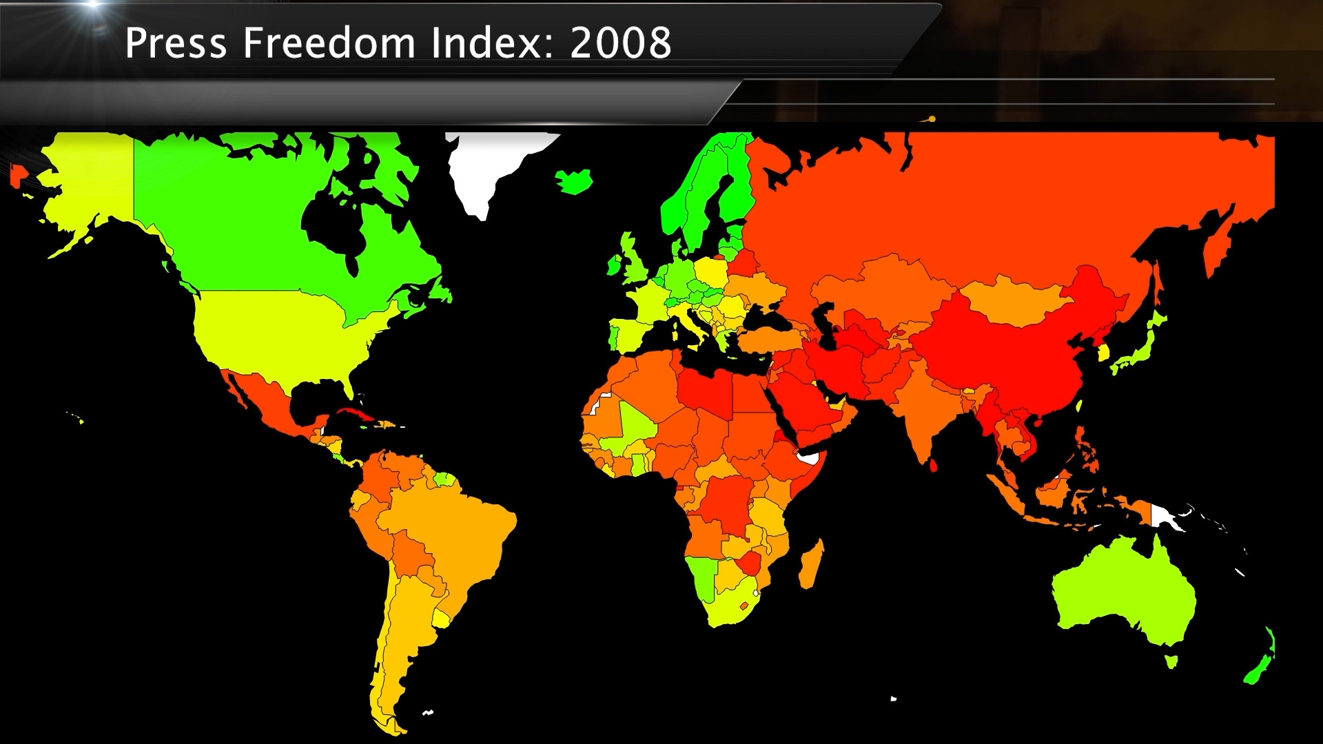
Showcases for Data Storyteller. Images source: Digital Anarchy 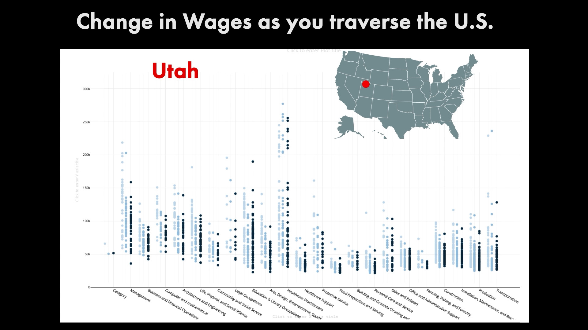

What exactly is Digital Anarchy’s Data Storyteller?
As the company describes it, it’s a new data visualization plugin set, which was developed with video creators in mind. First, you can integrate it into the editing software of your choice: Adobe Premiere Pro, DaVinci Resolve, Final Cut Pro, or After Effects. Secondly, it has different templates and automated functions (including the animation), in case you need a quick result for your video. At the same time, there are tons of parameters you can change and customize for a precise outcome – we will talk about some of them below.
The best part is, of course, that you don’t have to be a data scientist to use this software, as it seems very intuitive. Imagine getting a Microsoft Excel or CSV file from a documentary producer, which you then upload directly to Digital Anarchy’s Data Storyteller. The plugin has a built-in spreadsheet. Select all the data you wish to include in the visualization, and in an instant you get the following:
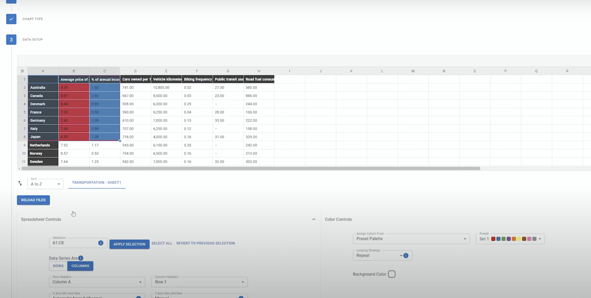
The build-in spreadsheet. Image source: Digital Anarchy 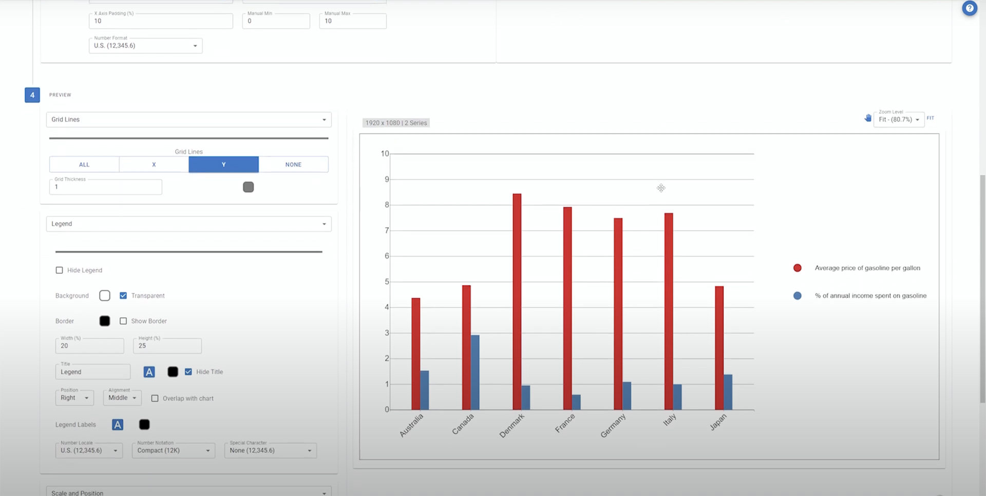
How your chosen data is visualized. Image source: Digital Anarchy
Afterward, you can animate your generated visualization directly in the host software.
Data Storyteller’s plugin set includes Data Storyteller Charts and Data Storyteller Maps. Both are part of the same installer and work similarly. They are divided in two, only because they require different settings and controls to be able to display data correctly. Of course, you can use both tools in the same project timeline.
The following demo video offers a brief overview of what else the plugin is capable of:
How to use Data Storyteller?
After you install the plugins in your editing software, you can start configuring charts and maps. First, choose between the former or the latter and apply the plugin to the timeline. Upload your data file (it can be anything from a simple work-in-progress report to the complex analytics of the crime level in different cities, providing the average age and income). You can then select either Line, Bar, or Scatter chart types, or US or World map visualizations, depending on what infographics you need. (For example, the World Map offers different projections, including a 3D globe.)
After uploading a file, users can choose what data to include in the animation, as well as play with different parameters. There are two approaches: either to utilize one of the existing templates (it’s a faster and much simpler way) or to set up your chart completely by hand. The second option allows you to play with different settings, like set resolution, height/width, color, transition effects, position on the screen, custom key-frame animation, and so on. Bear in mind that you can also save your own template if you work with similar data visualizations regularly.
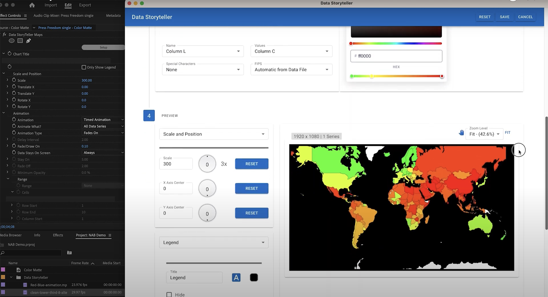
After the data visualization is ready (and hopefully looks good, while delivering clear information), you can save your Data Storyteller project as a JSON file. That allows users to share their setup with other team members or to import it later, whenever they need the same style for a different data set.
A few words about animation in Digital Anarchy’s Data Storyteller
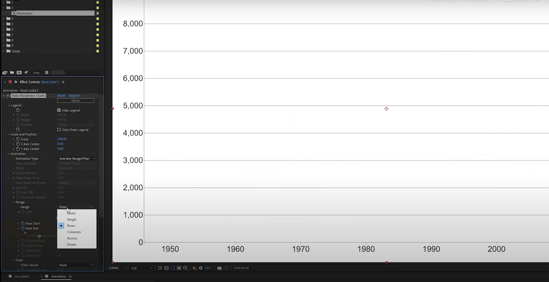
As mentioned above, there’s no need to manually animate elements. However, the automated animation looks very simple and only allows setting a few parameters, such as Draw On Time or Fade Off.
If you need more precise animation (for example, letting data points in your chart appear in sync with the music beats or voiceover), you can manually keyframe each of the elements, choosing how and when they appear.
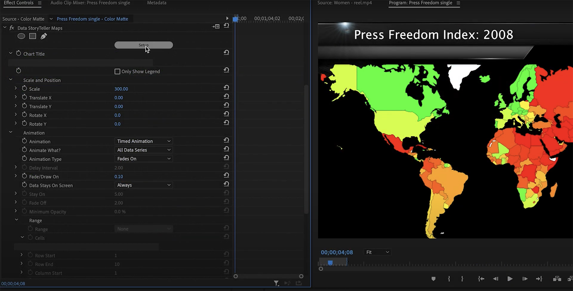
As you see in the screenshot above, you can play with the animation of the graphs directly in your host software (for example, in Premiere Pro). The preview is also available on the Data Storyteller app and saved to your timeline.
Technical specifications and limitations
The technical requirements for Digital Anarchy’s Data Storyteller include:
- Data Storyteller works in both Windows and Mac OS (Windows 10 and later; MacOS High Sierra and later, MacOS 11 and later; Supports Intel and Silicon Chips on Mac);
- The charts included with the help of this plugin are basically vector-based graphics. That means you can render them in any video resolution required: starting from HD and going up to 12K or even higher;
- Imported CSV or Excel files can be simple spreadsheets or more complex, with multiple sheets or large data sets. (For example, you can upload and animate multiple years of census data year by year).
Speaking of limitations, I must admit that I haven’t tried the software yet, so I’m not sure how intricate and visually engaging the data animation can become in that situation. From the description above, it seems that you can let different elements appear on the screen whenever you want them to, or animate the position of the graphs. This is okay for charts and maps, yet you shouldn’t expect any spectacular mind-blowing animation from the plugin.
Another limitation we already touched on: the first version of Digital Anarchy’s Data Storyteller only supports 5 chart types. However, the company plans on expanding the types and templates within the next updates:
“Because Data Storyteller is built on the robust charting library of D3.js, we will continually be adding other types of charts after the 1.0 release.“
From the press release
Price and availability
Digital Anarchy‘s Data Storyteller is available for purchase here. The regular price is $199, but the “buy” page on the website mentions a special sale until the 10th of September ($159 instead of $199). If you need more information about the plugin, please head over to the product’s webpage.
Do you often work with graphs and charts in your videos? What do you think of Digital Anarchy’s Storyteller Plugin? Can it become something that makes an editor’s life easier?
Feature image source: Digital Anarchy.


