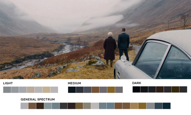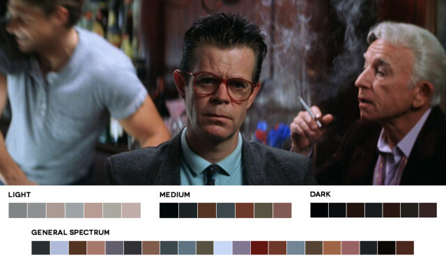
Being able to use color to create harmony, or tension within a scene, or to bring attention to a key visual theme can be used to spectacular effect. In this article we look at 5 common film color schemes that can help you understand how cinematic color design works.
This industry of ours is great. I truly love it, the people, the gear, the creativity and energy. At the same time, as your experience grows and your expanding network of connections allows you to move up the ranks, you also find the expected, assumed level of knowledge increases. This is logical, but I have found the assumed knowledge is often rarely discussed, because, well, it’s assumed that you already have it.
 I want to share a few of my “ah ha!” moments that I assume some (most) of you already know, because of course it’s “assumed” knowledge, but the truth is maybe it will help more than a few of you to connect some dots of your own.
If you’ve never really come to grips with why certain colors or combinations of color evoke or induce a emotional response, or simply just look pleasing, this explanation of basic practical color theory may suddenly cause the puzzle pieces to fall together or spark some interest in researching it further.
Planning the look
In post of course, a colorist can only work with what he (or she) is given, and so it can be argued that the overall look and feel of the image is the responsibility of the production designer. This is carefully planned by art department as a whole in consultation with the director and cinematographer long before cameras roll. While this is true, how many of us regularly work with a professional production designer?
Sometimes perhaps, but certainly not for every project. Many times I’ve brought on someone in a junior role, or simply used a stylist to quickly set dress a location with found existing objects, or to bring some selected items in with them if needed. The basic knowledge I am about to share helped immensely in those situations.
The Effect of Color
Color can affect us psychologically and physically, often without us being aware, and can be used as a strong device within a story. Knowledge gives you control, and control means you can manipulate and use color to give your work a powerful and beautiful edge.
Being able to use color to create harmony, or tension within a scene, or to bring attention to a key visual theme can be used to spectacular effect.
In the sense of the work of the world’s greatest cinematographers we admire so much nothing is accidental. A strong red color has been shown to raise blood pressure, while a blue color has a calming effect. Some colors are distinctly associated with a particular location or place, while others give a sense of time or period.
The Color Wheel
First of all we’ll look at some fundamentals that will apply equally to both design, and post.
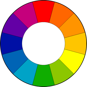
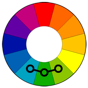
It all starts with the color wheel. This should look familiar to anyone with experience of a 3 way color corrector.
The color wheel is the common tool you will see when it comes to color control, and it is standard in color theory in defining a number of combinations that are considered especially pleasing.
In a simplified form the color wheel comprises 12 colors based on the RYB (or subtractive) color model.
In the RYB color model, the primary colors are red, yellow and blue. The three secondary colors are green, orange and purple, and can be made by mixing two primary colors. A further six tertiary colors can be made by mixing the primary and secondary colors.
Let’s make some sense of this. Firstly you’ll notice warmer colors on the right side, and cooler colors on the left. Warm colors are bright and energetic. Cool colors give a soothing and calm impression.
We will quickly define the common color harmonies or color chords, each consists of two or more colors within a specific pattern or relationship on the color wheel.
All of the frame grabs used to illustrate the 5 most common schemes were created by graphic designer Roxy Radulescu from her site www.moviesincolor.com. It’s worth taking some time to look through all the work she has done.
5 Common Film Color Schemes
1. Complementary Color Scheme
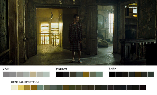
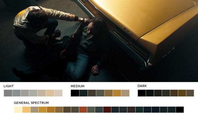
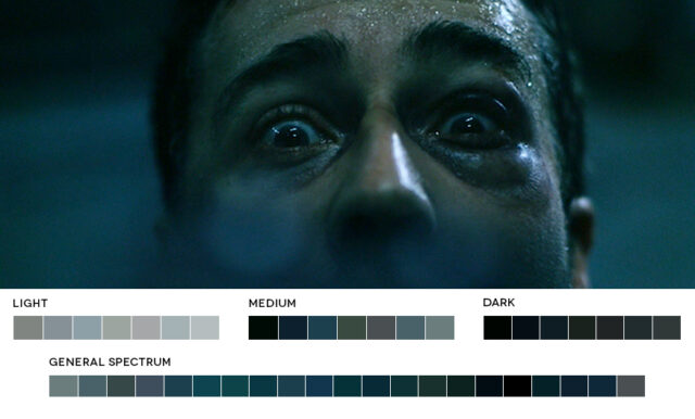
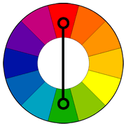 Two colors on opposite sides of the color wheel make a complimentary pair. This is by far the most commonly used pairing. A common example is orange and blue, or teal. This pairs a warm color with a cool color and produces a high contrast and vibrant result. Saturation must be managed but a complimentary pair are often quite naturally pleasing to the eye.
Orange and blue colors can often be associated with conflict in action, internally or externally. Often a internal conflict within a character can be reflected in the color choice in his or her external environment.
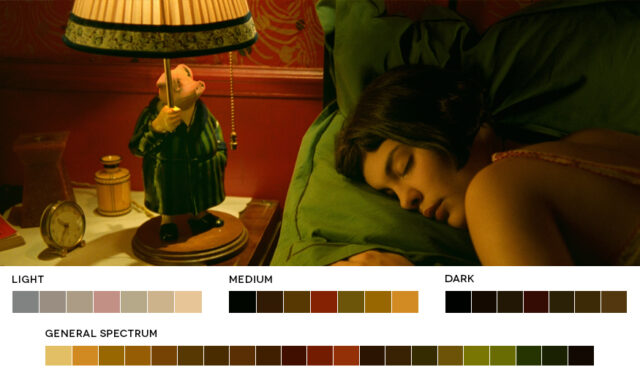
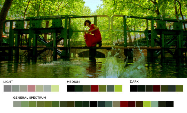
The color palette of Jean-Pierre Jeunet’s “Amelie” is a great example of a complementary pairing of red and green.
Orange and Teal are readily apparent in this scene from “Fight Club.” Teal is often pushed into the shadows, and oranges into highlights.
A similar look in this scene from “Drive.”
A complementary pairing isn’t always so obvious and the contrast between the two colors used is often relative. Another shot from “Fight Club” which at first appears just to have a strong overall teal tint to the entire image, but a closer look reveals there is still a orange touch to the skin tones relative to the deep blue green.
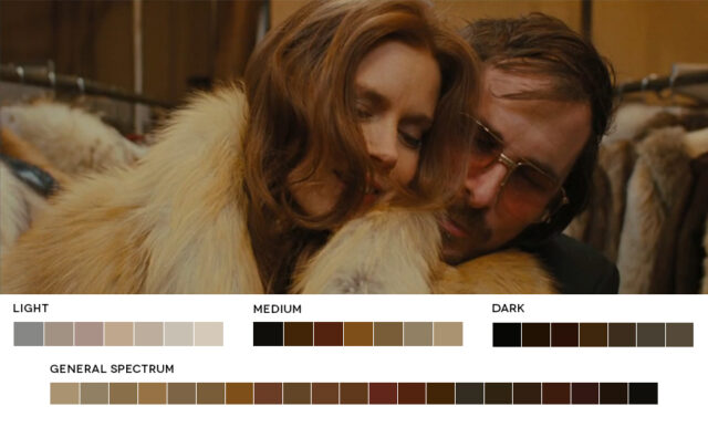
2. Analogous Color Scheme
Analogous colors sit next to each other on the color wheel. They match well and can create a overall harmony in color palette. It’s either warmer colors, or cooler colors so doesn’t have the contrast and tension of the complementary colors.
Analogous colors are easy to take advantage of in landscapes and exteriors as they are often found in nature. Often one color can be chosen to dominate, a second to support, and a third along with blacks, whites and grey tones to accent.
Reds, Oranges, Browns and Yellows in this scene from “American Hustle” fall next to each other on the color wheel forming a warm overall feel with very little tension in the image.
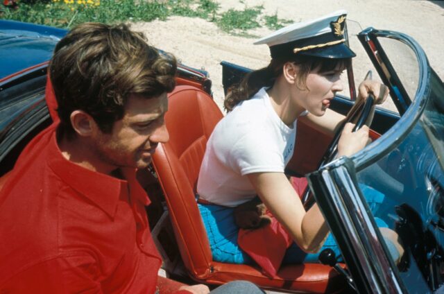
3. Triadic Color Scheme
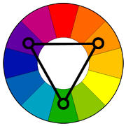 Triadic colors are three colors arranged evenly spaced around the color wheel. One should be dominant, the others for accent. They will give a vibrant feel even if the hues are quite unsaturated.
Triadic is one of the least common color schemes in film and although difficult, can be quite striking.
Jean-Luc Goddard’s 1964 “Pierrot Le Fou” makes use of a triadic color scheme of red, blue and green.
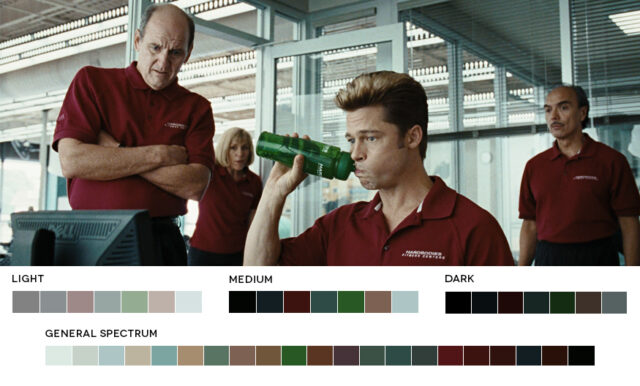
4. Split-Complementary Color Scheme
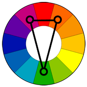 A split-complimentary color scheme is really very similar to complimentary colors but instead of using the direct opposite color of the base color, it uses the two colors next to the opposite. It has the same high contrast but less tension than a complimentary pair.
A split complimentary color scheme in this scene of the Coen Brother’s “Burn After Reading” of red, green and teal.
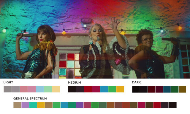
5. Tetradic Color Scheme
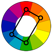 Tetradic colors consist of four colors arranged into two complementary pairs. The result is a full palette with many possible variations. As with most of these color harmonies, one color is usually dominant.
“Mama Mia’s” colorful party scene falls into the example of a tetradic choice of colors creating a well balanced and harmonious palette in a scene that could otherwise have looked like a bad disco.
Some common general looks that can be created in post pretty much regardless of what colors are in the image are the orange/teal look where orange is pushed into the highlights and upper-mids of the skin tones and teal (or blue green) is pushed into the shadows.
A scene from “Magnolia” showing another example of Hollywood’s love affair with orange and teal. Blue/green has been pushed into the shadows, and orange in the midtones and highlights specifically in skin tones.
I hope that this basic breakdown can help give you control in making planned and purposeful color choices either on set when working with a designer, or purely in post in order to set your work apart. Studiobinder have a free e-book called “How to Use Color in Film” if you’re interested in finding out more.
Of course I assume you all knew this already… but this was just in case you didn’t ;)
