Have you noticed that the word “cinematic” is becoming more and more overused lately? But what does it really mean? To me, personally, it means having the ability to tell your stories visually, revealing the initial purpose of the shot and its unique voice. Some cinematographers do this intuitively without giving it much thought. Others construct each and every detail of the frame with precision. In either case, knowing how to use the elements of composition is a filmmaking superpower that anyone can unleash. So, what are we waiting for? Let’s start with the basics – paying attention to lines in the composition of a shot, and what that approach can bring to the table.
World-famous director Lars von Trier said in a recent interview that he doesn’t really consider virtual reality as constructive as cinema because it excludes any framing.
…Whereas the frame is the basis of the gaze: it’s in the limit it sets that the most vital source of artistic expression is found.
Lars von Trier, from the interview to “Le Monde”
Lines are an essential element of shot composition because they exist in an infinite number of ways in reality, as well as in the screen world. How can we ignore them, considering that even the frame itself is bound by four straight lines, defining its boundaries and corners?
Invisible lines in shot composition – the rule of thirds
In this overview, we will mostly concentrate on visible lines, which actually appear in a shot, cutting it or guiding the viewer’s attention. But of course, it’s only a drop in the ocean of mighty filmmaking geometry. Even if you’re not yet an experienced cinematographer, chances are you’re familiar with the rule of thirds. While this rule may seem obvious, it is certainly not unimportant. It’s an example of how a strong composition can be achieved by using imaginary guiding lines.
In the MZed course “Fundamentals of Directing”, independent screenwriter and director Kyle Wilamowski explains this phenomenon quite simply. Take any desired frame, draw two vertical and two horizontal lines across the screen, dividing it into identically sized thirds, and look at where they intersect. These are the focal points that immediately capture the viewer’s attention.
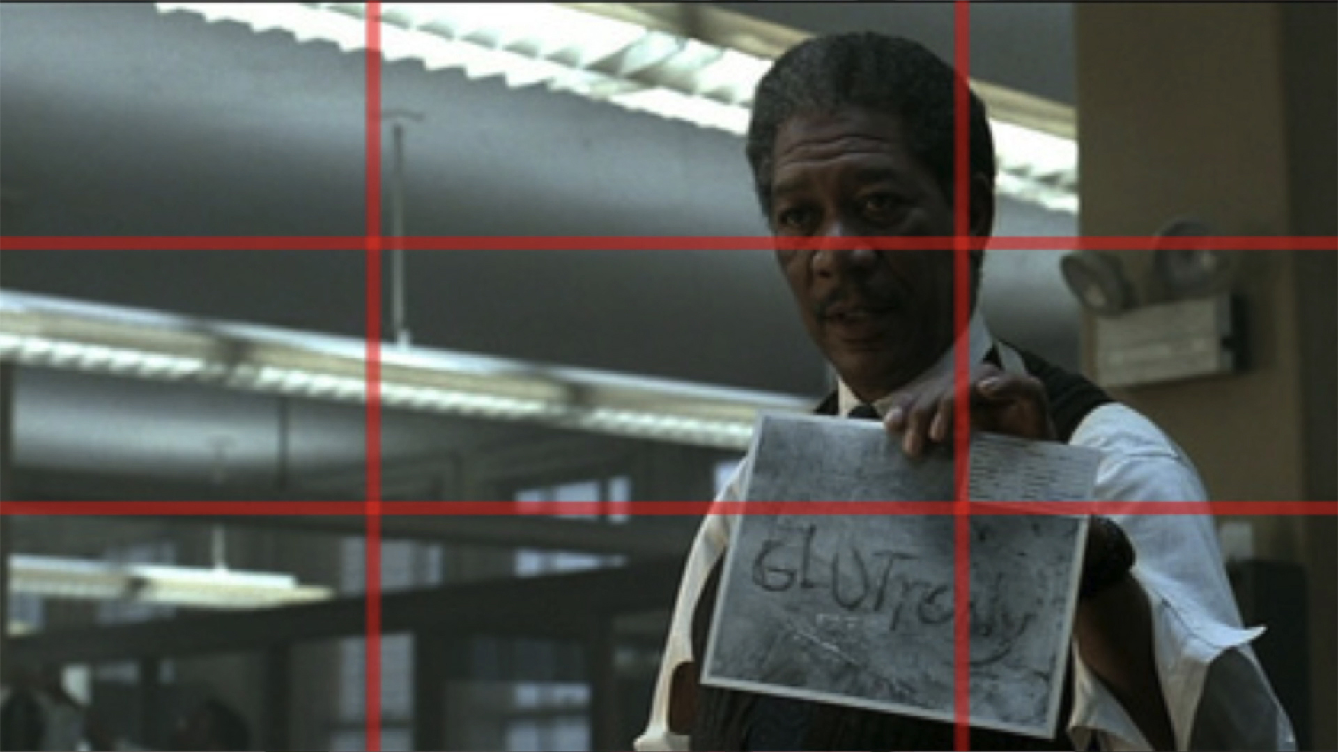
The rule of thirds helps to create the most balanced composition, pleasing to our eye. So, if you want to emphasize specific elements within your shot, place them along those invisible guidelines or, ideally, at the intersection points where they converge. To give you an idea, above is a film still from David Fincher’s “Se7en”, which showcases this composition rule. There are two significant details here: the face of Morgan Freeman’s character, and the piece of evidence he holds in his hand. Can you see where both are placed? Not a coincidence, for sure.
Leading lines to guide the viewer’s attention
Interestingly enough, each actual line INSIDE your picture can also achieve this goal. Lines naturally draw the eye, directing attention either towards a specific focal point or away from it. We already talked about this optical trick a bit here, but let’s elaborate.
Fundamentals of Directing
Leading lines can be horizontal, vertical, or diagonal. As the name “leading” suggests, they smoothly direct our glance toward something the director wants us to focus on. One striking example is Stanley Kubrick’s “The Shining” and the scenes in the hallway.
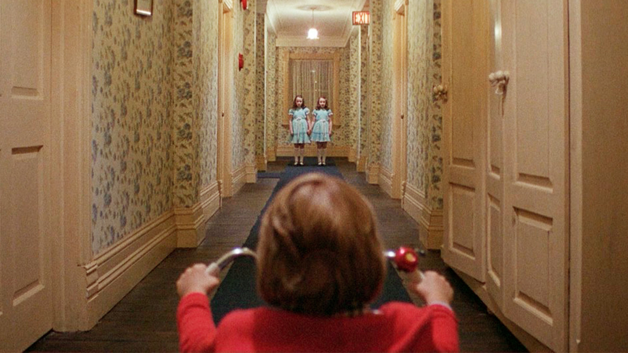
Even when little Danny rides his bike through the empty rooms, our eyes keep wandering to the middle of the frame, to the point in the distance. That’s how the classic central perspective works, creating diagonal lines on the sides of the picture. As a result, we unconsciously anticipate that something will happen there. When the twins appear, they are positioned precisely at this spot within the frame, and they become the main point of interest.
Straight or curved lines?
On a side note, leading lines in the composition of a shot do not have to be straight. Did you know that rectangles are a balanced, man-made shape not found in nature?
It may represent logic, civilization, control, or the aesthetic of modernity.
A quote from the book, “Cinematic Storytelling”
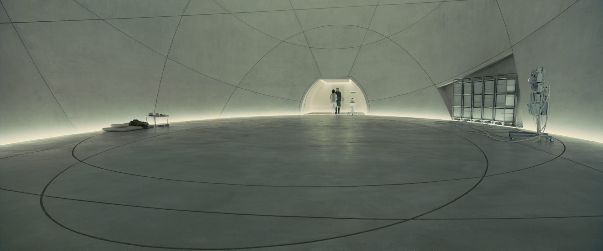
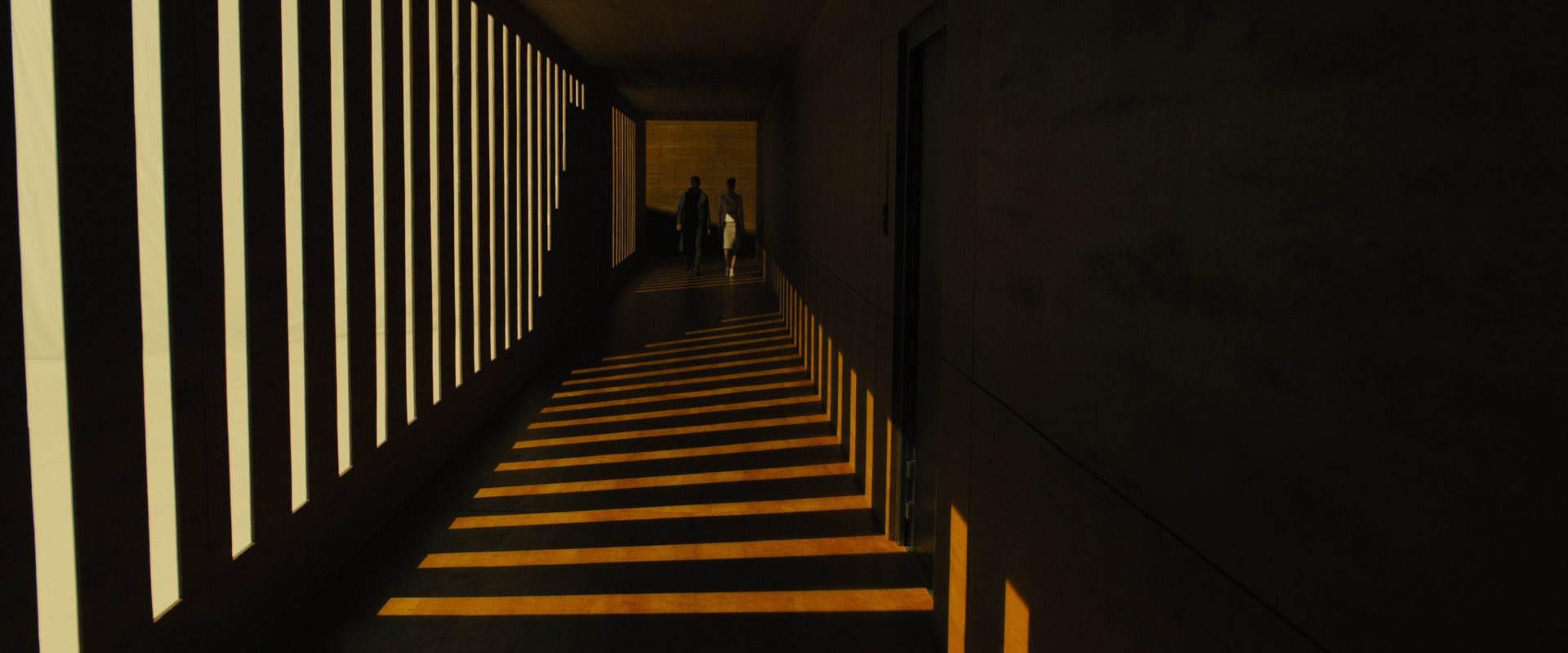
Of course, most lines in the modern world are rather straight and tend to be either vertical or horizontal, because they’re created by architecture. But it shouldn’t stop you from finding other options to direct the viewer’s eye. It could be spiral staircases filmed from above, a curvy river flowing in an aerial shot, or some futuristic set design decision like in the following example from “Blade Runner 2049”.
Dividing lines as a storytelling tool
Another reason to control the lines within your frame could be for the sake of surface division. Meaning: when you want to separate the shot into two or more areas. For instance, if you plan on telling several stories simultaneously, you can use an optical divider quite literally, like a split screen.
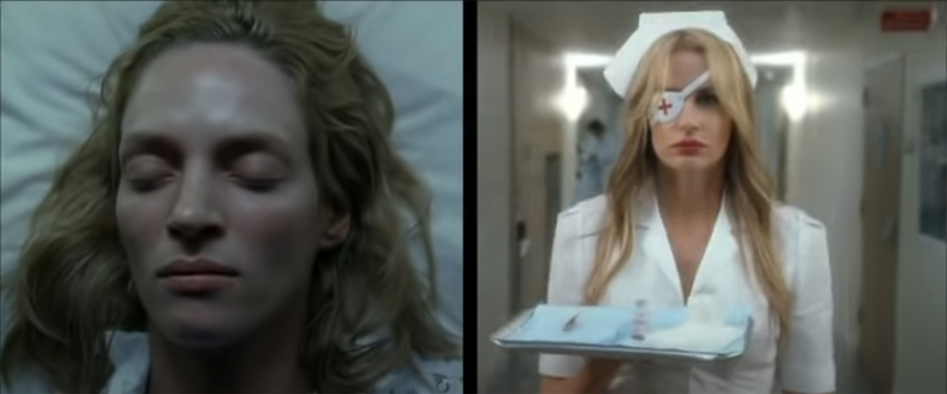
But in most cases, cinematographers look for the existing dividing lines in the scene’s geometry and include them in the overall composition. Doorways, windows, walls, and tonal changes in the background color – even the horizon – are lines that can serve as a divider in your composition. You will consider a choice for various reasons. For example, choosing a line to separate two characters gives each of them their own small frame for the story’s development. It also motivates us to compare them, to look for similarities and differences.
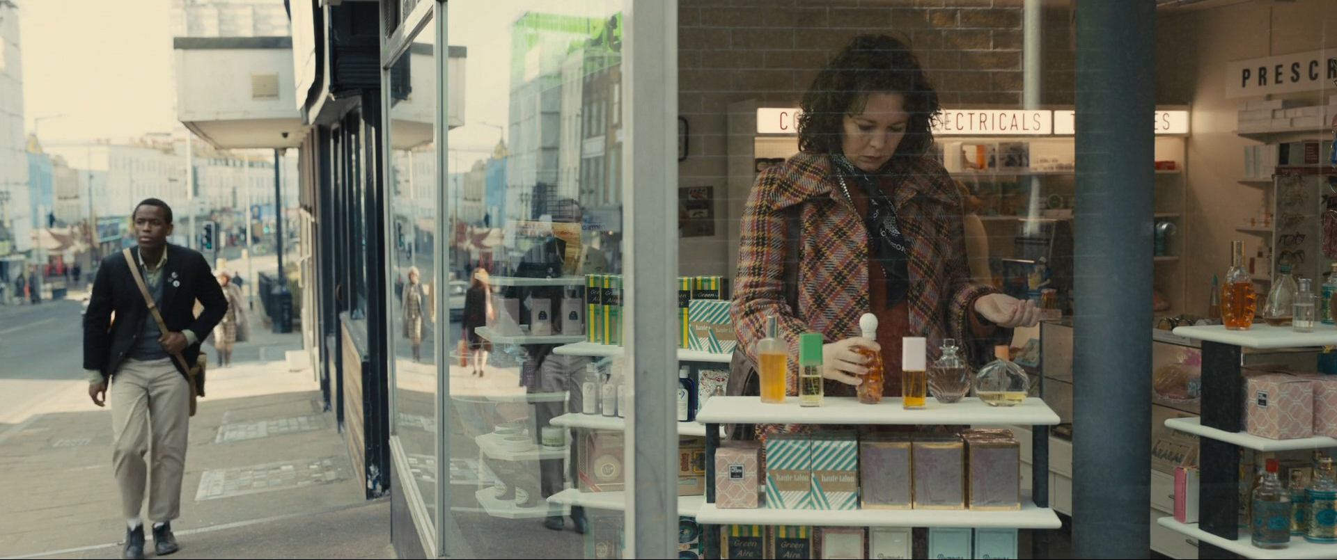
The film still above is from the latest collaborative work of renowned director Sam Mendes and brilliant DP Roger Deakins – “Empire of Light”. This slow, cinematic drama consists solely of precise framing where no shot is a coincidence. So, in this case, a vertical line separates the two main characters as if they belong to different worlds (which they do). Yet somehow it also subtly hints at their similarities, which are later confirmed as the movie progresses. Take a look at how each character is positioned, finding themselves confined within enclosed boundaries at different moments, restrained, and unable to breathe freely within their own frames. That’s visual storytelling, my dear fellow filmmakers!
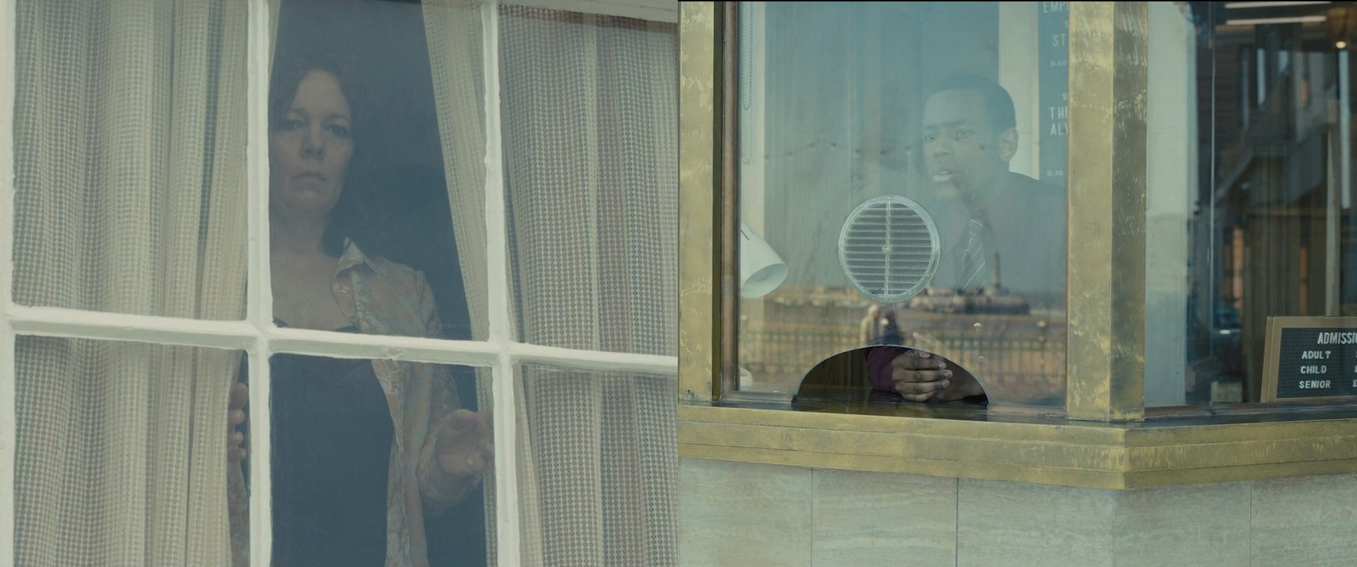
Trapping your characters inside the lines and forms
That’s another reason why you would place a divider inside your frame. Lines can comment on a story situation and intensify a desired emotion. Say, if it’s a character who is feeling trapped – lines are at your service. Hulu’s series “The Handmaid’s Tale” exemplifies the use of this technique. See for yourself:
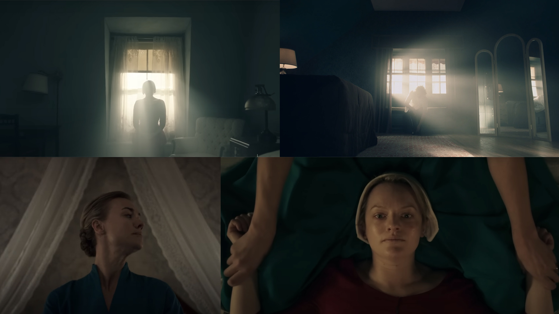
On one hand, the creators of the show really love to work with closeups so the audience develops an emotional connection to the women enslaved in Gilead. On the other hand, when they do show them in wider shots, they often place the characters trapped inside line elements, like in the examples above. What’s interesting here is that it doesn’t even have to be rectangular to create this anxious feeling. The cage formed out of their arms, closing in on the protagonist, or the diagonal lines of bed curtains framing the wife (who is also a prisoner in this situation, at that moment), have the same effect.
Another contemporary series, which masterfully uses lines for storytelling is “Severance” on Apple TV+. If you haven’t watched it yet, please consider this as my personal recommendation. To offer you a glimpse into its thoughtful cinematography, here is the opening shot of the show:
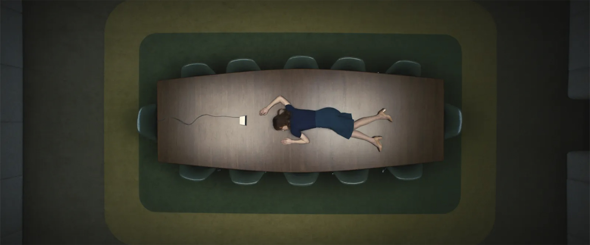
Using lines in shot composition to create worlds
So, now we’ve established that lines can guide the eye and draw attention, they can contribute to the emotional impact of a story, and they can separate characters (or bring them together when placed within close confines). But they may also create different spaces within one picture. Sounds similar to dividers, I know, yet there is another aspect to it. Let me show you an example from “Women Talking” – an Oscar-awarded drama by Sarah Polley based on the novel of the same name.
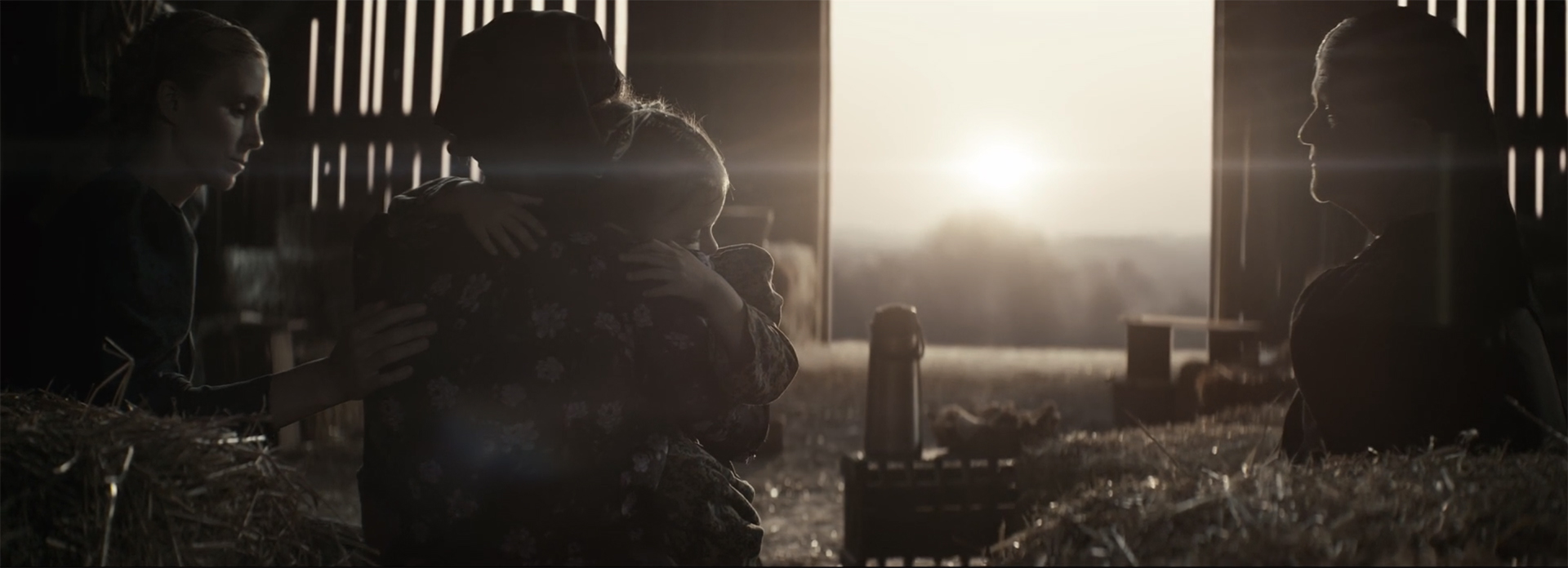
In the ASC Clubhouse Conversation, which is available on MZed.com, the cinematographer of the film Luc Montpellier talks about the original material and how they approached it. The book highlights the challenges faced by women who live in an insular Mennonite colony and is set entirely in the loft. But for Montpellier and the director, Sarah Polley, it was extremely important to break free from those limitations. The filmmakers wanted to portray the world of this culture and convey the essence of their faith to the audience. As the characters have to make the difficult decision of whether to stay in their beloved colony or abandon it and move forward, building a new world for themselves and their children, it was imperative to show what they had to lose. That is exactly what a rectangle in the shot above emphasizes – a feeling of home, framed in lines. At the same time, this sun-lit space is also a metaphor for the unknown, which awaits them in the future, if they decide to leave.
Lines can also create rhythm
Oh yes, they can, and the most literal example here is this very special music video for “Star Guitar” by the Chemical Brothers:
Of course, it’s not exactly what filmmakers mean by rhythmical lines in the shot, but I adore this visualization of the thought. At the same time, it’s such a huge topic that we should set it aside for another time and a more thorough investigation. As a small warm-up, try watching a film and imagining lines that are shot in a composition of musical beats, and we’ll see what happens.
How to emphasize lines in shot composition – practical tips
Let’s imagine you’re going to shoot something and want to intentionally use lines in shot composition. Where should you start? Some handbooks on cinematography suggest squinting your eyes when you’re at a location so that you start seeing lines, forms, and contrasts instead of objects. Then break down your scene, come back home, and make a so-called linear motif storyboard. Basically, it shows shots in their correct order, but without scene content. Just draw the lines, whether leading, dividing, unifying, all of it. Mark their orientation and try to understand what story they tell. Is it the one you want to tell as well?
And what about you? Do you pay attention to the lines in shot composition? Which visual tool that we discussed above is your favorite one? Let’s talk in the comments section below!
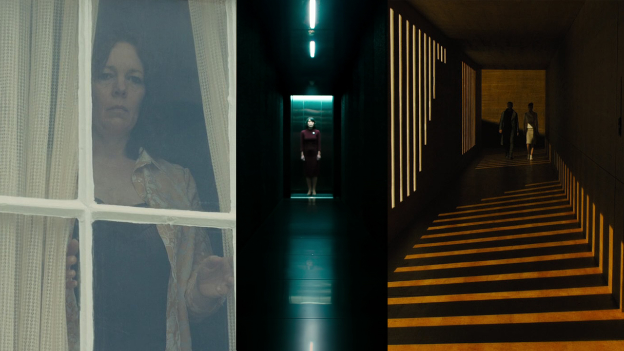
Feature image: film stills from “Empire of Light” (2022), “Severance” (2022), and “Blade Runner 2049” (2017).
Full disclosure: MZed is owned by CineD
Additional sources:
- “The Visual Story” by Bruce Block, second edition, 2008.
- “Cinematic Storytelling” by Jennifer Van Sijll, 2005.


