The Loupedeck CT (as in Creative Tool) is around for a while now but if you think this device is a one-trick-pony, only serving a bunch of carefully assorted apps, think again! Loupedeck (the company) just issued a software update which increases the capabilities of the CT, big times. The buzzword here is Loupedeck Profile Creator. This opens up the console for literally every app out there. Sounds creative? It is!
Loupedeck came a long way. With their first console, which was purpose-build for Adobe Lightroom, a second, plus-labeled iteration, which expanded the support across several NLEs and now the third and most versatile version yet: the Loupedeck CT.
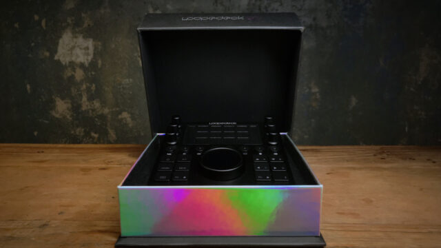
This device has one purpose: making it easier and more intuitive for you, the user, to interact with certain applications. Rather than relying on good ol’ keyboard and mouse, the Loupedeck CT offers dials, a wheel, virtual buttons with touchscreen capabilities and haptic feedback and, still mandatory, lots of clicky buttons. Since we’re talking a very well-made product, it certainly deserves a nice packaging as well and the packaging is, again, very well-made indeed! Not that this is overly important but it is a nice touch, no question about it.
The Definitive Guide to DaVinci Resolve
The Loupedeck CT
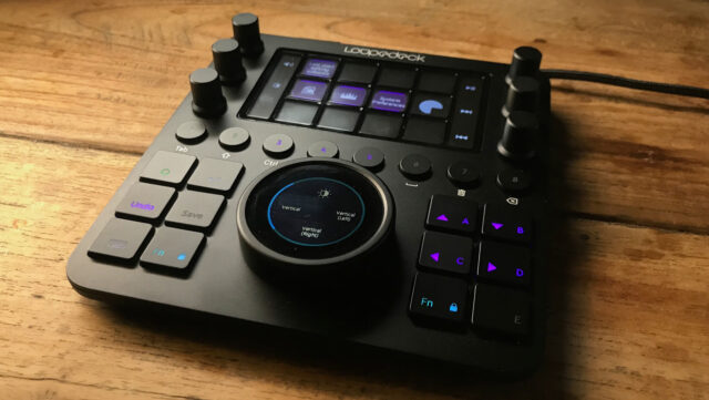
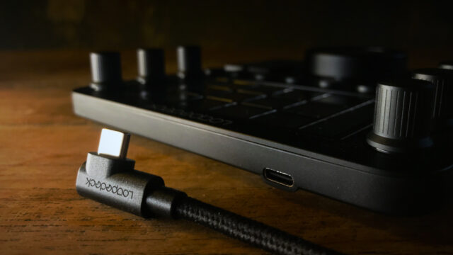
The whole device is a treat to look at. Its upper surface is made out of aluminum while the bottom shell is made out of plastic (for a reason, we’ll come to that later). The whole thing isn’t huge, 15cm x 16cm, but this feels about the right size for it to live next to a keyboard/mouse setup on your desk. It is connected via USB-C to your computer and it comes with a nice 90°-angled fabric cable.
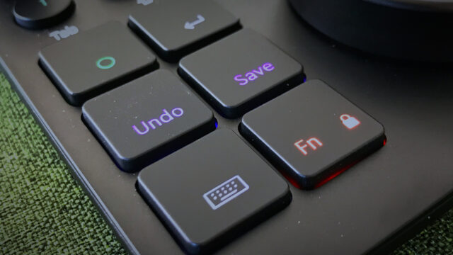
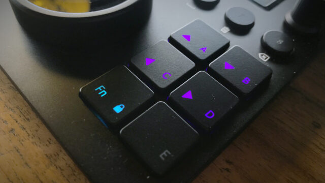
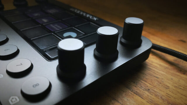
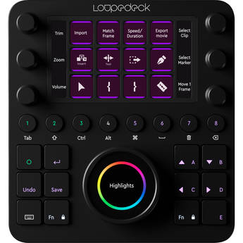
So what does it have to offer? For starters, 12 regular buttons with a decent late 90’s feel to them. I don’t mean this in a bad way, I really like the 2mm travel of the keys, they seem to be build for years of constant use. Moving on, you get 8 round buttons. These offer way less travel but still a solid ‘click’ once pressed. They are more like pressing a button on, say, a CD player (if that’s still a thing). All of these ‘hard’ keys are backlit and the color changes depending on the state they’re in. And you get dedicated buttons for undo and save, very useful!
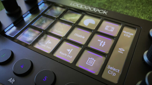
The more advanced buttons are further up on the panel: An array of 12 virtual buttons, little touchscreens to be exact, offers any function you want which is mapped to that button depending on the app you’re using. Furthermore, the whole array double-acts as a touchscreen, too. You can scroll through different sets of 12-key layouts with a swipe of your finger, just as you would swipe your different screens full of apps on your smartphone.
And, this is really cool, since these buttons are no real buttons but tiny touchscreens, the Loupedeck offers haptic feedback every time you press one of these. If you don’t like it, you can disable this feature but I think it’s really useful. However, if you’re pressing (touching) one of the buttons with just your fingertip, you most likely won’t feel the haptic feedback since some parts of your hand need to have physical contact to the housing in order to do so.
You’ll find a so-called touch strip on each side of the aforementioned 12-key grid. These vertical touch strips display the functions which are mapped to their associated dials, six in total. Again, you can flick through different functions by swiping, only this time you have to swipe vertically. The six dials can be turned infinitely but you feel tiny steps while turning so it feels very accurate operating them. These dials also can be clicked, for resetting a value for example.
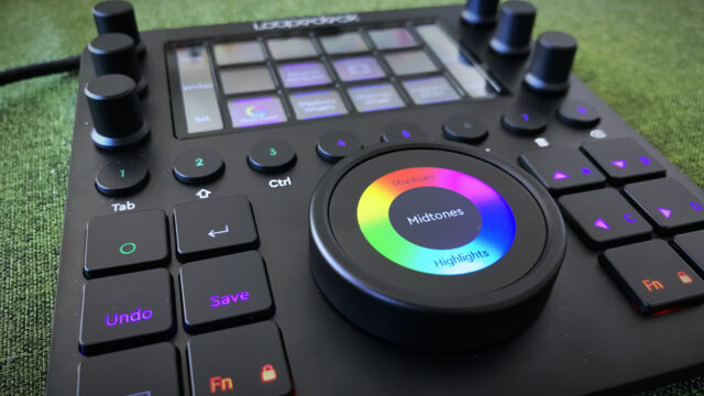
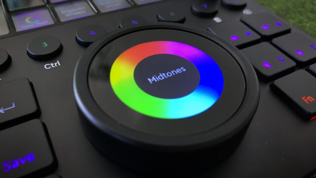
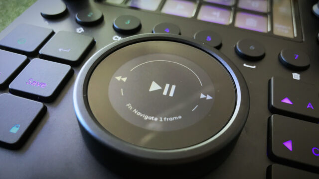
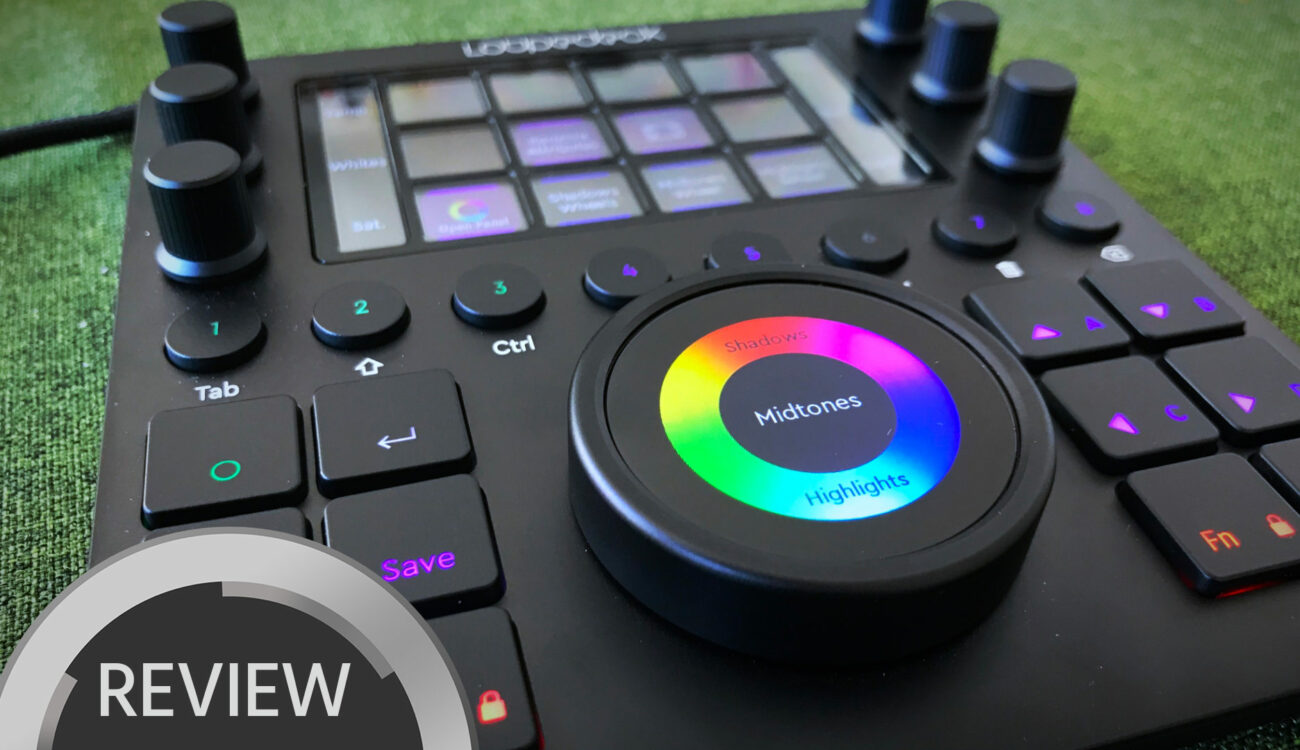
The real star of the Loupedeck CT is reserved for this last paragraph of the tour: The huge wheel, which is also a touchscreen. The wheel itself, that’s the outer ring, does feel very satisfying and solid. It turns quietly, smoothly and with very little resistance to it, so you can give it a spin with your fingers and it will turn for just a little bit longer. In contrast to the dials it is not a stepped wheel, it’s more a flywheel of some sorts. The entire center of the wheel is, again, a fully-fledged touchscreen. And it is, again, highly customizable. Of course, color grading springs to mind immediately.
Working With the Loupedeck CT
I was lucky enough to work with this panel over the course of a few weeks now and I must say, I’m impressed of the build quality and the overall look’n’feel of the Loupedeck CT. It really is a step up from their older decks as well as many other solutions out there. What Loupedeck wanted to achieve is to create one universal device for many creative applications and purposes. So it offers everything you’d need: dials, buttons, touchscreens, even a giant wheel. The question is: Is a universal control surface capable of satisfying all the needs one might have for a specific application?
Well, since this a video-centric news outlet, I only tested the Loupedeck CT with certain applications. Premiere Pro, a bit of After Effects and Photoshop. The current list of supported apps goes like this:
- Adobe Lightroom Classic
- Adobe Photoshop CC / Camera RAW
- Adobe Premiere Pro CC
- Apple Final Cut Pro X
- Adobe Illustrator
- Ableton Live
- Adobe After Effects
- Adobe Auditioon
- System (volume up/down, play/pause, brightness up/down, …)
The list will be expanded over time. And to make things clear: These are not just mappings for a bunch of hotkeys, these are deep integrations into the given app, using api (application programming interface) protocols.
DaVinci Resolve ?
This deep integration is why, for example, Blackmagic Design DaVinci Resolve is not on this list. They simply don’t offer any third-party integration since they want to sell their own control surfaces. That’s of course fair enough but still a proper integration would be nice to see. If you’re wondering why Tangent devices or old Avid Artist panels are being supported by Blackmagic Design, these integrations come from a time before they were offering their own panels. They decided to not drop the support fo these existing devices but you can’t tweak the hard-coded mapping anymore. And sadly, new devices coming to market, like the Loupedeck CT, don’t get any love from DaVinci.
So you see, Loupedeck can’t be blamed here, and neither can Blackmagic be blamed, they’re giving away an amazing piece of software for free basically. So it’s only fair to let them make some money with their own hardware (even though a low end version would be much appreciated).
Loupedeck Profile Creator
BUT, and here we come full circle to the very top of this review: Loupedeck just added a new feature to their configuration software called the Loupedeck Profile Creator. This is not a fully-fledged api-driven deep integration but it’s the next best thing they actually could pull of without any help from Blackmagic Design (or any other company for their applications). With the Loupedeck Profile Creator you can build your own profile for any app you like. Just use the Loupedeck software to drag’n’drop custom hotkey, makros (a sequence of multiple hotkey or combinations of them) and other functions directly to a button or dial or the touch wheel of the Loupedeck CT.
Sure, you can do most of this with your existing keyboard but since the Loupedeck CT offers 1) dials, 2) that touch wheel and 3) virtual buttons with custom labels since they’re tiny screens, your mapping will be much more intuitive and pleasant to work with.
However, as stated above, the level of integration is not as deep as with the pre-configured profiles the Loupedeck CT comes with. For example you can’t map the touch wheel to manipulate the gamma control in primary wheels within DaVinci Resolve since there’s simply no shortcut for it you could map. You can place your mouse on a certain control and fine-tune it with a mouse-vertical or mouse-horizontal mapping to the touch wheel and it does improve the accuracy big times over just using the mouse but you still have to grab the mouse and drag it over to that control.
You also can use the mouse: vertical and mouse: horizontal tools mapped to dials fo maneuvering the mouse on the screen. Once you hit a control on the screen, the mouse will dock to it and you now can control it with the given dial. However, this is a bit fiddly, indeed and I think using the real mouse here is the way to go.
The good thing is that we’re solely talking software here, so everything could potentially be improved over time. We’ll see but the folks over at Loupedeck are certainly hard at work to deliver the best possible experience with the Loupedeck CT and the hardware is already absolutely well-made.
Check out this 10-minute walkthrough of the new Loupedeck Profile Creator:
The Software
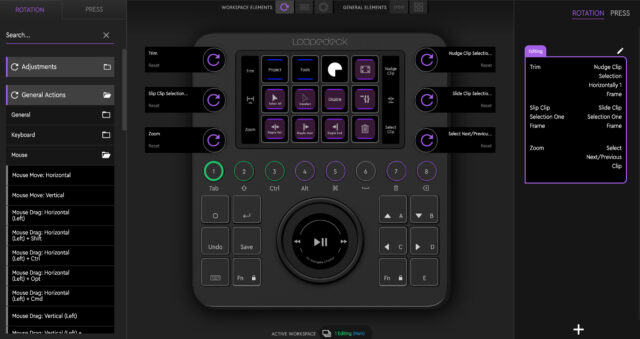
Talking about software, the heart of the Loupedeck is of course its software. No piece of computer hardware is worth anything without proper, well thought out software. Loupedeck offers the same app for all their devices and once you’ve selected your given panel you’ll be presented with the according UI. I’d say the Loupedeck software has a certain learning curve to it but once you know how it works, it just works. For novices, there’s a quick guide build right into the software with lots of illustrations and explanations. Neat!
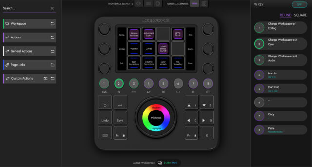
The main concept circles around Workspaces. You can flick through workspaces by clicking the round buttons labeled 1 to 8. Each workspace maps different functions to the touch buttons, touch strips (via the dials) and the touch wheel. Each of these elements can have multiple Pages whose can be accessed by swiping through them.
The whole UX approach involves a consistent color scheme: Workspaces are green, Pages are indicated by a blue color and Actions come in purple. You also can map different pages to the touch buttons rather than just swiping through them. Same goes for workspaces, you can map these to either the round buttons, a touch button, or both.
Pressing a key with an action (or a set of pre-recorded actions) assigned to it will execute that action. Same goes for rotating a dial, touching the center of the wheel and so on. The centering screen on the wheel can be configured in various ways, split in four pieces (think of a cake), split in two or three rows, map it to a play/pause button, whatever you want. Within Premiere’s color tab you can lift or lower the shadows/mid tones/highlights by rotating the wheel and manipulate the color by moving your finger around the center touchscreen. And because you don’t want to accidentally flick trough various pages while doing so, both Fn keys light up red by default in that mode in order to lock page-swiping. Again, very neat!
Customizing Your Setup
Of course the Loupedeck CT (or its software that is) is limited to whatever the api of a given app has to offer. While working in Premiere for example I created a new page for the touch wheel and I chose the 4-way split. The wheel now is mapped to jog 5 frames back and forth which I find is a sufficient speed for rushing through your timeline, the left and right of the touchscreen is for marking in and out and the bottom is for play/pause. That way I can flick through my timeline, perform quick ins and outs, press one of the touch buttons to perform a ripple delete and work my way through the entire timeline without ever touching the keyboard or mouse.
The new custom profile creator offers presets for the following apps but you can of course create a profile for whatever app you want, just select the given app from a list and off you got. Every time you open up that app, the Loupedeck CT will auto-switch to the desired profile.
- Chrome Browser (Windows)
- Firefox Browser
- Microsoft Excel
- Microsoft Outlook
- Logic Pro X
- Cubase Pro/Elements 10.5
- Avid ProTools 12.7 (Mac)
- iZotope RX7
- DaVinci Resolve 16
- Capture One
- Camera Bits PhotoMechanic
- Pixologic ZBrush
- Serato DJ Pro
- Spotify
Of course you can tweak each of these profiles any way you want, just like the rest of the (deeper) integrated profiles. I’d say customizing your given setup takes time. But once you’re done it is a treat to use, really. Furthermore, Loupedeck has announced native (as in pre-configured through apis) integration with Streamlabs, a software used extensively by gamers and YouTubers around the globe. Since this is not exactly what cinema5D is all about I haven’t explored all the details of this new integration but it certainly sounds interesting. These are the main features of this latest deep integration:
- Control your stream easily by switching between your scenes
- Hide and unhide any unwanted sources or skip/mute events at any time
- Control the audio levels of your sources easily with the dials.
- Use the CT as a live video mixer in Streamlabs’ studio mode when broadcasting
Competition
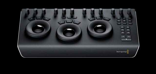
There are a lot of panels out there. Some are meant to be used with just a single application (Blackmagic Design DaVinci Resolve Micro Panel for example), some are more flexible (Tangent Devices, Palette -now called Monogram-), some are not even meant to be used for controlling video related software (APC40 MK2 DaVinci Resolve Edition, MIDIGrade) but all of these devices try to help you improving your workflow with certain creative apps.
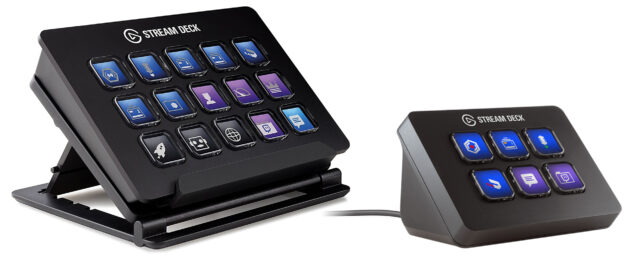
I can’t test them all but I do have some experience with the DaVinci Panels and I also own an Elgato Stream Deck, which is just a tiny device with 15 customizable LCD buttons, very handy for often-used shortcuts and it even auto-switches between apps, just like the Loupedeck CT.
To be honest, the biggest downside of the DaVinci line of grading panels is also their biggest advantage: They are custom-build for just that one app. And they are perfect companions in that regard. But this perfect integration comes at a price: Outside of DaVinci Resolve they are useless and you can’t customize them at all. Miss a certain button? Buy the bigger panel!
Enter stage the Loupedeck CT (and all the others multi-app controllers): They are much more versatile but they need to somehow balance between very different use-cases and applications. How to do that? In my opinion, the extensive use of highly customizable buttons with LCD screens (and touch capabilities) are the way to go. And the Loupedeck CT offers a good balance between moderate desk real estate and flexible layout with loads of possibilities. There’s one catch, though. I find that a device which aims to maybe not replace but extend the classic keyboard/mouse setup should offer features that the keyboard simply doesn’t have: Dials, faders, wheels. And more of them!
A Few Downsides
For my taste the Loupedeck could have even more dials, maybe a second (or third?) touch wheel and a few (maybe touch based) faders. But that’s just me trying to improve my color grading workflow with it. For somebody else the setup might just be perfect and to make it clear: This is the best multi-app hardware controller I’ve ever had the chance working with.
Another slightly annoying thing are the arrow keys, they are not in a reversed T shape but in a plain square. Up/down in the upper row, left/right one row down. It fits the overall aesthetics of the panel, sure, but a normal reversed T would be much more intuitive I guess.
I had some issues with the pre-mapped Shuttle layout for the touch wheel within Premiere Pro. In order to scroll through the timeline I needed to really creep the playhead through, once I turned the wheel just a tad too fast, the playhead would jump to the very end (or start) immediately. This is probably something that could be easily fixed in software, so not a big deal I think.
Another minor wiggle is (at least for me) the absence of some more deep-level settings. For instance I can map ‘Mouse move: vertical’ to the touch wheel but I can’t reverse it. Turning the wheel counter-clockwise always translates to down, clockwise is always up. I’d like to be able to change that. In fact, it might be a good idea to redo the underlying software a little bit: As it is now you can choose from a (sometimes very) long list of actions and drag one of them to a certain button or dial or whatever you choose. But that’s it then, you can’t tweak that setting any further. My idea would be to map a given setting (for example: mouse drag) onto the touch wheel and then tweak it further from there, like mouse drag (with left key pressed), vertical. I think this would tidy things up a little bit within the configuration software. Again, once it’s done you never have to look at it again. So it’s a minor thing, really but it still might be helpful for setting the Loupedeck CT up.
In order to mimic some of the deep integrations from within Premiere Pro I tried to map certain functions to the Loupedeck CT DaVinci Resolve custom profile. My goal was to label the six dials to settings like contrast, color temp, midtone detail, saturation etc. from the primaries wheels panel within the color room. This can be done via mouse drag (left) horizontal (move the mouse horizontally while click and hold the left button). But you first need to move the mouse over the given adjustment which defeats the purpose of using a dedicated panel a little bit of course. This is not Loupedeck’s fault, Blackmagic simply doesn’t offer that kind of control for third-parties but it’s still a bit of a disappointment.
The Good Stuff
This thing is highly customizable so even if your workflow is not 100% perfect yet, you probably can tweak the layout further. And I must say it’s really fun to fiddle around with the settings, layouts and mappings. Once you’re done it’s a setup once and forget operation. In regards of the custom profile creator you can even click on “get profiles..” in order to search online for existing profiles by the community (or by Loupedeck themselves). And of course you can tweak these presets to taste once you’ve downloaded them.
Another neat feature is that you can import and export your custom mappings and profiles (this is especially important for the new custom profiles). The Loupedeck doubles as a USB thumb drive with 8GB worth of storage. That doesn’t seem much but it’s more than efficient for carrying around all the profiles you like without the need of carrying (and potentially forgetting) an extra USB drive.
Since the lower casing of the Loupedeck CT is made out of plastic it opens up the possibility to let it communicate with your computer via Bluetooth. And that is a feature that seems to be coming to the Loupedeck CT soon, since it’s already enabled in the setting s but it still says that it will be available via software update soon. The implication here is it also has a build in battery I assume.
And again, the addition of the custom profile creator the Loupedeck CT really has upped its game. Now you’re not reliant upon deep integrations offered by Loupedeck (and allowed by the software publisher) but you can create any profile you like. Sure, these custom profile don’t offer the same level of deep integration but we’ll see, maybe that changes over time. Since we’re talking software here everything goes. The hardware itself is very nicely done and I think it’s good for many years of extended use.
Wrap Up
I really enjoy working with the Loupedeck CT. It is pricey, yes, but it offers a lot of features and the new custom profile creator really pushes open the door for many new possibilities. Personally, I’d like to see even more dials and wheels but we’re looking at a solid piece of hardware here which is not only very potent feature-wise but also offers an elegant and well-made addition to your desk. The industrial design is well thought out and beautiful and the amount of possible setups is kind of endless. The best thing is that the Loupedeck CT is driven by software which can (and will) be improved over time.
Other panels like the DaVinci control surfaces for example, are purpose-build devices and they can’t be improved via software update but maybe they don’t need to be updated because they are purpose build for one piece of software. Whether that’s a good thing or not is not for me to be judged, I think both approaches have their right to exist.
You don’t want to ditch your keyboard or mouse while working with the Loupedeck CT, look at it as a (very capable) addition for your setup. You still have to move the mouse around the screen and you still have to type on your keyboard. As Loupedeck’s own user guide states:
CT is not designed to eliminate all mouse usage. Moreover, with some functions, CT works best when it gets a little help from your mouse (e.g., selecting a clip with the mouse and then working with the clip with CT). With some actions, CT nicely takes the workload off the mouse, though – e.g., navigating through the timeline, moving clips, adjusting color, tuning transitions etc.
I think that quote nails it quite well. The deeper the integration for a given app is, the better the CT works standalone but for some tasks you still need the mouse and/or the keyboard and that is fine I guess. It’s simply impossible to offer full standalone control with a single multi-app device like the Loupedeck CT. For what it is, it gets the job done and it’s really good at it!
Full disclosure: Loupedeck sent me a Loupedeck CT at no cost. However, they did not ask for a particular opinion or anything other than my own thoughts about it, nor did they pay any money for this review.
link: Homepage
What do you think? Do you already use some kind of control surface your your given software? Which one? Share your experience in the comments below!
