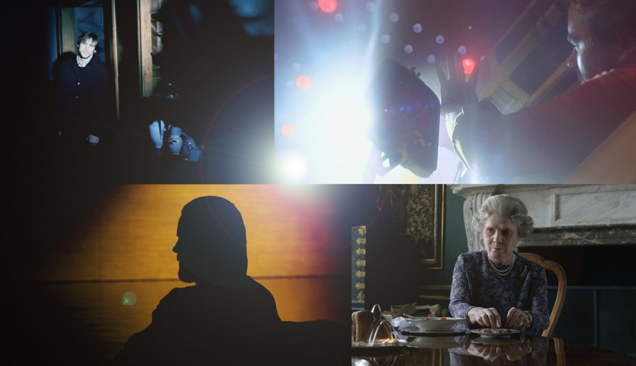
Limitations ignite creativity. When we define rules and boundaries, our brain tries to find a new way around them. Are you familiar with the Oulipo movement? This was a gathering of French-speaking writers and mathematicians in the 1960s who came up with different constrained writing techniques. An example is to omit certain letters in your work or to create a poem where each line is a single word, and each successive word is one letter longer. That helped to harness new ideas. Introducing constraints is a powerful tool in filmmaking as well. Can you light a scene with just one source? Sure! But how will the image look, and what dramatic impact will it have? Trust me, the possibilities are endless. Let’s dive into some of the iconic examples of using single-source lighting!
Modern lighting conventions require light in films to be believable and authentic. It shouldn’t disturb the audience’s immersion and distract their attention. We call it “emulate”: take inspiration from reality and try to mimic it in the frame. At the same time, lighting is an impactful storytelling tool that can increase emotional reaction or indirectly emphasize some deep-lying message. Single-source lighting is no exception. You may think of it as a very dramatic option, but it can also be realistic, flattering, disturbing, or scary – just what your story needs.
How lighting tells stories
Filmmaker and educator Tal Lazar explains in his MZed course “The Language of Lighting”, that mastery lies in the correct balance. Yes, it is important to make the lighting feel realistic within your film world so it doesn’t put your viewers off. On the other hand, we have to liberate ourselves from the restrictions of reality to come up with creative ideas to tell a story. Sometimes, the light should support the audience’s expectations (using practicals is a great way to motivate your lighting choices, for example). In other cases, it should break them, and we’ll take a look at a prominent example further below.
The Language of Lighting
How to balance the story and the realism? It’s for you to decide. One of the tools, therefore, is using contrast. Shadows are a big part of our world, no arguing, and their dramatic value is as massive as the light itself. Take a look at the subsequent film still from Denis Villeneuve’s “Enemy.” Even if you haven’t watched it, how would you describe the character? What is he going through at the moment?
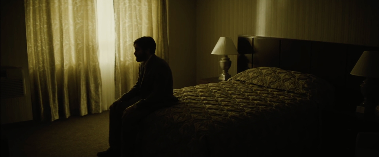
The room is dark, and the only light comes from a big window in the back. That turns the protagonist into a mere silhouette. He is alone and waiting. His posture indicates a mix of anticipation and slight anxiety. We can’t observe his face properly, and it ignites an uncomfortable feeling within us, so we experience the same emotion he does. Not all of this was created by choice of lighting alone: Blocking, acting, and frame composition also play an important role in this ensemble. Yet, without contrast and shadows, the impact would be drastically less. Is it a realistic setup? Yes. Does it tell a story? It sure does.
Light from a single source as a character
Should the light always be realistic, though? Of course not if your story suggests otherwise. The single source can even become an active character in the film. A perfect example is the following scene from Spielberg’s “Close Encounters of the Third Kind”:
In the beginning, everything feels normal. We even see an ordinary car passing by and a human driver arguing with Roy. Yet, when similar headlights approach from the back for the second time (at 1:28), filmmakers start playing with the audience’s expectations. Suddenly, the lighting behaves weirdly: It moves upwards, at an impossible angle, with an intensity stronger than anything else in the scene. We never see any aliens. Only the lights. Yet, their story is as clear to us as it is to the main character.

Film stills from “Close Encounters of the Third Kind” by Steven Spielberg, 1977 
Mystery created by the single-source lighting
Now, we watched two examples of single-source lighting. Both were strong and dramatic yet had various effects: One implying suspense, another communicating something scary and otherworldly. Why so? Where was the difference? The answer is in the direction of the light.
This is an important parameter to keep in mind. When you work with single-source lighting, toplight and backlight will be your go-to angles to achieve a moody, dramatic look. Remember the opening scene of “The Godfather,” where the only light comes steeply from above, leaving the character’s eye sockets black and intimidating?
Backlight from a single source also has a profound impact on the viewer, especially if it’s hard. It hides the details of the character in the shadows, conjures silhouettes, and creates mystery. To give you an example, for “Blade Runner” (both the original one and the sequel), it is part of the visual language. Just look at these dark, captivating film stills! I feel as if I’m being sucked into a void and need to hold my breath until my eyes get used to the darkness and can finally see the details.

Film stills from “Blade Runner” by Ridley Scott, 1982 and “Blade Runner 2049” by Denis Villeneuve, 2017 


In the spotlight: flattening the image
Front lighting, on the contrary, is a rare cinematic choice. It is known to make visuals flat and dull. However, when we take a single source and strike it directly into the character’s face, it can create an unexpected effect. For instance, how about this scene from “Eternal Sunshine of the Spotless Mind?”
Here, only Jim Carrey’s character is in the spotlight, blended with it. The rays represent his consciousness, his mind, whereas everything else in the shadows is his memories that are being erased. Maybe it’s not the most beautiful image, conventionally speaking, but is it strong? Hell, yeah.
Another example that comes to my mind is the use of frontal single-source lighting in Robert Eggers’s “The Lighthouse.” It emphasizes how both lighthouse keepers slowly lose it, becoming insane and obsessed. The light plays the central role in this process story-wise, so no wonder filmmakers set accents with it, although trying to keep it as natural as possible.

Film stills from “The Lighthouse” by Robert Eggers, 2019 

Chiaroscuro lighting
We talk a lot about high contrast (also called “low key”) light here, so I can’t help but stop at so-called chiaroscuro lighting for a moment. It is not necessarily always achieved with a single source, but it can be. (In fact, this will be the best way to boast deep dark shadows and create a striking image). Let’s start with a brief term definition.
Rembrandt lighting is lighting that intentionally creates contrasts of light and dark. High contrast lighting or chiaroscuro was developed by the Italian painter Caravaggio. The lighting often appears to come from spotlights shining on the action while other areas disappear into unlit shadows.
From the book “Cinematic Storytelling”
The chiaroscuro technique is said to achieve a heightened dramatization and build tension. It is often used in pivotal scenes where the biggest questions, twists, or realizations are at stake. One famous example of using this type of lighting is the scene from “Apocalypse Now,” where Willard is brought before Colonel Kurtz and finally meets him.
In the first shot, the backlit curtain emphasizes Kurtz’s dominance and mystery. Yet, as we see him in the closeup rising from his bed, his head comes into the spotlight, whereas the rest of the frame stays black. That creates a weird feeling as if his head was detached from the body. And still, we don’t see the Colonel’s face until the very end of the scene. The use of chiaroscuro here dramatizes his insanity and makes the whole scene very intense, doesn’t it?
Using single-source lighting to enhance realism
Okay, we took apart some examples where single-source lighting creates high contrast and heightened drama. However, that’s not always the rule. You can also use a single-source lighting approach with soft diffused light, like in the brilliant Netflix show The Crown.
In the ASC clubhouse conversation, cinematographer Adriano Goldman explains that this sort of lighting has even become the show’s trademark throughout the 6 seasons. His main philosophy here was to make the look believable, realistic, and grounded. That’s why in the closeups, you will often see this soft ¾ light on the faces.

Film stills from “The Crown”. Images source: Netflix 


In scenes like the ones above, light comes from a single source – the window. However, it’s not the real sun, but a masterful emulation with huge film lamps outside. Their light is always softened by layers of nets, diffusions, and curtains, giving it the sort of quality Adriano Goldman was after. It’s a beautiful stylistic choice and another way to use single-source lighting as your main approach.
Sun as your single light source
Of course, if you prefer naturalistic cinematography, then you may try using the only lighting source you’ll ever need – the sun. But that’s a different topic altogether. If you’re interested in learning more about it, read our article on “Nomadland,” where filmmakers took the best out of sunset light. Additionally, you may find some useful tips on lighting people outdoors here.
Let’s turn the tables now! How do you feel about single-source lighting? In which cases do you go for it in your films? What are some other dramatic examples from movies I forgot to mention? Looking forward to your thoughts and suggestions in the comment section below!
Feature image: a collage, made of the film stills from “Eternal Sunshine of the Spotless Mind” by Michel Gondry, 2004; “Close Encounters of the Third Kind” by Steven Spielberg, 1977; “Blade Runner 2049” by Denis Villeneuve, 2017; Netflix series “The Crown”.
Full disclosure: MZed is owned by CineD.
Additional source:
- “Cinematic Storytelling” by Jennifer Van Sijll, 2005;


