Musicbed, a platform that licenses a highly curated selection of songs for use in film, video, broadcast and other media, has launched a redesigned website with new interesting features. Find out more below. 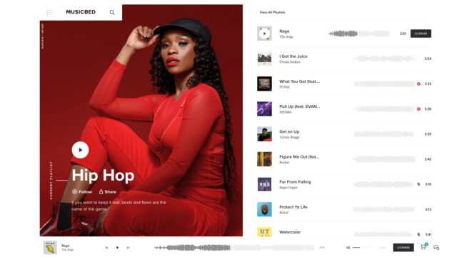
We’ve been using Musicbed since its inception, and in my opinion Musicbed is a truly fascinating marketplace for creators and music producers alike. Every time I did research searching for the best place to find good music to my films, I ended up on Musicbed’s website.
The Musicbed platform has over 700 world-class artists which present their music for licensing, for any purpose imaginable (distribution, streaming and even sometimes adjusted to the project’s custom budget).
Their platform is unique among comparable licensing platforms. On Musicbed, the music is so diverse and of such high quality that you can simply listen to it to get inspired for your project. Also, their site is very user friendly, which allows you to find exactly what you were looking for much faster.
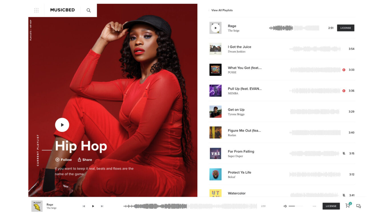
And now, their website has been redesigned and relaunched with new features. Let’s have a look:
Integrated browser and smart filters
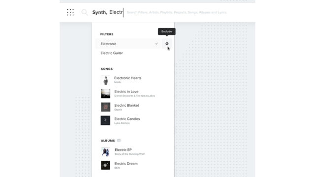
The option to ‘Include’ and ‘Exclude’ is now implemented in their search interface in one place.
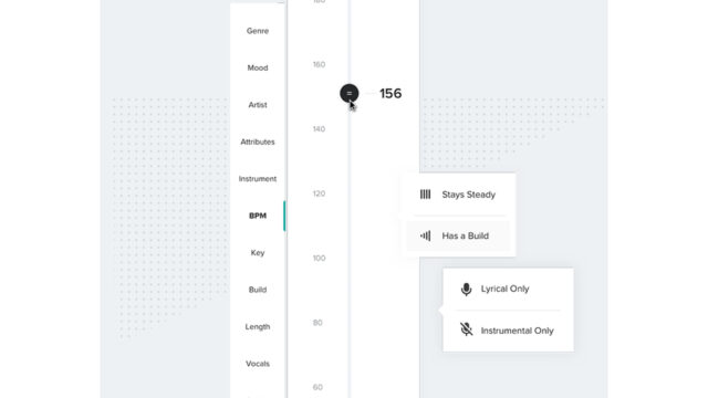
Also, you can filter by instrument, song build, length, vocals or even BPM (beats per minute), which is great – this reflects how filmmakers work. It will be very easy to find a fitting “beat” and “feel” for your footage. And from experience we can tell that looking for music can be the most cumbersome part of the editing process.
Checkout process
Although the checkout process is also redesigned, I didn’t find any significant changes. I actually liked the old version better. However, this new design is very straightforward and easy to use, with a lot of options to match the particular need of a project.
All-new Knowledge Base
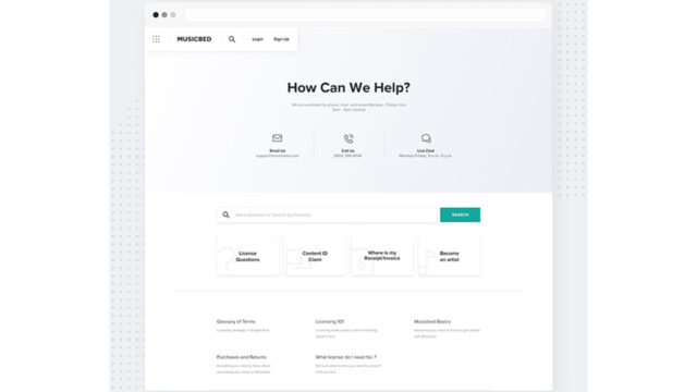
It seems that the help and support page has also redesigned and now looks more engaging and easier to use.
Conclusion
As I wrote above, Musicbed is by far my favourite tool to find new high quality pieces of music from amazing artists, as well as a place to get some inspiration.
It seems that this redesign is more focused more on looks rather than functionality.
I have my doubts that those new smart filters are good enough to get what you need. For example, I did try to filter by BPM some Tony Anderson’s music, but I haven’t gotten any correct results. However, I am happy to be convinced otherwise!
Update: Musicbed team is aware of some minor bugs related to the advanced filters. The team is already working to fix those bugs.
The bottom line here: the most important part in platforms like this one are always the artists and creators themselves, and the quality they deliver. Musicbed says that it goes through 50-100 music submissions daily and that it gives every submission the attention it deserves. Only the best of all submissions are accepted to Musicbed’s marketplace. That says it all!!
