Quick Tip: Resolve – Color Reference Charts Part 2
Music Courtesy of MusicVine.com Get 25% off your next music license with code C5D25 (valid for one use per customer)
In the first part of this two-part Quick Tip, we looked at using a color reference chart with the tools available in most NLEs out there. (Click here for our first part)
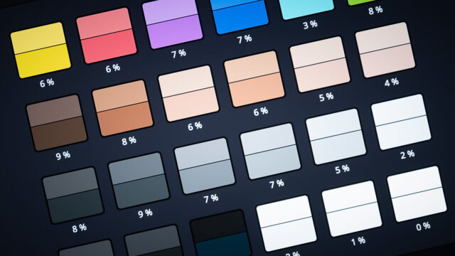
Blackmagic DaVinci Resolve has a built-in feature called “Color Match”, that lets you use Color Reference Charts almost automatically.
Color Reference Charts Tips
No matter how you use your Color Reference Chart – semiautomatic with Resolve or manually in another application – If they are not shot properly on set, they are useless. I have compiled some tips:
- The chart needs to be evenly lit by your main “key” light source. (But only if it’s this light your camera’s white balance is set to! If for example, your key light is a blue “moon” exterior, sticking the chart in and balancing it, will result in “correcting” the blue moonlight to white – thus ruining what the cameraperson intended! If your key light is not supposed to look white, you need to light the chart separately with a (relative to the camera’s white balance) white light.
- Make sure color effect light (like the amber kicker you might use for hair etc.) does not hit the chart.
- If you are shooting green- or blue screen – make sure you don’t have color spill on the chart.
- Make sure the chart is free from shadows, reflections, and glare.
- Try to make the chart as big as you can in frame (there are different chart sizes available, so you may need more than one size).
- Charts have a neutral grey patch that should be exposed correctly relative to your camera’s gamma for the best results. Usually, it’s 40 IRE mid-tone gray (refer to the documentation of the color chart for that).
- If you want to match more than one camera: all the cameras you want to match should film the chart in the exact same conditions. So don’t move or angle the chart, from one camera to the next, move the cameras!
- It’s a good idea to have a person hold the chart, so you have real skin tones in the same frame in addition to the skin tone patches on the chart and can immediately see if the match looks correct in post.
Let’s wrap this up
Color charts are very helpful tools to archive a consistent look when used correctly. However, they should be used in a way to guide the colorist and not be taken as gospel. They are here to help the colorist and not do his work for him.
You know the drill: thoughts, questions, and ideas belong in the comments below. Please let us know if you have ideas for future Quick Tip Videos.


