Each time I stumble upon newly published stills from the upcoming season of the “Severance” series, my head instantly replays one thing: its epic intro. Do you remember how beautifully odd and fascinatingly disgusting it looked, with somewhat clumsy animation and creative scene transitions? However, there is one tool that makes this intro stand out even more. Namely, orthographic projection. Sounds difficult? No worries! We will dissect this term piece by piece until we reach its pumping heart and show how it can visually impact your scenes.
It all starts with perspective. As you know, perspective is one of the most important visual cues to create depth in your shots and make them feel realistic (we talk a lot about it here). When we mention this term, I bet everyone imagines vanishing points, lines running together, and how the size of similar objects becomes smaller and smaller in the background. Somehow, we’re rarely aware that there are different ways of depicting reality other than the linear perspective. Let’s put an end to this injustice!
What is perspective?
In his rather philosophical text “Perspective as Symbolic Form,” Erwin Panofsky refers to a definition made by phenomenal German painter Albrecht Dürer:
Perspectiva is a Latin word which means “seeing through.”
Dürer lived between the 15th and 16th centuries, in times of the Renaissance, and besides his art, he worked on theoretical treatises, which involved principles of mathematics for linear perspective. Yes, it wasn’t always obvious how its geometry worked, especially not until the Renaissance. More curious, though, is that even linear perspective doesn’t fully reflect how we see the real world (although that is the point of it).
Alex Buono's Visual Storytelling 2
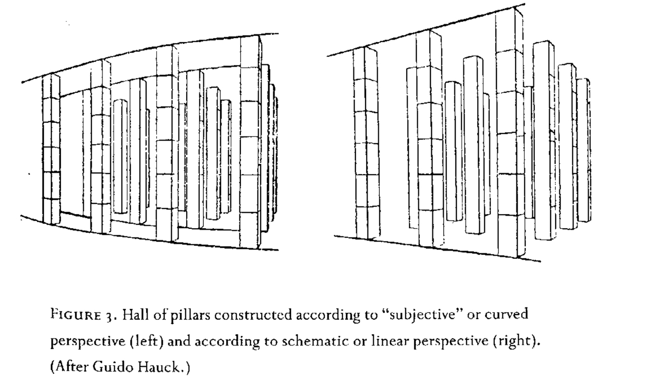
The thing is, because we have two eyes (both with a curved retina), we don’t see straight lines as straight. Instead, even the most vertical lines (like the walls of a building) start to bend slightly when they are located further away from us. Our brain learned to ignore that fact, but this is how we actually perceive reality. Therefore, theoretics distinguish between the “subjective” perspective and the linear perspective:
We have seen and depicted the world differently
Simply put, perspective is how we see the world around us from our standpoint. However, we have already established that there is more than one approach to perspective. The history of this phenomenon further emphasizes how our relationship with the world has changed throughout time.
Let’s take antique art as an example. They didn’t have all those beautiful leading lines, vanishing points, and “correct” spatial relations between individual elements. The space in such drawings remained aggregate and heavy; it consumed the objects. Why? Didn’t the artists see that it looked weird, inconsistent, and wrong? But wrong to whom? As Erwin Panofsky explains, we shouldn’t ask, “Did antiquity have perspective?” but rather: “Did antiquity have our perspective?”
With the advance of the Renaissance, the conception of the world changed, and “human” entered the limelight. Suddenly, the art also received this “dominating unity” that observes and defines the direction of the gaze. That’s why they suddenly needed another way to depict reality. Enter linear perspective.

“Entry into Jerusalem and Last Supper” by anonymous mosaicist, on a west transept wall of Cathedral in Monreale, 1180s 
“Last Supper” by Leonardo da Vinci, Friary of Santa Maria delle Grazie, 1498
But Mascha, what does all this have to do with filmmaking?
Orthographic projection as a rare gem
We’re so accustomed to the look of linear perspective that we easily forget it’s not “real”. Films use this effect to a great extent: it helps to create deep space and support the illusion of three dimensions (which works amazingly, taking into account that we usually watch movies on a flat screen). And then something interesting happens, and our attention snaps back at a moment’s notice. Here, I finally return to the intro of “Severance.” Let’s rewatch it together first:
Putting aside the very artistic voice of the animator Oliver Latta (whom, by the way, director Ben Stiller originally found thanks to Instagram reels), have you noticed anything odd? Anything that makes this intro even more visually compelling? Anything that kept your mind wondering?
Ladies and gentlemen, orthographic projection! A lot of shots in this intro use it. Basically, it means having no perspective shift. Orthographic projection is a visual way to show the true angles, the true scale of objects, and the true relationships between them. Look again at this shot below and note how all the doors and tiny protagonist figures are exactly the same size, although some are definitely located further away from our eyes:
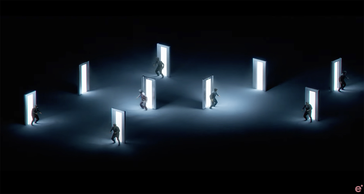
That creates an odd trippy effect. On one hand, no perspective shift is true to real life. On the other hand, it doesn’t look right to our brain, so the image feels otherworldly. A bitter irony, since it depicts exactly how things are in our human reality!
2,5D look from the games
Some of you might know this effect from computer games. There, it’s called a 2,5D look (or a 2,5 world) – a used-to-be popular camera perspective that creates an impression of a three-dimensional scene, using 2D elements and avoiding full 3D renderings.

Looks somewhat similar to our previous shot from “Severance”, doesn’t it? All the chairs are the same size, regardless of their place in the house, and so are people. The idea behind the 2,5D perspective is that players get an overview of the game world, but they don’t have to watch objects, scenes, and characters from a strict top-down view, which feels flat. Instead, game designers can use a slanted angle, add more details to the scenery, and provide characters with a relatable human body.
Deciding on orthographic projection to achieve a game look
No wonder orthographic projection has a strong connection to the gaming world in our minds. So, using it in films instantly transmits the reference to the viewer. A good example would be the Light Cycle racing scenes in the original “Tron” movie from 1982. In some shots, filmmakers do use linear perspective. In others, you would see that distances and scales remain consistent, and objects do not diminish when they go further away.
This effect enhances the artificial feel of the environment and emphasizes that we are indeed in a computer-generated landscape. Compare it to the same sequences from the newer “Tron” movie, and you’ll notice how immensely different they feel. Can we consider “perspective vs. orthographic projection” a visual storytelling tool, then? I believe, yes, we can.
Achieving impossible geometry
It goes even further, though, than only simulating the look of computer games. We already mentioned that orthographic projection feels weird, otherworldly, and even dreamy. What a great way to represent something like paradoxical or impossible spaces, then! Say, famous Penrose steps?
Of course, we can argue that the infinite staircase in Christopher Nolan’s masterpiece about layers of dreams does obey the laws of linear perspective to some extent. At the same time, it would only exist in the orthographic view. I might be mistaken, so please try drawing this paradox or recreating it in a 3D program, and let’s compare our notes in the comments.
Nolan uses this technique a bunch of times throughout the film. For instance, in the bending city scene in Paris, where orthographic projection creates a uniform, undistorted view of the cityscape despite its impossible geometry.
Orthographic projection as a stylistic choice
Lastly, orthographic projection can emphasize the flat, schematic nature of digital and cybernetic. We will find it a lot in computer interface sequences in various movies, but it might also be a stylistic choice. One example is the futuristic anime “Ghost in the Shell” from 1995. Filmmakers occasionally use the orthographic view for specific sequences. For instance, it appears in the scenes depicting futuristic cityscape, like at 00:05 in the subsequent trailer:
Do you see how buildings and objects appear at the same scale regardless of depth? I don’t think it has a storytelling purpose in this case. No, in my eyes, it rather contributes to the film’s cyberpunk aesthetic, giving it a special feel that would not be there if they had followed the rules of classic linear perspective.
Not all comes down to the artist’s perspective
This technique, as well as other visual tools, becomes most impactful in films when we know how to use it. As with other rules and conventions, you follow them and, at the right moment, decide when to bend or eliminate them altogether. In the end, it all comes down to the artist’s intention. Or not?
I know we talk a lot about different techniques in these articles, deconstructing scenes and analyzing what effect they produce on the audience. But there is one important thing I want you to consider. Oscar-nominated filmmaker Alex Buono talks about it in his “Visual Storytelling 2” course on MZed.com.
The purpose of art is not to define, is to engage. The experience of the art is the point of the art.
Alex Buono
What Alex and I mean to imply here: Yes, you can learn different storytelling tools and become a mighty maestro of visual subtext in your movies. Yet, in the end, your artist’s intention does not matter because there is no invalid interpretation. Of course, you can hide subtle (or not-so-subtle) cues in your film, but after you put it out into the world, you won’t run around shouting: “That’s not what I meant here! Let me explain!”
Conclusion
After your work (movie, art, music) is released, it leaves your family home and becomes public. Now other people will try to interpret your story and find their own meanings in it. That’s okay. So yes, learn your tools, work with precision, and think about why while implying one technique or another. But after it’s finished, let your film go and experience its best life on this peculiar planet.
Let’s turn the tables now! How did you like the “Severance” intro, and how did it make you feel? Have you ever noticed orthographic projection in other movies? If so, could you please share some examples with us? Also, feel free to continue the philosophic discussion on perspective as the characteristic of our worldview. We’re always happy to see you in the comments down below!
Feature image: a film still from the intro of the “Severance” series (by Ben Stiller, 2022, Apple TV+).
Full disclosure: MZed is owned by CineD.
Additional source: “Perspective as Symbolic Form” by Erwin Panofsky, 1991.


